Search packages, repositories and app categories

flutter_tree_pro cover
Package detailsv0.0.15

flutter_tree_pro

Flutter tree select widget.You can use it to select tree nodes.This is also support RTL.

AndroidiOSWebmacOSWindowsLinux
30-day downloads
140
Likes
28
Pub points
150

Install package

flutter pub add flutter_tree_pro

Package Overview

Package selection guidance compiled from public package information, community data, and project usage.

Flutter Tree Pro is a customizable tree selection widget for Flutter, enabling users to navigate and select hierarchical data structures with ease. It supports right-to-left (RTL) layouts, making it suitable for multilingual applications. The package integrates seamlessly across Android, iOS, Web, macOS, Windows, and Linux platforms. Designed for intuitive user interaction, it allows developers to build complex tree-based interfaces such as file explorers, organizational charts, or category selectors. Its lightweight and flexible architecture ensures smooth performance even with large datasets.

Use cases

  • File explorer interfaces
  • Organizational chart displays
  • Category filtering systems
  • Hierarchical data selection
  • Settings navigation menus

Key features

  • RTL support
  • Cross-platform compatibility
  • Customizable node styling
  • Efficient rendering for large trees
  • Multi-selection capability

Suitable for

  • Developers building hierarchical UIs
  • Apps requiring tree-based navigation
  • Internationalized applications
  • Complex data structure visualization
  • Web and mobile apps with shared codebases

Considerations

  • May require custom styling for complex themes
  • Performance impact with extremely deep trees
  • Limited built-in animations
  • Requires manual handling of state management
  • Not optimized for real-time collaborative editing

Original README

Original README snapshot from the linked source repository. Visit the repository for the latest content.

flutter_tree_pro

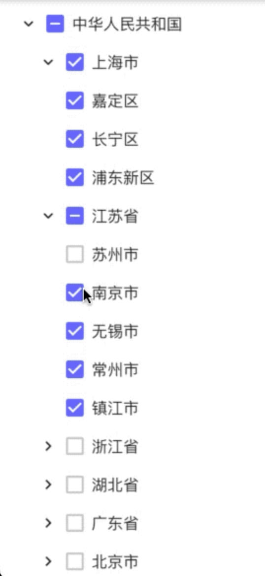
A Flutter tree-select widget with checkbox selection, single-select mode, RTL support, and leaf-node drag-and-drop.

Demo

flutter_tree demo

Features

  • Build tree data from flat list (DataType.DataList) or nested map (DataType.DataMap)
  • Multi-select with parent/child check-state synchronization
  • Single-select mode with initial selected node
  • Expand/collapse nodes
  • RTL layout support
  • Custom tree connector line style (TreeLineStyle)
  • Drag-and-drop for leaf nodes
    • Drop on a non-leaf node: dragged leaf becomes a child of that node
    • Drop on a leaf node: dragged leaf is inserted after target leaf as a sibling

Installation

Add dependency to your pubspec.yaml:

dependencies:
  flutter_tree_pro: ^0.0.16

Then run:

flutter pub get

Quick Start (DataList)

import 'package:flutter/material.dart';
import 'package:flutter_tree_pro/flutter_tree_pro.dart';

class TreeDemo extends StatefulWidget {
  const TreeDemo({super.key});

  @override
  State<TreeDemo> createState() => _TreeDemoState();
}

class _TreeDemoState extends State<TreeDemo> {
  final List<Map<String, dynamic>> listData = [
    {'id': 1001, 'parentId': 0, 'value': 'USA'},
    {'id': 1002, 'parentId': 1001, 'value': 'California'},
    {'id': 1003, 'parentId': 1002, 'value': 'San Francisco'},
    {'id': 1004, 'parentId': 1001, 'value': 'New York'},
  ];

  final List<Map<String, dynamic>> initialListData = [
    {'id': 1003, 'parentId': 1002, 'value': 'San Francisco'},
  ];

  List<Map<String, dynamic>> checked = [];

  @override
  Widget build(BuildContext context) {
    return Scaffold(
      appBar: AppBar(title: const Text('flutter_tree_pro')),
      body: FlutterTreePro(
        listData: listData,
        initialListData: initialListData,
        isExpanded: true,
        isRTL: false,
        isSingleSelect: false,
        config: const Config(
          dataType: DataType.DataList,
          id: 'id',
          parentId: 'parentId',
          label: 'value',
          children: 'children',
          lineStyle: TreeLineStyle(
            color: Color(0xFFE0E0E0),
            width: 1.0,
            indent: 28,
            showVerticalLine: true,
            showHorizontalLine: true,
          ),
        ),
        onChecked: (items) {
          setState(() {
            checked = items;
          });
        },
      ),
    );
  }
}

Data Source Modes

DataType.DataList

Use flat list data with id + parentId and pass it through listData.

Required fields in each item (or mapped by Config):

  • id
  • parentId
  • label (for display text)
DataType.DataMap

Use nested tree data with children and pass it through treeData.

If treeData is empty and initialTreeData is provided, initialTreeData will be used as fallback root data.

API

FlutterTreePro parameters
Parameter Type Default Description
treeData List<Map<String, dynamic>> const [] Tree source for DataMap mode
listData List<Map<String, dynamic>> const [] Flat source for DataList mode
initialTreeData Map<String, dynamic> const {} Fallback root tree node when treeData is empty
initialListData List<Map<String, dynamic>> const [] Initial checked items in multi-select mode
config Config const Config() Field mapping and tree style config
onChecked Function(List<Map<String, dynamic>>) required Selection callback
isExpanded bool false Expand all nodes initially
isRTL bool false Enable right-to-left layout
isSingleSelect bool false Enable single-select mode
initialSelectValue int 0 Initial selected node ID in single-select mode
Config
Field Type Default Description
dataType DataType DataType.DataMap Data mode
id String 'id' Node ID key
parentId String 'parentId' Parent ID key
label String 'label' Display text key
value String 'value' Reserved compatibility field
children String 'children' Children key
lineStyle TreeLineStyle const TreeLineStyle() Connector line style
TreeLineStyle
Field Type Default Description
color Color Color(0xFFD9D9D9) Line color
width double 1.0 Line width
indent double 24.0 Per-level indentation
showVerticalLine bool true Show vertical connectors
showHorizontalLine bool true Show horizontal connectors

Drag-and-Drop Rules

  • Only leaf nodes can be dragged.
  • A node cannot be dropped onto itself.
  • A node cannot be dropped directly onto its current parent.
  • Drop on a leaf node inserts after that target leaf, keeping the same parent level.
  • Drop on a non-leaf node appends as the target node's child.

Notes

  • In multi-select mode, onChecked returns checked leaf nodes after internal filtering/deduplication.
  • In single-select mode, onChecked returns at most one selected node.
  • Config.value is reserved for compatibility and is not used by current select-state logic.

Example Project

See /example for a runnable demo:

cd example
flutter pub get
flutter run

License

MIT

Categories

Source repository

Projects using this package

No data available yet.