Search packages, repositories and app categories

gradient_elevated_button cover
Package detailsv1.2.0

gradient_elevated_button

Custom Flutter button with gradient background for visually appealing UI.

AndroidiOSWebmacOSWindowsLinux
30-day downloads
338
Likes
15
Pub points
150

Install package

flutter pub add gradient_elevated_button

Package Overview

Package selection guidance compiled from public package information, community data, and project usage.

A customizable Flutter button featuring a gradient background, designed to enhance UI aesthetics. It extends the standard ElevatedButton with smooth gradient fills, shadow effects, and responsive feedback. Ideal for modern app interfaces requiring visually engaging buttons without sacrificing functionality. The package supports all major platforms including Android, iOS, Web, macOS, Windows, and Linux, ensuring consistent appearance across devices.

Use cases

  • Creating eye-catching call-to-action buttons
  • Enhancing login or signup screens
  • Designing modern mobile and web interfaces
  • Adding visual flair to forms and dashboards
  • Improving user engagement through dynamic visuals

Key features

  • Gradient background support
  • Built-in elevation and shadow effects
  • Customizable colors and stops
  • Responsive touch feedback
  • Cross-platform compatibility
  • Simple integration with existing Flutter code

Suitable for

  • UI designers seeking visual polish
  • Developers building modern apps
  • Projects emphasizing aesthetic appeal
  • Apps targeting multiple platforms
  • Teams using Flutter for full-stack development

Considerations

  • May require additional styling for accessibility
  • Performance impact on complex gradients
  • Limited customization beyond gradient and elevation
  • Not suitable for minimalistic design patterns
  • Best used with contrasting text for readability

Original README

Original README snapshot from the linked source repository. Visit the repository for the latest content.

GradientElevatedButton

Package Version License Likes Points Popularity

Git Issues

Buy Me a Coffee

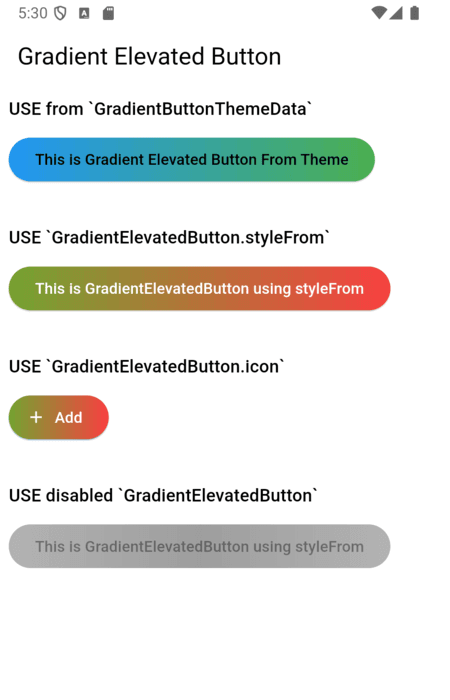
A customizable elevated button with gradient support for your Flutter applications. This package allows you to create buttons with gradient backgrounds, custom foreground colors, and various other customizable properties using the GradientElevatedButton widget.

Features

  • Gradient Background: Easily apply gradients to your button backgrounds.
  • Customizable Style: Customize text color, shape, padding, and more.
  • Integration with Theme: Use GradientButtonThemeExtension (via ThemeExtension) to apply a consistent style across your app. (Old: GradientButtonThemeData is deprecated)

Demo

Usage

1. Theming with ThemeExtension (Recommended)

The recommended way to theme all gradient buttons is to use GradientButtonThemeExtension with ThemeData.extensions:

MaterialApp(
  theme: ThemeData(
    extensions: <ThemeExtension<dynamic>>[
      GradientButtonThemeExtension(
        style: GradientElevatedButton.styleFrom(
          backgroundGradient: const LinearGradient(
            colors: [Colors.blue, Colors.green],
            begin: Alignment.centerLeft,
            end: Alignment.centerRight,
          ),
          foregroundColor: Colors.black,
        ),
      ),
    ],
  ),
  home: ...,
)

Then use GradientElevatedButton as usual:

GradientElevatedButton(
  onPressed: () {},
  child: Text('Themed Gradient Button'),
)
2. [DEPRECATED] Using GradientButtonThemeData

GradientButtonThemeData is deprecated and will be removed in a future release. Migrate to ThemeExtension as shown above.

// Deprecated usage:
GradientButtonThemeData(
  data: GradientElevatedButton.styleFrom(
    backgroundGradient: const LinearGradient(
      colors: [Colors.blue, Colors.green],
      begin: Alignment.centerLeft,
      end: Alignment.centerRight,
    ),
    foregroundColor: Colors.black,
  ),
  child: MaterialApp(
    // ...
  ),
)
3. Using GradientElevatedButton.styleFrom

Alternatively, you can style the GradientElevatedButton directly using GradientElevatedButton.styleFrom to define the button's gradient, shape, and other properties:

Widget gradientWidget = GradientElevatedButton(
  onPressed: () {

  },
  style: GradientElevatedButton.styleFrom(
    gradient: const LinearGradient(colors: [
      Color.fromARGB(255, 166, 206, 57),
      Color.fromARGB(255, 0, 175, 173),
    ],
      disabledGradient: const LinearGradient(colors: [
        Colors.grey.withAlpha(200),
        Colors.grey,
        Colors.grey.withAlpha(200),
      ],
        begin: Alignment.topCenter,
        end: Alignment.bottomCenter,
      ),
    ),
  ),
  child: const Text("This is Gradient Elevated Button"),
);

Customization

You can fully customize the GradientElevatedButton using the following properties:

  • backgroundGradient: A LinearGradient (or other types) that defines the background gradient.
  • foregroundColor: The color of the text and icon on the button.
  • disabledBackgroundGradient: A LinearGradient (or other types) that defines the disabled background gradient.
  • disabledForegroundColor: The color of the text and icon on the disabled button.
  • padding: Padding inside the button.
  • shape: Define the button’s shape with a ShapeBorder like RoundedRectangleBorder or StadiumBorder.
  • elevation: Controls the button's elevation (default: 2).
  • onPressed: The callback function that is called when the button is pressed.

Migration Guide

To migrate from GradientButtonThemeData to the new ThemeExtension approach:

  1. Remove GradientButtonThemeData from your widget tree.
  2. Add GradientButtonThemeExtension to your ThemeData.extensions.
  3. Use GradientButtonThemeExtension.of(context) to access the style if needed.
  4. All GradientElevatedButton widgets will now use the theme from the extension.

See the example and code comments for more details.

Example

click here for example

Issues and Feedback

Please file any issues or provide feedback by visiting the Issues and Feedback for this repository.

For suggestions or further feedback, feel free to send an email to chegz.dev@gmail.com, and we'd be happy to hear from you!

Contributors thanks

contributors

Categories

Source repository

Projects using this package

No data available yet.