
Overview
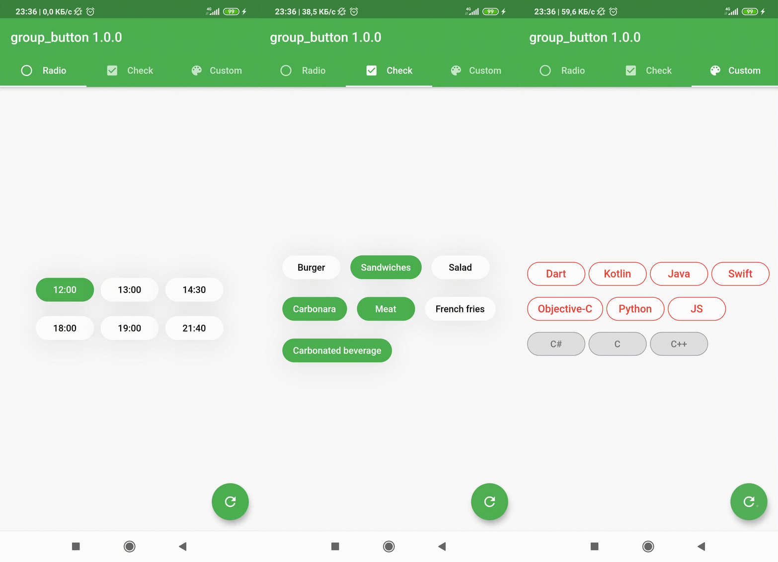
A Flutter custom widget that enables the creation of grouped buttons, supporting both radio and checkbox styles. It simplifies the implementation of mutually exclusive or multiple selection options in a clean, reusable format. Ideal for forms, filters, and settings interfaces where users need to choose one or more options from a set. The package is compatible across all major platforms and integrates seamlessly with existing Flutter projects.
Use cases
- Form inputs with grouped selections
- Filtering options in UI
- User preference settings
- Multi-select or single-select button groups
- Dynamic form builders
Key features
- Supports radio and checkbox button types
- Easy integration with Flutter
- Cross-platform compatibility
- Customizable styling
- Built-in state management for group selection
- Responsive design for all devices
Suitable for
- Developers building interactive forms
- UI designers needing grouped button components
- Apps requiring filter or preference selection
- Projects targeting multiple platforms
Considerations
- Requires manual handling of selection callbacks
- Limited built-in validation
- Styling may require additional customization
- Not suitable for complex dynamic groups without extra logic