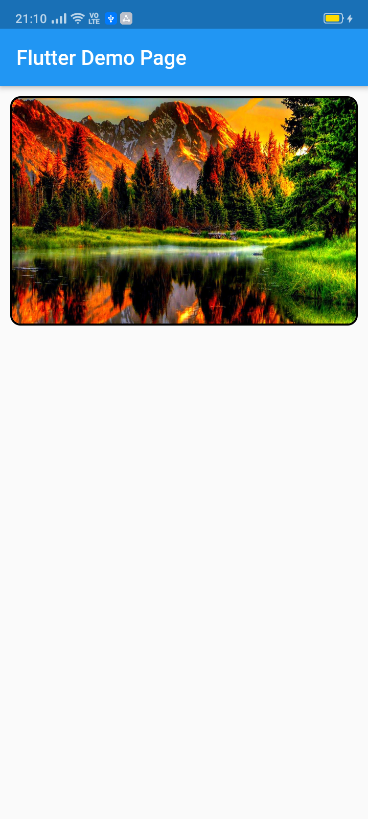
This pub lets you make a widget slider (automatic/manual sliding) with full customization. Mainly intended for image slider, this also accepts all other widgets.
Package selection guidance compiled from public package information, community data, and project usage.
The image_slider package enables the creation of customizable sliders in Flutter, supporting both automatic and manual sliding transitions. Designed primarily for displaying images, it also accommodates any widget type, offering flexibility in content presentation. With full customization options, developers can tailor the appearance and behavior of the slider to fit various design needs. It is ideal for showcasing galleries, product displays, or promotional content within apps. The package is open-source and maintained on GitHub, making it accessible for community contributions and modifications.
Use cases
Image galleries
Product carousels
Promotional banners
Dynamic content slides
Interactive UI elements
Key features
Automatic and manual sliding
Full widget customization
Support for any widget type
Open-source and community-driven
Easy integration via pub add
Suitable for
Mobile app developers
UI/UX designers
E-commerce applications
Content-rich applications
Custom carousel implementations
Considerations
Limited platform-specific optimizations
No built-in pagination indicators
Requires manual styling for advanced designs
Depends on external maintenance
May need additional dependencies for animations
Original README
Original README snapshot from the linked source repository. Visit the repository for the latest content.
image_slider
This pub lets you make a widget slider (automatic/manual sliding) with full customization. Mainly intended for image slider, this also accepts all other widgets.
ImageSlider(
/// Shows the tab indicating circles at the bottom
showTabIndicator: false,
/// Cutomize tab's colors
tabIndicatorColor: Colors.lightBlue,
/// Customize selected tab's colors
tabIndicatorSelectedColor: Color.fromARGB(255, 0, 0, 255),
/// Height of the indicators from the bottom
tabIndicatorHeight: 16,
/// Size of the tab indicator circles
tabIndicatorSize: 16,
/// tabController for walkthrough or other implementations
tabController: tabController,
/// Animation curves of sliding
curve: Curves.fastOutSlowIn,
/// Width of the slider
width: MediaQuery.of(context).size.width,
/// Height of the slider
height: 220,
/// If automatic sliding is required
autoSlide: false,
/// Time for automatic sliding
duration: newDuration(seconds: 6),
/// If manual sliding is required
allowManualSlide: true,
/// Children in slideView to slide
children: links.map((String link) {
returnnewClipRRect(
borderRadius: BorderRadius.circular(8.0),
child: Image.network(
link,
width: MediaQuery.of(context).size.width,
height: 220,
fit: BoxFit.fill,
));
}).toList(),
),
License
Copyright 2020 Jay Mehta

Licensed under the Apache License, Version 2.0 (the "License");
you may not use this file except in compliance with the License.
You may obtain a copy of the License at

    http://www.apache.org/licenses/LICENSE-2.0

Unless required by applicable law or agreed to in writing, software
distributed under the License is distributed on an "AS IS" BASIS,
WITHOUT WARRANTIES OR CONDITIONS OF ANY KIND, either express or implied.
See the License for the specific language governing permissions and
limitations under the License.
Getting Started
This project is a starting point for a Dart
package,
a library module containing code that can be shared easily across
multiple Flutter or Dart projects.
For help getting started with Flutter, view our
online documentation, which offers tutorials,
samples, guidance on mobile development, and a full API reference.
Example
As time based...
import'package:flutter/material.dart';
import'package:image_slider/image_slider.dart';
voidmain() {
runApp(MyApp());
}
classMyAppextendsStatelessWidget{
@overrideWidgetbuild(BuildContext context) {
returnMaterialApp(
title: 'Flutter Demo',
debugShowCheckedModeBanner: false,
theme: ThemeData(
primarySwatch: Colors.blue,
visualDensity: VisualDensity.adaptivePlatformDensity,
),
home: MyHomePage(title: 'Flutter Image Slider Demo Page'),
);
}
}
classMyHomePageextendsStatefulWidget{
MyHomePage({Key key, this.title}) : super(key: key);
finalString title;
@override_MyHomePageStatecreateState() => _MyHomePageState();
}
class_MyHomePageStateextendsState<MyHomePage>
withSingleTickerProviderStateMixin{
/// This pub allows you to make image_slider widget and also multiple other useful widgets like walkthrough etc.@overridevoidinitState() {
super.initState();
tabController = TabController(length: 3, vsync: this);
}
TabController tabController;
staticList<String> links = [
"https://i.pinimg.com/originals/cc/18/8c/cc188c604e58cffd36e1d183c7198d21.jpg",
"https://www.kyoceradocumentsolutions.be/blog/wp-content/uploads/2019/03/iStock-881331810.jpg",
"https://resources.matcha-jp.com/resize/720x2000/2020/04/23-101958.jpeg"
];
@overrideWidgetbuild(BuildContext context) {
returnScaffold(
appBar: AppBar(
title: Text(widget.title),
),
body: Column(
children: [
Container(
margin: EdgeInsets.all(10),
decoration: BoxDecoration(
borderRadius: BorderRadius.circular(10),
border: Border.all(width: 2)),
child: ImageSlider(
/// Shows the tab indicating circles at the bottom
showTabIndicator: false,
/// Cutomize tab's colors
tabIndicatorColor: Colors.lightBlue,
/// Customize selected tab's colors
tabIndicatorSelectedColor: Color.fromARGB(255, 0, 0, 255),
/// Height of the indicators from the bottom
tabIndicatorHeight: 16,
/// Size of the tab indicator circles
tabIndicatorSize: 16,
/// tabController for walkthrough or other implementations
tabController: tabController,
/// Animation curves of sliding
curve: Curves.fastOutSlowIn,
/// Width of the slider
width: MediaQuery.of(context).size.width,
/// Height of the slider
height: 220,
/// If automatic sliding is required
autoSlide: false,
/// Time for automatic sliding
duration: newDuration(seconds: 6),
/// If manual sliding is required
allowManualSlide: true,
/// Children in slideView to slide
children: links.map((String link) {
returnnewClipRRect(
borderRadius: BorderRadius.circular(8.0),
child: Image.network(
link,
width: MediaQuery.of(context).size.width,
height: 220,
fit: BoxFit.fill,
));
}).toList(),
),
),
Row(
mainAxisAlignment: MainAxisAlignment.spaceEvenly,
children: [
tabController.index == 0
? Container(
width: 0,
height: 0,
)
: RaisedButton(
onPressed: () {
tabController.animateTo(tabController.index - 1);
setState(() {});
},
child: Text("Previous"),
),
tabController.index == 2
? Container(
width: 0,
height: 0,
)
: RaisedButton(
onPressed: () {
tabController.animateTo(2);
setState(() {});
},
child: Text("Skip"),
),
tabController.index == 2
? Container(
width: 0,
height: 0,
)
: RaisedButton(
onPressed: () {
tabController.animateTo(tabController.index + 1);
setState(() {});
},
child: Text("Next"),
),
],
)
],
));
}
}