Search packages, repositories and app categories

info_popup cover
Package detailsv4.3.2

info_popup

The simple way to show the user some information on your selected widget.

AndroidiOSWebmacOSWindowsLinux
30-day downloads
46.2K
Likes
165
Pub points
150

Install package

flutter pub add info_popup

Package Overview

Package selection guidance compiled from public package information, community data, and project usage.

InfoPopup is a lightweight Flutter package that enables developers to easily display informative popups on any widget with minimal setup. It provides a clean, customizable way to show contextual information to users, enhancing UX by offering tooltips or guidance directly on UI elements. The package supports multiple platforms including Android, iOS, Web, macOS, Windows, and Linux, ensuring consistent behavior across devices. With simple integration via a single command, it's ideal for adding subtle yet effective user feedback mechanisms.

Use cases

  • Displaying tooltips on buttons
  • Providing context-sensitive help
  • Enhancing form field guidance
  • Improving onboarding experiences
  • Adding interactive hints
  • Showing status explanations

Key features

  • Simple one-line integration
  • Customizable popup content
  • Cross-platform compatibility
  • Supports various widget targets
  • Configurable positioning
  • Lightweight and fast

Suitable for

  • UI/UX designers seeking quick feedback tools
  • Developers building educational apps
  • Teams focusing on accessibility
  • Apps requiring intuitive user guidance
  • Projects with tight development timelines

Considerations

  • Limited to basic popup styling
  • No built-in animation customization
  • Best suited for small text content
  • May require manual positioning adjustments
  • Not ideal for complex modal interactions

Original README

Original README snapshot from the linked source repository. Visit the repository for the latest content.

Introduction

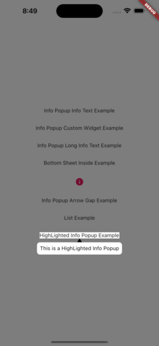
The info_popup package allows you to easily show a simple, customizable popup on your wrapped widget. The highlight feature, which can be activated at will, helps draw the user's attention to the desired location.

You can test it now on the Info Popup preview page. Note that the website experience may be different.

Features

  • Display a customizable popup on your wrapped widget
  • Activate the highlight feature to draw the user's attention to the desired location
  • Fully customize the content of the popup
  • Add margins to the popup from any side

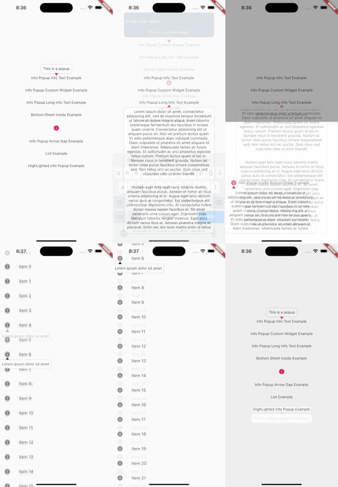
MainPresentation HighlightExample

Getting Started

To use this package, add info_popup as a dependency in your pubspec.yaml file.

dependencies:
  info_popup: ^3.0.0

Alternatively, you can add it to your project by running the following commands in your terminal:

with Dart:

$ dart pub add info_popup

with Flutter:

$ flutter pub add info_popup

Usage

To show a popup, wrap the widget that you want to display the popup on with the InfoPopupWidget widget. All you have to do is wrap it in the widget you want to show information with the InfoPopupWidget widget. With the InfoPopupController, you can customize it as you wish, and turn it on and off.

import 'package:info_popup/info_popup.dart';
	InfoPopupWidget(
		contentTitle: 'Info Popup Details',
		child: Icon(
			Icons.info,
			color: Colors.pink,
		),
	),

Example

This is a normal info text displayed using the InfoPopupWidget widget with several optional parameters.

              InfoPopupWidget(
                contentTitle: 'Info Popup Details',
                arrowTheme: InfoPopupArrowTheme(
                  color: Colors.pink,
                  arrowDirection: ArrowDirection.up,
                ),
                contentTheme: InfoPopupContentTheme(
                  infoContainerBackgroundColor: Colors.black,
                  infoTextStyle: TextStyle(color: Colors.white),
                  contentPadding: const EdgeInsets.all(8),
                  contentBorderRadius: BorderRadius.all(Radius.circular(10)),
                  infoTextAlign: TextAlign.center,
                ),
                dismissTriggerBehavior: PopupDismissTriggerBehavior.onTapArea,
                areaBackgroundColor: Colors.transparent,
                indicatorOffset: Offset.zero,
                contentOffset: Offset.zero,
                onControllerCreated: (controller) {
                  print('Info Popup Controller Created');
                },
                onAreaPressed: (InfoPopupController controller) {
                  print('Area Pressed');
                },
                infoPopupDismissed: () {
                  print('Info Popup Dismissed');
                },
                onLayoutMounted: (Size size) {
                  print('Info Popup Layout Mounted');
                },
                child: Icon(
                  Icons.info,
                  color: Colors.pink,
                ),
              ),

"This is a custom popup example created using the InfoPopupWidget widget.

Custom Popup Widget
              InfoPopupWidget(
                customContent: Container(
                  decoration: BoxDecoration(
                    color: Colors.blueGrey,
                    borderRadius: BorderRadius.circular(10),
                  ),
                  padding: const EdgeInsets.all(10),
                  child: Column(
                    children: const <Widget>[
                      TextField(
                        decoration: InputDecoration(
                          hintText: 'Enter your name',
                          hintStyle: TextStyle(color: Colors.white),
                          enabledBorder: OutlineInputBorder(
                            borderSide: BorderSide(color: Colors.white),
                          ),
                        ),
                      ),
                      SizedBox(height: 10),
                      Center(
                        child: Text(
                          'Example of Info Popup inside a Bottom Sheet',
                          style: TextStyle(
                            color: Colors.white,
                          ),
                        ),
                      ),
                    ],
                  ),
                ),
                arrowTheme: const InfoPopupArrowTheme(
                  color: Colors.pink,
                  arrowDirection: ArrowDirection.up,
                ),
                dismissTriggerBehavior: PopupDismissTriggerBehavior.onTapArea,
                areaBackgroundColor: Colors.transparent,
                indicatorOffset: Offset.zero,
                contentOffset: Offset.zero,
                onControllerCreated: (controller) {
                  print('Info Popup Controller Created');
                },
                onAreaPressed: (InfoPopupController controller) {
                  print('Area Pressed');
                },
                infoPopupDismissed: () {
                  print('Info Popup Dismissed');
                },
                onLayoutMounted: (Size size) {
                  print('Info Popup Layout Mounted');
                },
                child: Icon(
                  Icons.info,
                  color: Colors.pink,
                ),
              ),

Conclusion

The info_popup package provides a simple and effective way to show a customizable popup on your wrapped widget. With the highlight feature, you can draw the user's attention to the desired location.

License

This project is licensed under the MIT License - see the LICENSE file for details.

Categories

Source repository

Projects using this package

No data available yet.