
Overview
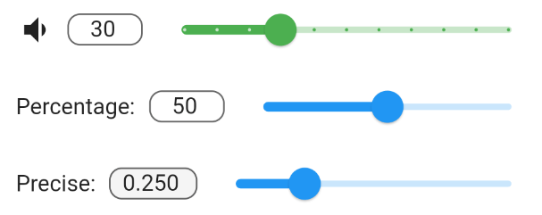
The input_slider package provides a synchronized input component that links a Slider and a TextField, ensuring both remain in sync as users interact with either. It is highly customizable, allowing developers to adjust appearance, range, step size, and formatting. Ideal for forms requiring precise numeric input with visual feedback, it supports all major platforms including mobile, web, and desktop. The package simplifies the creation of intuitive number inputs without manual synchronization logic.
Use cases
- Form inputs requiring precise numeric values
- Interactive settings with visual sliders
- Synchronized numeric entry across UI elements
- Customizable input fields for dashboards
- Real-time value adjustments in applications
- Cross-platform numeric input components
Key features
- Bidirectional sync between Slider and TextField
- Customizable range and step values
- Supports decimal and integer input
- Platform-agnostic design
- Extensible styling options
- Built-in validation and formatting
Suitable for
- Developers building interactive forms
- Designers needing responsive numeric inputs
- Apps requiring consistent user input handling
- Cross-platform Flutter applications
- UI components with real-time feedback
Considerations
- Requires careful handling of decimal precision
- May need additional validation for edge cases
- Not ideal for non-numeric data types
- Limited to numeric input use cases
- Potential performance impact with frequent updates
- Depends on external dependencies for full functionality