Search packages, repositories and app categories

Package detailsv2.0.1

intervalprogressbar

A interval progress bar for Flutter. Horizontal, vertical, colorful and interval progress.

30-day downloads
35
Likes
15
Pub points
40

Install package

flutter pub add intervalprogressbar

Package Overview

Package selection guidance compiled from public package information, community data, and project usage.

A Flutter package that provides a customizable interval progress bar, supporting both horizontal and vertical orientations. It features vibrant colors and the ability to display multiple progress intervals, making it ideal for visualizing segmented progress or time-based tasks. The progress bar is designed to be intuitive and visually engaging, suitable for applications requiring dynamic progress feedback. It integrates seamlessly with Flutter's widget system and is easy to implement with minimal configuration.

Use cases

  • Visualizing segmented progress in apps
  • Displaying time-based intervals
  • Enhancing user feedback in loading screens
  • Creating animated progress indicators
  • Showing multi-stage task completion

Key features

  • Horizontal and vertical orientation support
  • Colorful and customizable appearance
  • Support for multiple progress intervals
  • Simple integration with Flutter
  • Smooth animation transitions

Suitable for

  • Developers building task tracking apps
  • Designers seeking engaging UI elements
  • Apps requiring time-based progress visualization
  • Projects with multi-step processes

Considerations

  • Limited platform-specific customization
  • No built-in support for accessibility features
  • May require additional styling for complex layouts
  • Not optimized for very high-frequency updates

Original README

Original README snapshot from the linked source repository. Visit the repository for the latest content.

IntervalProgressBar

Package

An interval progress widget for Flutter.

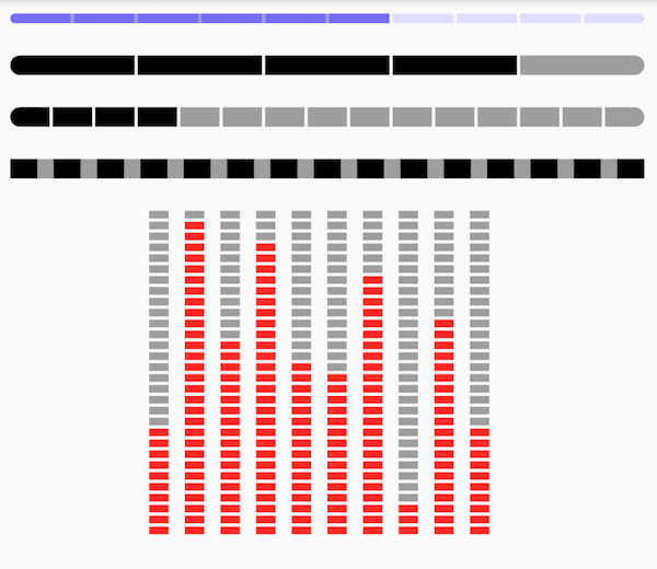
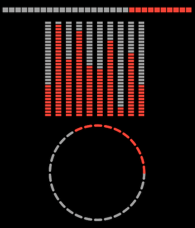
Preview

v1 v2
demo demo v2.0.1

Depend on it

https://pub.dev/packages/intervalprogressbar

Add this to your package's pubspec.yaml file:

dependencies:
  intervalprogressbar: ^{last_version}

Features

  • Horizontal
  • Vertical
  • Circle
  • Interval Progress
  • Colorful

Getting Started

Usage
Widget buildHorizontal() => IntervalProgressBar(
    direction: IntervalProgressDirection.horizontal,
    max: 30,
    progress: 10,
    intervalSize: 2,
    size: Size(400, 10),
    highlightColor: Colors.red,
    defaultColor: Colors.grey,
    intervalColor: Colors.transparent,
    intervalHighlightColor: Colors.transparent,
    reverse: true,
    radius: 0);
Widget buildVertical() => Row(
    mainAxisAlignment: MainAxisAlignment.center,
    children: [10, 29, 18, 27, 16, 15, 24, 3, 20, 10].map<Widget>((i) {
      return Padding(
          padding: EdgeInsets.only(right: 10),
          child: IntervalProgressBar(
              direction: IntervalProgressDirection.vertical,
              max: 30,
              progress: i,
              intervalSize: 2,
              size: Size(12, 200),
              highlightColor: Colors.red,
              defaultColor: Colors.grey,
              intervalColor: Colors.transparent,
              intervalHighlightColor: Colors.transparent,
              reverse: true,
              radius: 0));
    }).toList());
Widget buildCircle() => IntervalProgressBar(
      direction: IntervalProgressDirection.circle,
      max: 30,
      progress: 10,
      intervalSize: 2,
      size: Size(200, 200),
      highlightColor: Colors.red,
      defaultColor: Colors.grey,
      intervalColor: Colors.transparent,
      intervalHighlightColor: Colors.transparent,
      reverse: true,
      radius: 0,
      intervalDegrees: 5,
      strokeWith: 5,
    );
Property
Property type note
direction enum ProgressBar's direction, support vertical and horizontal
max int count of default blocks
progress int count of highlight blocks
intervalSize int size of interval blocks. when vertical direction, means height, when horizontal direction, means width
size Size size of this widget
highlightColor Color color of highlight blocks
defaultColor Color color of default blocks
intervalColor Color color of default intervals
intervalHighlightColor Color color of intervals which between highlight blocks
reverse bool
radius int
intervalDegrees double support for circle progress
strokeWith int support for circle progress

Categories

Dependencies

Dependency list 1 items

  • pedantic^1.5.0

Source repository

Projects using this package

No data available yet.