Package selection guidance compiled from public package information, community data, and project usage.
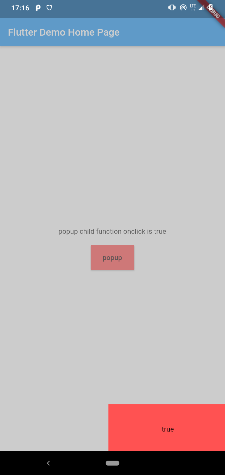
kumi_popup_window is a lightweight, customizable popup window package for Flutter. It provides a clean, minimal interface without predefined templates, allowing developers to fully design the content and appearance of popups. Ideal for creating simple, tailored overlays such as alerts, forms, or custom dialogs. The package supports all major platforms including Android, iOS, Web, macOS, Windows, and Linux, making it versatile for cross-platform applications. Its simplicity and flexibility make it easy to integrate into existing projects.
Use cases
Custom alert dialogs
Form overlays
Notification popups
User guidance tooltips
Modal content displays
Key features
Fully customizable content
No preset templates
Cross-platform support
Simple API
Lightweight
Easy integration
Suitable for
Developers needing flexible popups
Projects with unique UI requirements
Minimalist designs
Cross-platform apps
Quick dialog implementation
Considerations
Requires manual styling
No built-in animations
Limited pre-designed layouts
Not ideal for complex modals
Depends on developer for UX details
Original README
Original README snapshot from the linked source repository. Visit the repository for the latest content.
Method for customizing the content of the popup window. The returned widget will be used as the content of the popup window
null,(require)
gravity
Relative position of the pop-up window.
KumiPopupGravity.center
curve
Animation interpolator
Curves.decelerate
customAnimation
Custom popupWindow animation
false
customPop
Customize the position and animation of popupWindow
false
customPage
Customize the entire page, including Scaffold
false
bgColor
The color of the mask layer
Colors.black.withOpacity(0.5)
targetRenderBox
RenderBox of the target widget
null
underStatusBar
When the top pops up, is it below the statusBar
false
underAppBar
When the top pops up, is it below the AppBar
false
clickOutDismiss
Click outside the pop-up window to dismiss
true
clickBackDismiss
Click the physical back button to dismiss
true
offsetX
Offset at horizontal axis edge
0.0
offsetY
Offset at vertical axis edge
0.0
duration
Duration of the animation
Duration(milliseconds: 300)
needSafeDisplay
Do you need to display pop ups safely
false
onShowStart
When the popupWindow show animation start
null
onShowEnd
When the popupWindow show animation finish
null
onDismissStart
When the popupWindow dismiss animation start
null
onDismissEnd
When the popupWindow dismiss animation finish
null
onClickOut
Click on the listener outside the popup
null
onClickBack
Listening on clicking the physical back button
null
property/method
description
child
Popup window widget,Get its size and position by GlobalKey
isShow
Is the current pop-up displayed
controller
Animation Controller
show()
popup window show
dismiss()
popup window dismiss
About
QQ:876625596
Email:876625596@qq.com
Github:https://github.com/q876625596
License
MIT License
Copyright (c) 2020 q876625596
Permission is hereby granted, free of charge, to any person obtaining a copy
of this software and associated documentation files (the "Software"), to deal
in the Software without restriction, including without limitation the rights
to use, copy, modify, merge, publish, distribute, sublicense, and/or sell
copies of the Software, and to permit persons to whom the Software is
furnished to do so, subject to the following conditions:
The above copyright notice and this permission notice shall be included in all
copies or substantial portions of the Software.
THE SOFTWARE IS PROVIDED "AS IS", WITHOUT WARRANTY OF ANY KIND, EXPRESS OR
IMPLIED, INCLUDING BUT NOT LIMITED TO THE WARRANTIES OF MERCHANTABILITY,
FITNESS FOR A PARTICULAR PURPOSE AND NONINFRINGEMENT. IN NO EVENT SHALL THE
AUTHORS OR COPYRIGHT HOLDERS BE LIABLE FOR ANY CLAIM, DAMAGES OR OTHER
LIABILITY, WHETHER IN AN ACTION OF CONTRACT, TORT OR OTHERWISE, ARISING FROM,
OUT OF OR IN CONNECTION WITH THE SOFTWARE OR THE USE OR OTHER DEALINGS IN THE
SOFTWARE.