Package selection guidance compiled from public package information, community data, and project usage.
Material Dialogs is a Flutter package designed to simplify the creation of animated, stylish, and customizable Material Design dialogs. It provides an easy-to-use API for building modern dialog interfaces that align with Material guidelines across all platforms. The package supports various dialog types, including alert, confirmation, and custom dialogs, with smooth animations and responsive layouts. Ideal for enhancing user interaction with visually appealing pop-ups in apps targeting Android, iOS, Web, macOS, Windows, and Linux.
Use cases
Displaying alerts and confirmations
Creating custom modal dialogs
Enhancing user feedback with animations
Implementing onboarding or tutorial prompts
Adding interactive bottom sheets
Improving UI consistency with Material Design
Key features
Animated transitions
Customizable themes
Cross-platform support
Simple API
Built-in dialog types
Responsive design
Suitable for
Developers seeking quick dialog implementation
Apps requiring consistent Material Design
Projects targeting multiple platforms
UI-focused applications
Teams prioritizing developer experience
Prototyping and rapid development
Considerations
Limited to Material Design aesthetics
May require additional styling for non-Material themes
Depends on Flutter's Material library
Not suitable for complex custom modals
Best used with Flutter's default theme system
Requires understanding of Flutter's widget tree
Original README
Original README snapshot from the linked source repository. Visit the repository for the latest content.
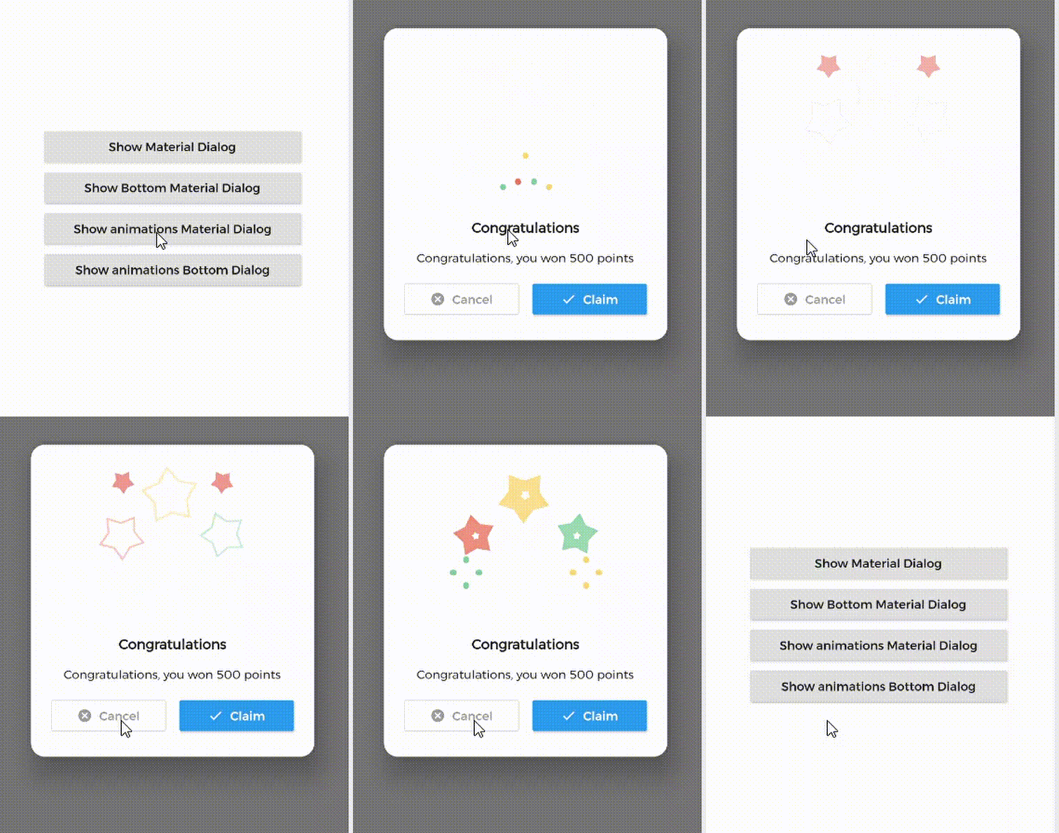
MaterialDialog This Plugin will be useful to create simple, animated, and beautiful dialogs in your next Flutter app.
This library implements Airbnb's Lottie library to render After Effects animation in app.
Types of Dialog
MaterialDialog library provides two types of dialog i.e.
1. Material Dialog
2. Bottom Sheet Material Dialog
A normal material dialog which can have one or two buttons.
A Bottom Sheet material dialog which can have one or two buttons, is showed from bottom of device.
Implementation
Implementation of Material Dialog library is so easy. You can check /example directory for demo. Let's have look talk in details about it.
IconsOutlineButton and IconsButton are both buttons widgets provided by the plugin to make things easier for you read more, you can use any other buttons if you want.
ii. Bottom Sheet Material Dialog
Dialogs class will be used to create your dialog, use bottomMaterialDialog. Below is an example to show your dialog in the app.
it's better to make your animation to have the same background color as your dialog's background color, please use lottie editor to remove the background layer of your animation or make it same as your dialog background color before using it in the plugin.
Contribute
Let's develop with collaborations. We would love to have contributions by raising issues and opening PRs. Filing an issue before PR is must.
Credits
This library is built using following open-source libraries.