Package selection guidance compiled from public package information, community data, and project usage.
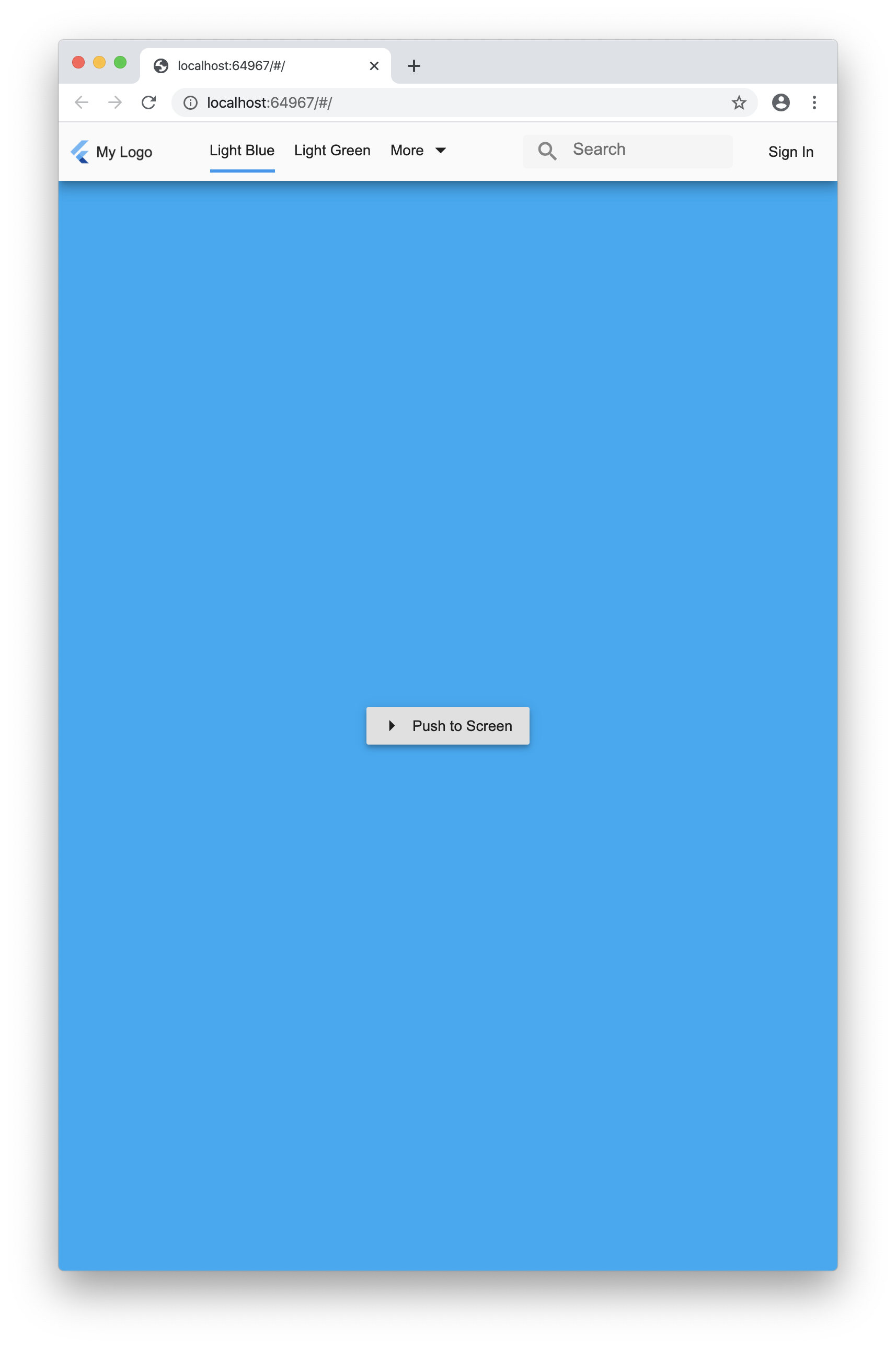
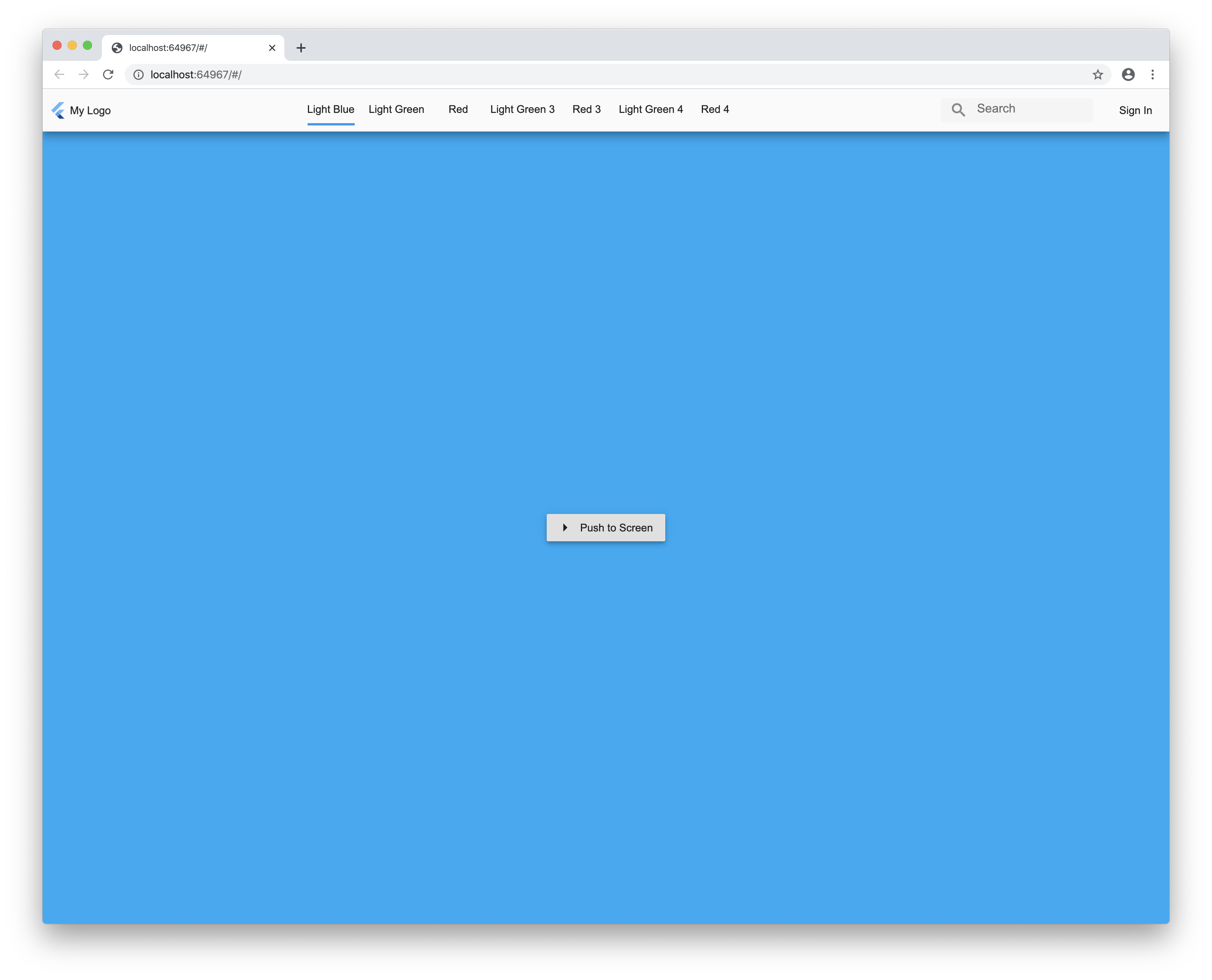
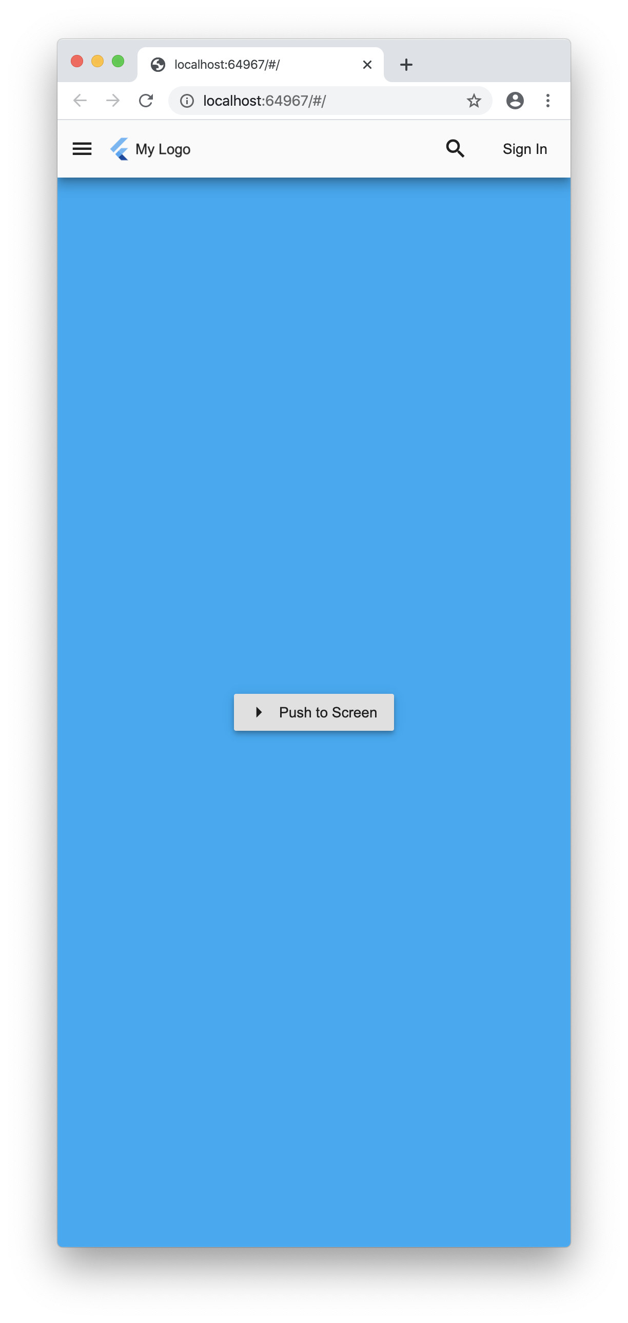
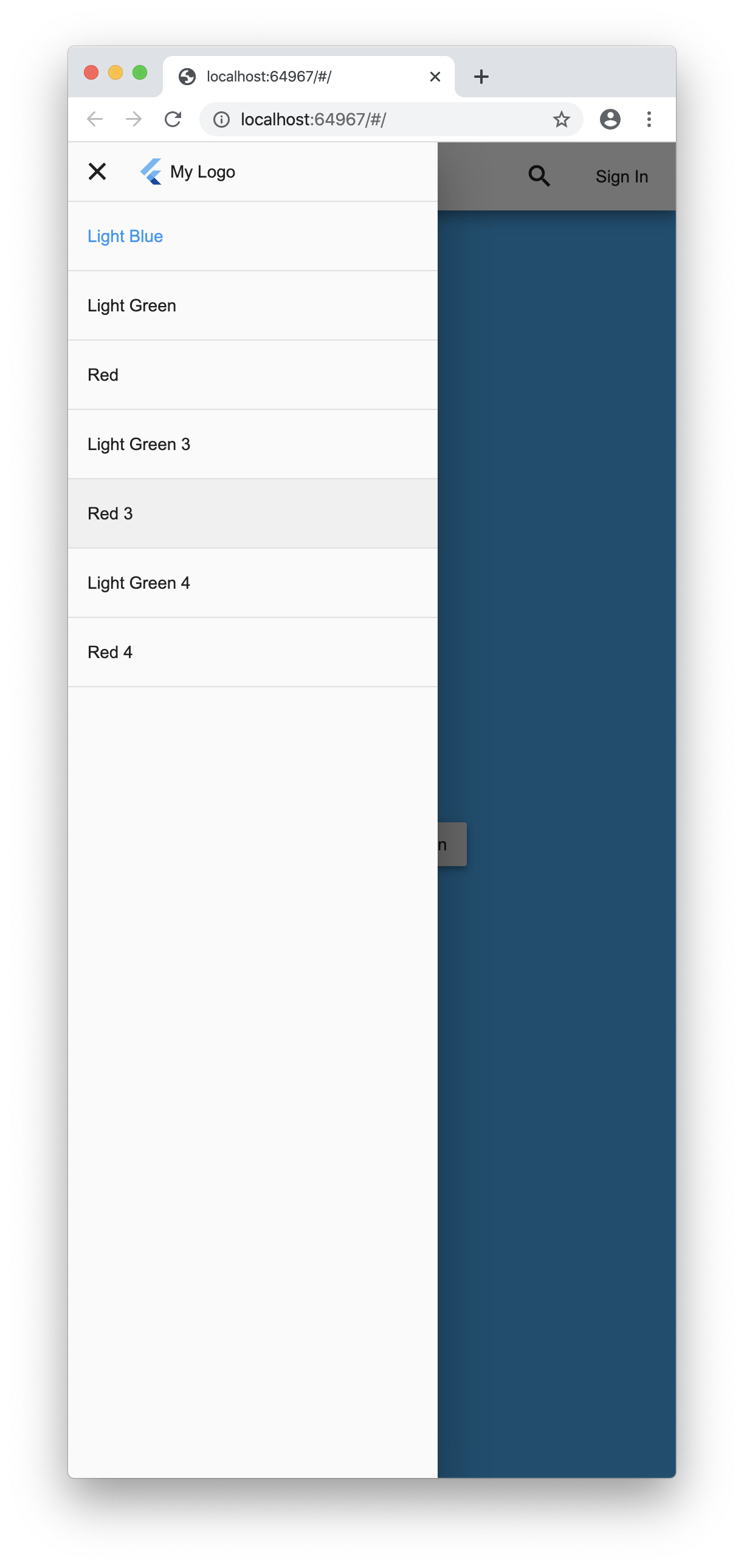
A responsive sidebar for Flutter that adheres to Material Design guidelines. It dynamically adjusts layout based on screen size, providing an optimal navigation experience across devices. Ideal for apps requiring consistent and accessible navigation, it supports both mobile and desktop layouts with smooth transitions. The package simplifies implementation of collapsible sidebars without sacrificing design fidelity or usability.
Use cases
Mobile and desktop app navigation
Responsive UI with adaptive layouts
Consistent drawer experiences across devices
Integrating Material Design navigation patterns
Building admin dashboards with sidebar menus
Key features
Material Design compliant
Auto-adapts to screen size
Collapsible and expandable states
Smooth transition animations
Easy integration with existing Flutter apps
Suitable for
Developers building responsive Flutter apps
Teams prioritizing Material Design consistency
Projects needing adaptable navigation structures
Apps targeting multiple device form factors
Considerations
Limited customization beyond Material Design
No built-in support for RTL layouts
Requires manual handling of state management
Not optimized for complex nested navigation
Original README
Original README snapshot from the linked source repository. Visit the repository for the latest content.
mobile_sidebar
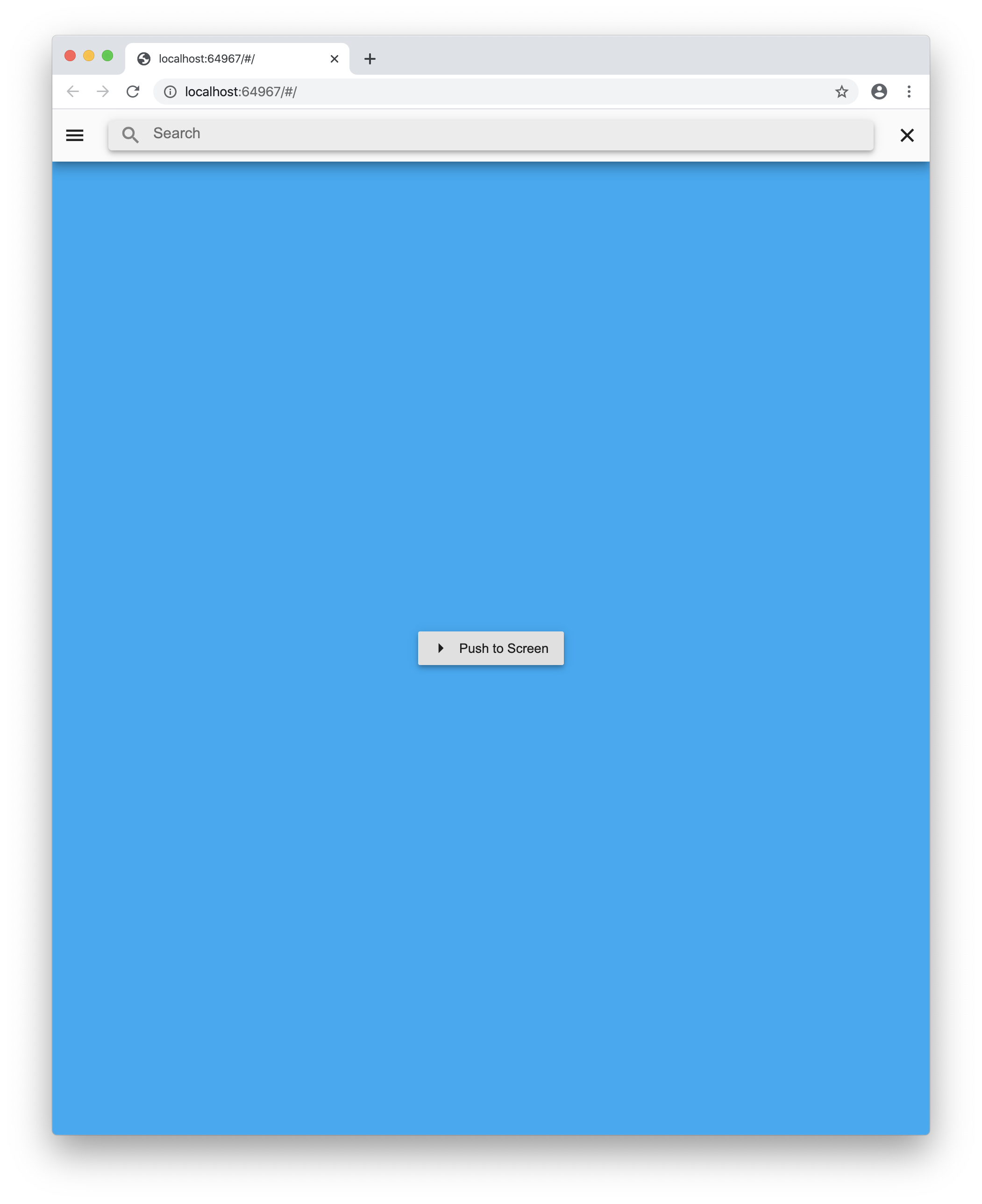
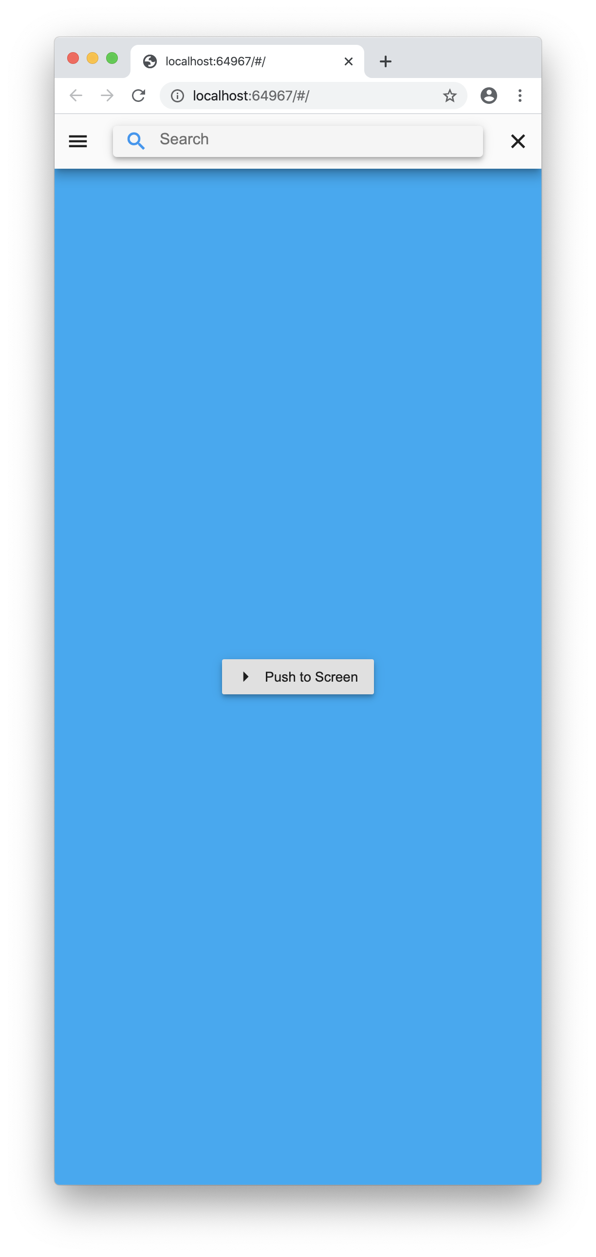
A Flutter plugin to show a sidebar on tablet and desktop then a list or gridview on mobile.