Package selection guidance compiled from public package information, community data, and project usage.
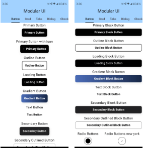
Modular UI is a Flutter package offering pre-built, aesthetically pleasing widgets inspired by Material Tailwind and shadcn/ui. Designed for rapid development, it provides a consistent, modern design system with customizable components that align with current UI trends. The package supports multiple platforms including Android, iOS, Web, macOS, Windows, and Linux, making it ideal for cross-platform applications. With clean, semantic code and intuitive APIs, Modular UI helps developers create polished interfaces without starting from scratch.
Use cases
Rapid prototyping
Cross-platform app development
Modern UI design
Component-based UI building
Design system implementation
Key features
Pre-built beautiful widgets
Inspired by Material Tailwind & shadcn/ui
Cross-platform support
Customizable components
Semantic and clean API
Suitable for
Frontend developers
UI/UX designers
Startups building MVPs
Teams using design systems
Developers seeking fast UI delivery
Considerations
Requires familiarity with Flutter widget structure
Limited customization beyond provided themes
Depends on external design inspiration
May need additional styling for unique branding
Best suited for modern, minimalist designs
Original README
Original README snapshot from the linked source repository. Visit the repository for the latest content.
Craft beautiful, accessible, and responsive Flutter UIs with a Modular-UI Design-inspired component library
  MUIPrimaryCard(
          title: 'UI/UX Review Check',
          description:
              'The place is close to Barceloneta Beach and bus stop just 2 min by walk and near to "Naviglio" where you can enjoy the main night life in Barcelona',
          image: Image.network(
            'https://images.unsplash.com/photo-1540553016722-983e48a2cd10?ixlib=rb-1.2.1&ixid=MnwxMjA3fDB8MHxwaG90by1wYWdlfHx8fGVufDB8fHx8&auto=format&fit=crop&w=800&q=80',
            fit: BoxFit.cover,
          ),
          buttons: [
            MUIPrimaryButton(
              text: 'Read More',
              onPressed: () {},
            ),
          ],
        ),
For more code samples, you can head on to our documentaion at . https://modularui.site
Features
Comprehensive Modular-UI Design components: Build modern and feature-rich interfaces with a wide range of buttons, cards, forms, navigation elements, and more.
Highly customizable: Tailor components to your exact needs with extensive styling options.
Responsive design: Ensure optimal UI experiences across different screen sizes.
Accessibility focus: Built with accessibility in mind, adhering to best practices.
Lightweight and performant: Efficiently crafted for smooth user interactions.
Additional Features
Custom themes and color palettes: Define your own visual style for a cohesive look.
Dark mode support: Seamlessly adapt your UI to user preferences.
Contributing
Calling on all the trendsetting Flutter enthusiasts! ❤️🔥 Join forces as we pioneer the creation of the ultimate, expansive, and seamless UI Library for Flutter. Let's make waves together! 🚀
Please refer to our contribution guidelines for details and don't forget to drop a Hi at discord