Package selection guidance compiled from public package information, community data, and project usage.
MorphableShape is a Flutter package that enables the creation of responsive, dynamic shapes capable of smoothly transitioning between different forms. Designed for interactive and animated UIs, it allows developers to define custom paths and animate their morphing in real time across multiple platforms. Ideal for visual effects, loading indicators, or creative interfaces, it simplifies complex path animations with intuitive APIs. The package supports all major Flutter platforms, ensuring consistent behavior from mobile to desktop and web.
Use cases
Animated UI elements
Interactive shape transitions
Loading animations
Creative interface design
Responsive shape components
Key features
Smooth morphing between shapes
Responsive design support
Cross-platform compatibility
Custom path definitions
Real-time animation control
Suitable for
UI/UX designers seeking dynamic visuals
Developers building interactive apps
Projects requiring fluid shape animations
Prototyping experimental interfaces
Apps with emphasis on visual storytelling
Considerations
Performance impact with complex paths
Requires careful path definition for smooth transitions
May need optimization for low-end devices
Limited documentation beyond basic examples
Best suited for moderate complexity animations
Original README
Original README snapshot from the linked source repository. Visit the repository for the latest content.
morphable_shape
A Flutter package for creating various shapes that are responsive
and can morph between each other.
Notice: This class uses the dimension package but only the px and percent units are respected since ShapeBorder has no access to the build context and the screen size.
Getting Started
First, you need to create a ShapeBorder instance. The responsive feature means that
you can have a single ShapeBorder instance that adapts to different sizes without you calculating the desired dimensions. For example, the following
code will give you a rounded rectangle border with a 60 px circular radius at the top left corner and a (60 px, 10%) elliptical corner at the bottom right corner.
(for more information of how to use the Length class, see dimension).
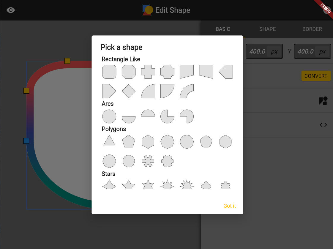
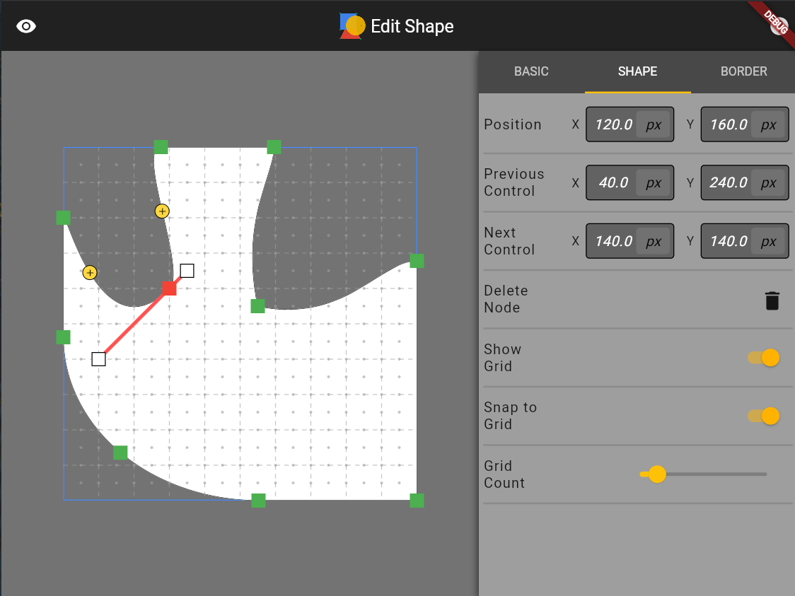
You can run the example app to create a local shape editing tool to see the various shapes supported by this package (also hosted online at https://fluttershape.com/).
DynamicBorderSide
The DynamicBorderSide is an extension to the built-in BorderSide class. It supports gradient filling in addtion to single color filling. It also supports painting partially by specifing the begin, end and offset parameters (e.g. paint only the first half of the border side). You can change the strokeJoin and strokeCap paramter as well.
This class is used to configure how the borders are painted with different shapes.
The most powerful and commonly used one should be the RectangleShapeBorder class. It allows to you configure each corner of the rectangle individually or at once.
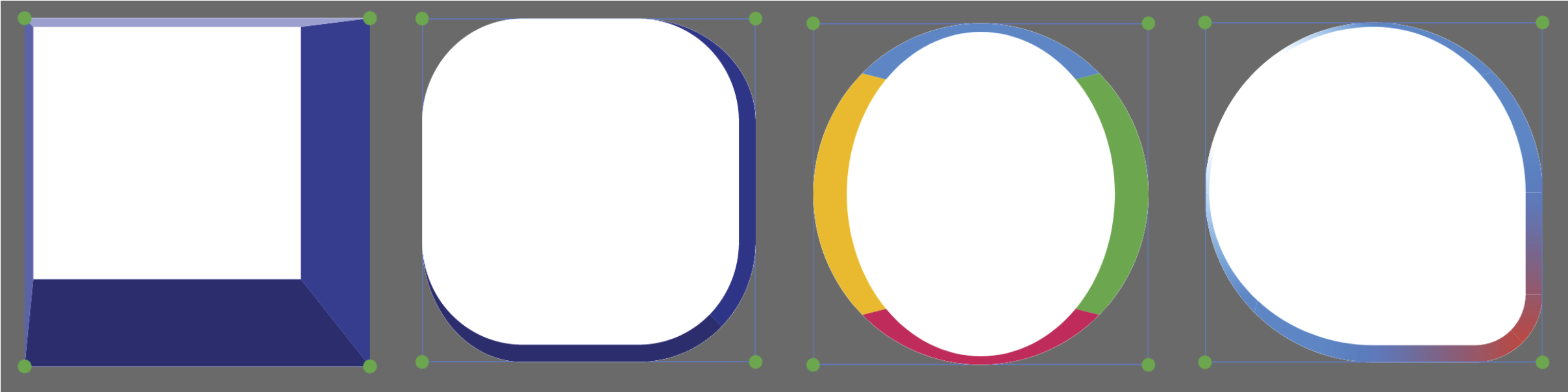
It also automatically scales all sides so that they don’t overlap (just like what CSS does). The RectangleShapeBorder supports four different corner styles:
You can make a triangle, a diamond, a trapezoid, or even an arrow shape by just using the RectangleShapeBorder class and providing the right corner style and border radius.
CircleShapeBorder
CircleShapeBorder gives you a circle. Simple as that.
RoundedRectangleShapeBorder
If you use the RoundedRectangleShapeBorder class, then the four border sides can be configured individually. The four border sides can be styled independently or at once, similar to what CSS offers:
Below are some border designs using this class. This class is very similar to what CSS
offers and is a combination of the BoxBorder and RoundedRectangleBorder class that Flutter
offers.
PolygonShapeBorder
PolygonShapeBorder supports changing the number of sides as well as corner radius and corner style:
These shape borders are also supported and responsive. Check out their constructors to see how to make them.
PathShapeBorder
Accepts a DynamicPath instance to draw a custom path border. Right now only straight line and cubic Bezier curves are supported. Arcs need to be translated to cubic Beziers first. In the future I may let this class accept close SVG path as well.
Shape Morphing
Every shape in this package can be morphed into one another, including the border side(s). Hence the name of this package. To morph between two shapes you first need to create a ShapeBorderTween:
The MorphMethod.weighted tries to use as little control
points as possible to do the morphing and takes into account the length of each side of a shape. The MorphMethod.unweighted uses more points
but do not utilize the length information. The MorphMethod.auto will choose either
one of the two methods based on some geometric criteria to make the morphing
process to look more natural. The auto method generally works well, but you can
try other ones if the morphing looks weird.
Shapes with the same geometry can be morphed faster and in a more consistent way. For example, rectangles and rounded rectangles, or polygons with the same number of sides. For other shapes, the morphing takes more time and may not look great especially for two very distinct shapes.
Shape Serialization
Every shape in this package supports serialization. If you have designed some shape you like, just call toJson() on it. Then you can reuse it by writting.
As I mentioned before, the example app in this package is a shape editing tool for
you to quickly design the shape you want and generate the corresponding code. Below are
some screenshots of the interfaces of this tool. I put about equal amount of effort
into developing this tool compared to developing this package so I strongly recommend you
to check it out. You can either build it locally or visit:
https://fluttershape.com/.