Search packages, repositories and app categories

nice_intro cover
Package detailsv0.2.1

nice_intro

Get your users to know your app with ease! This package will help you build beautiful intro sides for your app.

30-day downloads
45
Likes
93
Pub points
60

Install package

flutter pub add nice_intro

Package Overview

Package selection guidance compiled from public package information, community data, and project usage.

Nice Intro is a Flutter package designed to simplify the creation of visually appealing onboarding screens for mobile applications. It enables developers to build smooth, customizable intro slides that help users quickly understand and engage with the app’s features. With intuitive configuration and a clean API, it supports animations, content placement, and transitions tailored for first-time user experiences. The package focuses on aesthetics and usability, making onboarding both engaging and effective.

Use cases

  • Onboarding new users
  • App feature walkthroughs
  • First-time user experience
  • Product launch introductions
  • User engagement enhancement
  • Simplified tutorial flows

Key features

  • Customizable slide designs
  • Smooth animations
  • Easy integration with Flutter
  • Support for text, images, and icons
  • Responsive layout handling
  • Configurable navigation controls

Suitable for

  • Mobile app developers
  • UX designers
  • Startups launching apps
  • Apps requiring user education
  • Projects with onboarding needs

Considerations

  • Limited platform-specific customization
  • No built-in localization support
  • Requires manual handling of state management
  • Depends on external dependencies for advanced features
  • Not optimized for complex multi-step workflows

Original README

Original README snapshot from the linked source repository. Visit the repository for the latest content.

nice_intro

Get your users to know your app with ease

Getting Started

Onboarding is a great way to introduce your app to newcomers, to help them quickly adapt to the new conditions so that they can get the most out of your app

Pub Version Donate

A Flutter package to build awesome intro slides for your apps.

Demo

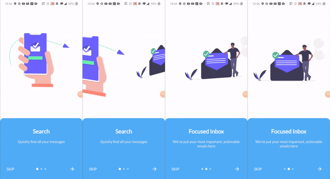
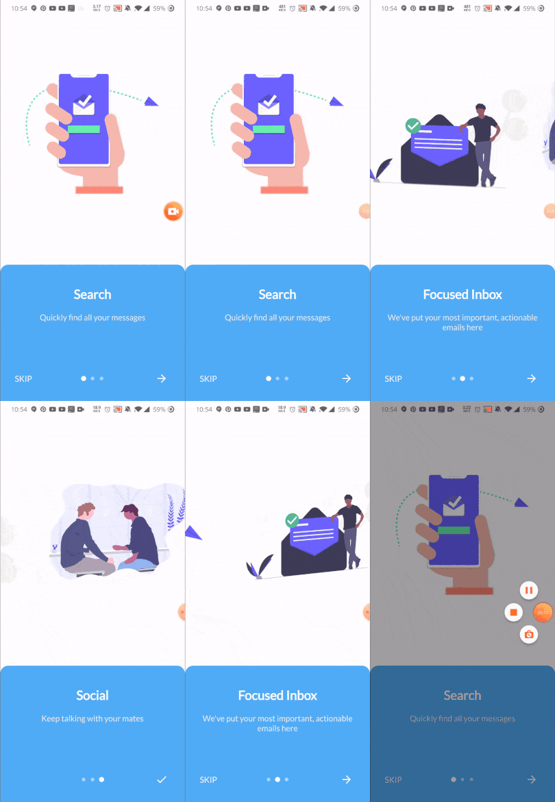
This is somehow what you can expect from this package :)

Package Demo package demo

Installation

Add the following to pubspec.yaml:

dependencies:
  nice_intro: ^0.2.0

Usage Example

First, import the following files

import 'package:nice_intro/intro_screen.dart';
import 'package:nice_intro/intro_screens.dart';

Then, create a list of screens each one with the IntroSreen class:

List<IntroScreen> pages =  [
        IntroScreen(
          title: 'Search',
          imageAsset: 'assets/img/1.png',
          description: 'Quickly find all your messages',
          headerBgColor: Colors.white,
        ),
        IntroScreen(
          title: 'Focused Inbox',
          headerBgColor: Colors.white,
          imageAsset: 'assets/img/2.png',
          description: "We've put your most important, actionable emails here",
        ),
        IntroScreen(
          title: 'Social',
          headerBgColor: Colors.white,
          imageAsset: 'assets/img/3.png',
          description: "Keep talking with your mates",
        ),
      ];

You'll come up with a list of nice slides screens.

Finally, pass the pages to an instance of IntroScreens class:

IntroScreens introScreens = IntroScreens(
      footerBgColor: TinyColor(Colors.blue).lighten().color,
      activeDotColor: Colors.white,
      footerRadius: 18.0,
      indicatorType: IndicatorType.CIRCLE,
      pages:pages

    return Scaffold(
      body: introScreens,
    );

And pass it to your scaffold widget.

Documentation
IntroScreen widget's properties
Name Type Default Description
title String required Set the title of your slide screen
description String required Set the description of your slide screen
header String Container() Set the widget to use as the header part of your screen
imageAsset String null Set the image path of your slide screen
textStyle TextStyle null Set the style of the title and description of your slide
headerBgColor Color Colors.white Set the background color of the slide
headerPadding EdgeInsets EdgeInsets.all(12) Set the padding of the header part of your slide screen
containerBg Color Colors.white Set the wrapper container's background color
IntroScreens widget's properties
Name Type Default Description
slides List<IntroScreen> required list of your slides
onDone Function required Set the action to do when the last slide is reached
onSkip Function required Set the action to do when the user skips the slides
footerRadius double 12.0 Set the radius of the footer part of your slides
footerBgColor Color Color(0xff51adf6) Set the background color of the footer part of your slides
footerGradients List<Color> [] Set the list of colors for the gradient of the footer part of your slides
footerPadding EdgeInsets EdgeInsets.all(24) Set the padding of the footer part of your slides
indicatorType IndicatorType IndicatorType.CIRCLE Set the type of indicator for your slides
activeDotColor Color Colors.white Set the color of the active indicator color
inactiveDotColor Color null Set the color of an inactive indicator color
skipText String "Skip" Set the text of the skip widget
nextWidget Widget Set the widget to use for next interaction of your slides
doneWidget Widget Set the widget to display when the last slide is reached
viewPortFraction double 1.0 Set the viewport fraction of your slides
textColor Color Colors.white Set the text color of the footer part of your slides
physics ScrollPhysics BouncingScrollPhysics Set the physics for the page view
IndicatorType enum properties
  • IndicatorType.CIRCLE
  • IndicatorType.LINE
  • IndicatorType.DIAMOND

Now enjoy!

Refer to example folder and the source code for more information.

Categories

Dependencies

Dependency list 1 items

Source repository

Projects using this package

No data available yet.