Search packages, repositories and app categories

not_static_icons cover
Package detailsv0.54.0

not_static_icons

Beautifully crafted animated icons for Flutter, crafted with Lucide — no Rive or Lottie required.

AndroidiOSWebmacOSWindowsLinux
30-day downloads
686
Likes
54
Pub points
160

Install package

flutter pub add not_static_icons

Package Overview

Package selection guidance compiled from public package information, community data, and project usage.

not_static_icons is a Flutter package that provides beautifully crafted animated icons using Lucide design principles, without requiring Rive or Lottie. It delivers smooth, lightweight animations directly through Flutter’s rendering engine, making it ideal for apps needing expressive yet performant iconography. The package supports multiple platforms and integrates seamlessly with existing Flutter projects. Each icon is designed for clarity and aesthetic appeal, enhancing user experience with subtle motion. Perfect for modern UIs where visual feedback matters.

Use cases

  • Enhancing app UI with animated icons
  • Adding subtle micro-interactions
  • Creating engaging onboarding experiences
  • Improving visual feedback in buttons
  • Building modern, dynamic dashboards
  • Replacing static icons with animated alternatives

Key features

  • Lucide-inspired design
  • No Rive or Lottie dependencies
  • Lightweight and performant
  • Cross-platform support
  • Easy integration with Flutter
  • Smooth, built-in animations

Suitable for

  • Developers seeking elegant animated icons
  • UI/UX designers focusing on motion
  • Apps with interactive interfaces
  • Projects aiming for modern aesthetics
  • Teams avoiding complex animation libraries

Considerations

  • May not support all Lucide icon variants
  • Animation complexity limited to predefined styles
  • Requires Flutter 3.0+ for best performance
  • Not suitable for highly complex animations
  • Limited customization per icon
  • Best used with minimal icon sets for optimal performance

Original README

Original README snapshot from the linked source repository. Visit the repository for the latest content.

not_static_icons | animated icons for Flutter

LICENCE - MIT pub package

Seamlessly animated Flutter icons — no Rive or Lottie required. Made with Lucide icons inspired by pqoqubbw/icons.

Features

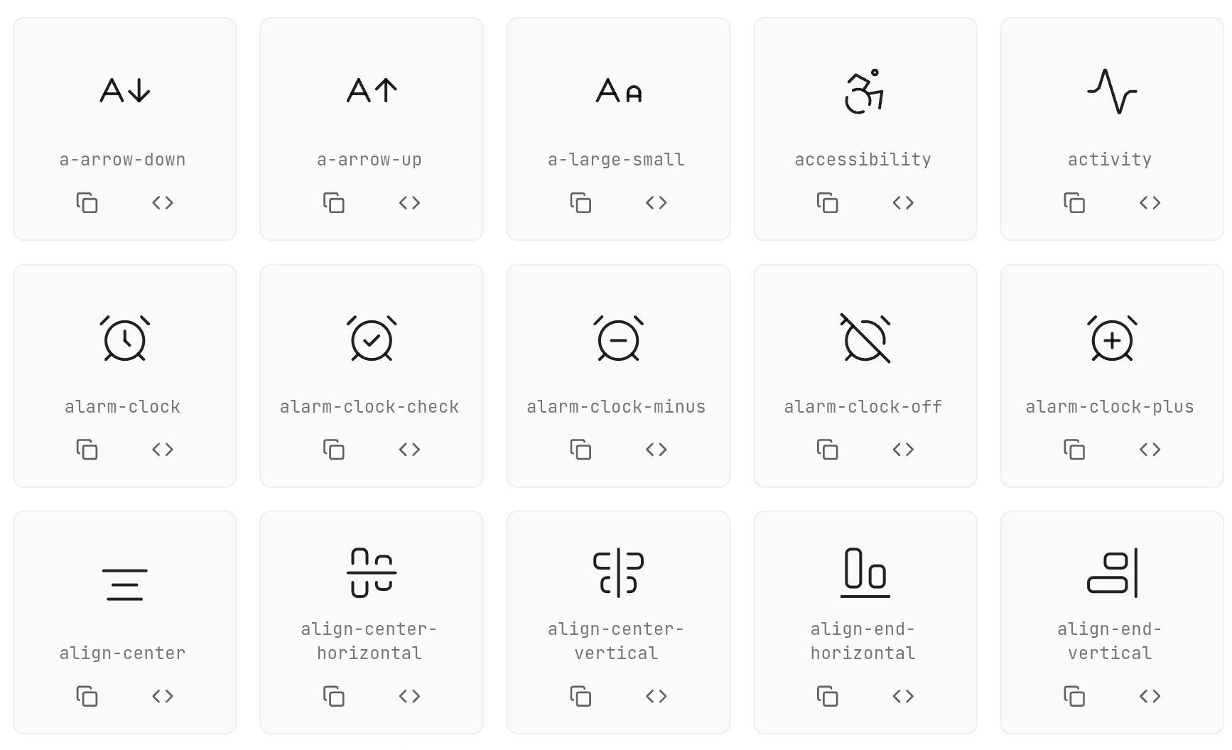
  • 700+ Animated Icons: Based on popular Lucide icon set
  • Interactive Animations: Hover and touch effects
  • Customizable: Size, color, animation duration, stroke width
  • Flexible Integration: Works with GestureDetector, InkWell, IconButton
  • Programmatic Control: AnimatedIconController for external animation control

Usage

Basic Usage
// Simple icon
AirplayIcon()

// Customized icon
AArrowDownIcon(
  size: 45,
  color: Colors.blue,
  animationDuration: Duration(milliseconds: 800),
  strokeWidth: 3.0,
  hoverColor: Colors.red,
  enableTouchInteraction: true,
  infiniteLoop: false,
  reverseOnExit: false,
)
Using onTap Callback

Use onTap instead of wrapping the icon in GestureDetector:

CheckIcon(
  size: 40,
  color: Colors.green,
  onTap: () {
    print('Icon tapped!');
  },
)
Using with IconButton

Use interactive: false and AnimatedIconController for IconButton integration:

class MyWidget extends StatefulWidget {
  @override
  State<MyWidget> createState() => _MyWidgetState();
}

class _MyWidgetState extends State<MyWidget> {
  final _iconController = AnimatedIconController();

  @override
  Widget build(BuildContext context) {
    return IconButton(
      onPressed: () {
        _iconController.animate(); // Trigger animation
        // Your action here
      },
      icon: HeartIcon(
        size: 32,
        color: Colors.red,
        interactive: false, // Disable internal gesture handlers
        controller: _iconController,
      ),
    );
  }
}
Using with InkWell
final _iconController = AnimatedIconController();

InkWell(
  onTap: () {
    _iconController.animate();
    // Your action here
  },
  child: Padding(
    padding: EdgeInsets.all(8),
    child: CopyIcon(
      size: 24,
      interactive: false,
      controller: _iconController,
    ),
  ),
)
All Configuration Options
ActivityIcon(
  size: 48.0,                                    // Icon size
  color: Colors.black87,                         // Default color
  hoverColor: Colors.blue,                       // Hover color
  animationDuration: Duration(milliseconds: 600), // Animation duration
  strokeWidth: 2.0,                              // Stroke width
  reverseOnExit: true,                           // Reverse animation on exit
  enableTouchInteraction: true,                  // Enable touch interaction
  infiniteLoop: false,                           // Enable infinite loop
  resetToStartOnComplete: false,                 // Reset after animation completes
  onTap: () {},                                  // Tap callback
  interactive: true,                             // Enable/disable internal gestures
  controller: AnimatedIconController(),          // External animation controller
)
AnimatedIconController Methods
Method Description
animate() Triggers the animation to play forward
stop() Stops the current animation
reset() Resets the animation to its initial state

Available Icons

Web demo MEDIUM ARTICLE

Animation Types

Each icon has its own unique animation:

  • Rotation: Icons rotate around their center
  • Scale: Icons scale up/down
  • Path Drawing: Icons draw their paths progressively
  • Morphing: Icons transform between states

Contributing

Contributions are welcome! Please feel free to submit a Pull Request.

CONTRIBUTING.md CODE_OF_CONDUCT.md ICON_CHECKLIST.md

Contacts

@khlebobul [Email - khlebobul@gmail.com](mailto:khlebobul@gmail.com) @khlebobul Personal - Website

Support

Support the project

License

LICENCE - MIT

Credits

Icons based on Lucide Icons inspired by pqoqubbw/icons

Used by

Categories

Source repository

Projects using this package