Search packages, repositories and app categories

onboarding_animation cover
Package detailsv0.0.4

onboarding_animation

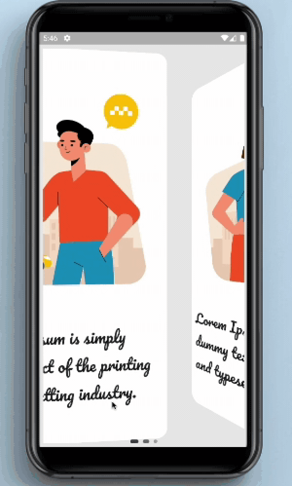
This package provides page type animation to onboarding screens and provides indicator.

AndroidiOSWebmacOSWindowsLinux
30-day downloads
193
Likes
73
Pub points
150

Install package

flutter pub add onboarding_animation

Package Overview

Package selection guidance compiled from public package information, community data, and project usage.

The onboarding_animation package offers customizable page transition animations for onboarding screens in Flutter applications. It enhances user experience with smooth, visually appealing slide effects between onboarding pages and includes a built-in indicator to show progress. Designed for simplicity and flexibility, it supports multiple platforms including Android, iOS, Web, macOS, Windows, and Linux. The package is ideal for apps aiming to create engaging onboarding flows with minimal setup. Developers can easily integrate it using a single command and customize animations to match their app’s design language.

Use cases

  • Onboarding screens for mobile and web apps
  • User onboarding tutorials
  • Product walkthroughs
  • App introduction flows
  • Engaging first-time user experiences

Key features

  • Smooth page transition animations
  • Built-in progress indicator
  • Cross-platform support
  • Easy integration via pub add
  • Customizable animation styles
  • Minimal configuration required

Suitable for

  • Mobile app developers
  • Web application creators
  • UX-focused designers
  • Startups building onboarding flows
  • Developers seeking quick onboarding solutions

Considerations

  • Limited to onboarding-specific use cases
  • May require additional styling for complex UIs
  • Animation performance depends on device capabilities
  • Not suitable for non-onboarding navigation flows
  • Customization options may be constrained by default themes

Original README

Original README snapshot from the linked source repository. Visit the repository for the latest content.

OnBoarding Animation


OnBoarding Animation provides page like animation to the onBoarding screens with the page indicator.


Screenshots and Screen recording

OnBoarding Animation


Usage

Installation

Add onboarding_animation: any to your pubspec.yaml dependencies. And import it:

import 'package:onboarding_animation/onboarding_animation.dart';
Example
OnBoardingAnimation(
          pages: [
           Container(),
           Container(),
           Container(),
          ],
          indicatorDotHeight: 7.0,
          indicatorDotWidth: 7.0,
          indicatorType: IndicatorType.expandingDots,
          indicatorPosition: IndicatorPosition.bottomCenter,
        ),

Parameters

Required Parameters
pages:
  • Need to pass the List of Widgets for providing the content of onBoarding cards.

Optional Parameters
controller:
  • This parameter is use to set the page controller.
indicatorOffset:
  • This parameter is used to set the offset of the indicator.
indicatorDotWidth:
  • Set the width of the the indicator's dot.
indicatorDotHeight:
  • Set the height of indicator's dot.
indicatorDotSpacing:
  • Using this parameter user can define the space between the dots of indicator.
indicatorDotRadius:
  • This is use to set the radius of the circle shown in the indicator.
indicatorInActiveDotColor:
  • This is use to set the color of the inactive(unselected) dot color.
indicatorActiveDotColor:
  • This is use to set the color of the active(selected) dot color.
indicatorStrokeWidth:
  • indicatorStrokeWidth is use to set the width of the stroke if the PaintStyle is selected to the stroke.
indicatorType:
  • This is an enum which is use to select the type of an indicator.
indicatorPosition:
  • This is an enum which is use to select the position of an indicator.
indicatorColorTransitionActiveStrokeWidth:
  • Need to pass the List of Widgets for the providing the content of the onBoarding cards.
indicatorExpansionFactor:
  • indicatorExpansionFactor is multiplied by indicatorDotWidth to resolve the width of the expanded dot.
indicatorJumpScale:
  • The maximum scale the dot will hit while jumping.
indicatorVerticalOffset:
  • The vertical offset of the jumping dot.
indicatorPaintStyle:
  • indicatorPaintStyle is use to select between the fill and the stroke style.
indicatorWormType:
  • indicatorWormType helps to select the form of the WormType between normal and thin.
indicatorSwapType:
  • indicatorSwapType helps to select the form of the SwapType between normal, yRotation and zRotation.
indicatorActivePaintStyle:
  • Inactive dots paint style (fill/stroke) defaults to fill.
indicatorActiveStrokeWidth:
  • This is ignored if indicatorActivePaintStyle is PaintStyle.fill.
indicatorScale:
  • indicatorScale is multiplied by indicatorDotWidth to resolve active dot scaling.
indicatorActiveDotScale:
  • indicatorActiveDotScale is multiplied by indicatorDotWidth to resolve active dot scaling.
indicatorMaxVisibleDots:
  • The max number of dots to display at a time if count is <= maxVisibleDots indicatorMaxVisibleDots = countmust be an odd number that's >= 5.
indicatorFixedCenter:
  • If True the old center dot style will be used.
indicatorInActiveDotDecoration:
  • indicatorInActiveDotDecoration is used to set the inactive dot decoration if indicatorType is selected to custom.
indicatorActiveDotDecoration:
  • indicatorActiveDotDecoration is used to set the active dot decoration if indicatorType is selected to custom.
indicatorActiveColorOverride:
  • This parameter is use to override the existing active colors.
indicatorInActiveColorOverride:
  • This parameter is use to override the existing inactive colors.

Guideline for contributors

Contribution towards our repository is always welcome, we request contributors to create a pull request to the development branch only.


Guideline to report an issue/feature request

It would be great for us if the reporter can share the below things to understand the root cause of the issue.

  • Library version
  • Code snippet
  • Logs if applicable
  • Device specification like (Manufacturer, OS version, etc)
  • Screenshot/video with steps to reproduce the issue

Library used


LICENSE!

OnBoarding Animation is MIT-licensed.


Let us know!

We’d be really happy if you send us links to your projects where you use our component. Just send an email to sales@mindinventory.com And do let us know if you have any questions or suggestion regarding our work.

Categories

Dependencies

Dependency list 1 items

Source repository

Projects using this package

No data available yet.