Search packages, repositories and app categories

Package detailsv0.0.5+1

overlay_container

A flutter widget which renders its child outside the original widget hierarchy.

30-day downloads
3
Likes
50
Pub points
40

Install package

flutter pub add overlay_container

Package Overview

Package selection guidance compiled from public package information, community data, and project usage.

OverlayContainer is a Flutter widget that renders its child outside the original widget hierarchy, enabling elements to be positioned independently of their parent layout. This is particularly useful for creating overlays, tooltips, or floating UI components that need to appear above other widgets without being constrained by their container's bounds. It leverages Flutter's Overlay mechanism to achieve this behavior, providing a clean and efficient way to manage layered UI elements. The package is lightweight and designed for simplicity, making it ideal for developers seeking precise control over widget positioning in complex layouts.

Use cases

  • Creating floating action buttons
  • Displaying tooltips or popovers
  • Implementing custom modal dialogs
  • Building overlay menus
  • Positioning UI elements beyond parent constraints

Key features

  • Render children outside parent hierarchy
  • Uses Flutter's Overlay for efficient rendering
  • Simple API with minimal setup
  • Supports absolute positioning
  • Works seamlessly with existing widget trees

Suitable for

  • Developers needing advanced overlay functionality
  • UI designers implementing layered interfaces
  • Projects requiring dynamic floating elements
  • Apps with complex interactive overlays
  • Teams prioritizing clean, maintainable code

Considerations

  • May require careful handling of focus and gestures
  • Not suitable for static layout structures
  • Potential performance impact with many overlays
  • Needs proper disposal of overlay entries
  • Limited platform-specific optimizations

Original README

Original README snapshot from the linked source repository. Visit the repository for the latest content.

overlay_container

Pub Package License

A flutter widget which renders its child outside the original widget hierarchy.

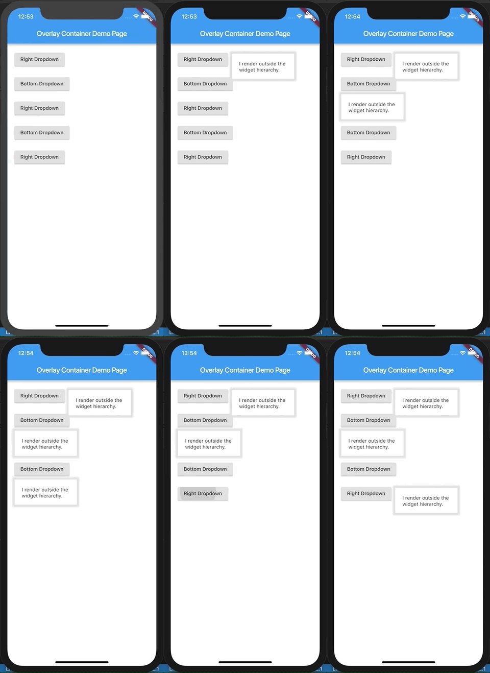
Demo.

Demo

This demo is present as an example here. You can also checkout the examples folder.

Description.

The child passed to this widget is rendered outside the widget hierarchy as an overlay to the exisiting widget tree. As a result this widget is highly suitable for building custom dropdown options, autocomplete suggestions, dialogs, etc. Think of it as widget placed absolutely and having a positive z-index over the rest of the widget tree. It is actually a friendly wrapper over the Flutter's Overlay and OverlayEntry APIs.

If you've ever used react, this tries to do what React Portal does, in a way.

Example.

import 'package:flutter/material.dart';
import 'package:overlay_container/overlay_container.dart';

class MyApp extends StatelessWidget {
  @override
  Widget build(BuildContext context) {
    return MaterialApp(
      title: 'Overlay Container Demo',
      theme: ThemeData(
        primarySwatch: Colors.blue,
      ),
      home: MyHomePage(),
    );
  }
}

class MyHomePage extends StatefulWidget {
  _MyHomePageState createState() => _MyHomePageState();
}

class _MyHomePageState extends State<MyHomePage> {
  // Need to maintain a "show" state either locally or inside
  // a bloc.
  bool _dropdownShown = false;

  void _toggleDropdown() {
    setState(() {
      _dropdownShown = !_dropdownShown;
    });
  }

  @override
  Widget build(BuildContext context) {
    return Scaffold(
      appBar: AppBar(
        title: Text('Overlay Container Demo Page'),
      ),
      body: Padding(
        padding: const EdgeInsets.all(20),
        child: Column(
          crossAxisAlignment: CrossAxisAlignment.start,
          children: <Widget>[
            RaisedButton(
              onPressed: _toggleDropdown,
              child: Column(
                children: <Widget>[
                  Text("Dropdown button"),
                ],
              ),
            ),
            // By default the overlay (since this is a Column) will
            // be added right below the raised button
            // but outside the widget tree.
            // We can change that by supplying a "position".
            OverlayContainer(
              show: _dropdownShown,
              // Let's position this overlay to the right of the button.
              position: OverlayContainerPosition(
                // Left position.
                150,
                // Bottom position.
                45,
              ),
              // The content inside the overlay.
              child: Container(
                height: 70,
                padding: const EdgeInsets.all(20),
                margin: const EdgeInsets.only(top: 5),
                decoration: BoxDecoration(
                  color: Colors.white,
                  boxShadow: <BoxShadow>[
                    BoxShadow(
                      color: Colors.grey[300],
                      blurRadius: 3,
                      spreadRadius: 6,
                    )
                  ],
                ),
                child: Text("I render outside the \nwidget hierarchy."),
              ),
            ),
          ],
        ),
      ),
    );
  }
}

A more elaborate example is found here.

Installation.

  • Instructions are here.

Inspiration

License.

Categories

Source repository

Projects using this package

No data available yet.