
Overview
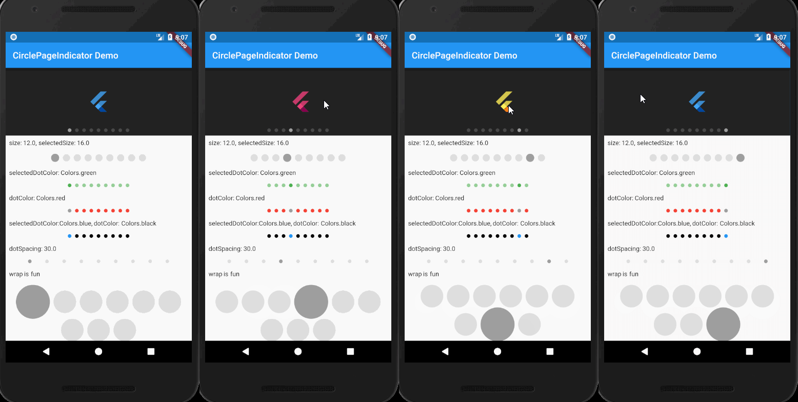
A Flutter package that provides customizable indicators for PageView widgets, enhancing user experience by visually showing the current page and total pages. It supports various indicator styles such as dots, lines, and custom widgets, allowing developers to tailor the appearance to match their app's design. The package is lightweight and integrates seamlessly with PageView, offering smooth transitions and easy configuration. Ideal for onboarding screens, image sliders, and any UI requiring visual navigation cues.
Use cases
- Onboarding screens
- Image sliders
- Multi-step forms
- Product showcases
- Tutorial guides
Key features
- Customizable indicator shapes
- Smooth animations
- Support for multiple layouts
- Easy integration with PageView
- Extensible design options
Suitable for
- Mobile apps with PageView
- Web-based sliders
- Cross-platform applications
- Design-focused interfaces
- Simple navigation indicators
Considerations
- Requires PageView widget
- Limited to visual feedback
- No built-in swipe gestures
- May need additional styling
- Not suitable for complex navigation