Package selection guidance compiled from public package information, community data, and project usage.
A Flutter package that provides a search bar with built-in pagination for displaying search results. It enables users to type queries and navigate through results in pages, improving performance and user experience when dealing with large datasets. The library handles asynchronous search operations and integrates seamlessly into existing UIs with minimal setup. It supports customizable result display and loading states, making it ideal for apps requiring efficient, scalable search functionality.
Use cases
Searching large datasets efficiently
Implementing paginated search results
Enhancing user experience in data-heavy apps
Building dynamic search interfaces
Integrating with remote APIs for search
Reducing memory usage during searches
Key features
Built-in pagination support
Asynchronous search handling
Customizable result UI
Loading and error state management
Easy integration with existing widgets
Support for remote and local data sources
Suitable for
Developers building search-heavy apps
Apps with large datasets
UIs requiring smooth scrolling and lazy loading
Teams prioritizing performance and UX
Projects using REST or GraphQL APIs
Flutter beginners learning pagination patterns
Considerations
Requires implementation of search logic
Limited to basic search UI customization
No built-in filtering or sorting
Depends on external data source
May need additional styling for complex designs
Not optimized for real-time search without debounce
Original README
Original README snapshot from the linked source repository. Visit the repository for the latest content.
Paginated Search Bar
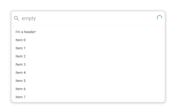
A search bar library that let's you search for items and paginate them in a results list. By default it looks like this:
.
It supports extensive customization with custom styling, headers, placeholders, footers and more powered by the Endless infinite scroll view library.
Usage
classExampleItem{
finalString title;
ExampleItem({
requiredthis.title,
});
}
PaginatedSearchBar<ExampleItem>(
onSearch: ({
required pageIndex,
required pageSize,
required searchQuery,
}) async {
// Call your search API to return a list of itemsreturn [
ExampleItem(title: 'Item 0'),
ExampleItem(title: 'Item 1'),
];
},
itemBuilder: (
context, {
required item,
required index,
}) {
returnText(item.title);
},
);
In this basic usage, all you need to get started is an onSearch function for fetching data and an itemBuilder for how it should be displayed in the search results list.
In this more advanced example, we've provided a few more customization options including an emptyBuilder and headerBuilderState. All of the builder functions like emptyBuilder provide the current BuildContext and return a widget to display. Each builder function additionally has a corresponding StateProperty builder like we see with headerBuilderState. The PaginatedSearchBar library uses the State property pattern for customizing the display of the widget based on the state of the system.
The complete list of paginated search bar states are:
enumPaginatedSearchBarState {
/// Present when the search bar is searching for items. Triggered when they update their search/// query in the input.
searching,
/// Present when the search bar is fetching a page of items either as a result of a modified search query/// or by scrolling to the bottom of the list view and triggering the next page load.
loading,
/// Present when the search bar has no matching items for the current search query.
empty,
/// Present when the search bar has no more items to fetch for the current search query. Triggered/// when the [PaginatedSearchBar.onSearch] function returns fewer than [PaginatedSearchBar.pageLimit]/// items or [EndlessPaginationDelegate.maxPage] has been reached and no more items can be fetched.
done,
/// Present the input is currently focused.
focused,
}
State properties builders then let us customize what we build based on these states. In the above example with headerBuilderState, we specified that it should only build the widget when the search results are empty.
If we instead wanted it show be shown when the search results are empty or done, we could use the state property resolveWith builder:
PaginatedSearchBar<ExampleItem>(
headerBuilderState: PaginatedSearchBarBuilderStateProperty.resolveWith((context, states) {
if (states.contain(PaginatedSearchBarState.empty) || states.contain(PaginatedSearchBarState.done)) {
returnconstText("I'm a header that only shows when the results are empty or done!");
}
}),
onSearch: ({
required pageIndex,
required pageSize,
required searchQuery,
}) async {
returnFuture.delayed(constDuration(milliseconds: 1000), () {
if (searchQuery == "empty") {
return [];
}
return [
ExampleItem(title: 'Page $pageIndex item 1'),
ExampleItem(title: 'Page $pageIndex item 2'),
];
});
},
itemBuilder: (
context, {
required item,
required index,
}) {
returnText(item.title);
},
);
The state properties are available for builders and style properties of the [PaginatedSearchBar].
Feedback
Let us know if there are any additional features or customization options you'd like to see to make a helpful search bar.

 .
