Search packages, repositories and app categories

pal_widgets cover
Package detailsv0.4.0

pal_widgets

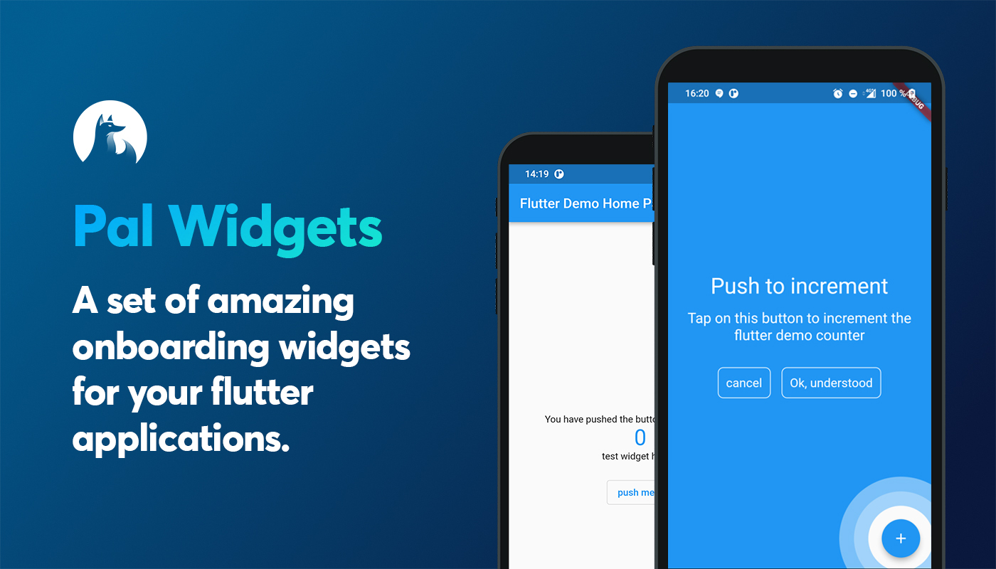
A set of amazing onboarding widgets for your flutter applications.

AndroidiOSWebmacOSWindowsLinux
30-day downloads
52
Likes
80
Pub points
150

Install package

flutter pub add pal_widgets

Package Overview

Package selection guidance compiled from public package information, community data, and project usage.

pal_widgets is a Flutter package offering a collection of visually appealing onboarding widgets designed to enhance user experience through guided tours and coach marks. It helps developers introduce app features step-by-step, improving user engagement and comprehension. The package supports multiple platforms including Android, iOS, Web, macOS, Windows, and Linux, ensuring consistent onboarding across devices. With customizable animations and intuitive APIs, it simplifies the implementation of interactive walkthroughs. Ideal for apps aiming to reduce user friction during onboarding.

Use cases

  • Onboarding new users
  • Highlighting key app features
  • Guided tutorials
  • Improving user retention
  • Introducing complex interfaces
  • Enhancing first-time user experience

Key features

  • Pre-built onboarding widgets
  • Cross-platform support
  • Customizable animations
  • Easy integration
  • Interactive coach marks
  • Responsive design

Suitable for

  • Mobile and web applications
  • Product teams
  • UX designers
  • Developers seeking quick onboarding solutions
  • Apps with complex workflows
  • Startups focusing on user onboarding

Considerations

  • Requires understanding of Flutter layout
  • May need customization for brand alignment
  • Performance impact with many steps
  • Limited to onboarding use cases
  • Depends on external dependencies
  • Not suitable for non-guided UI flows

Original README

Original README snapshot from the linked source repository. Visit the repository for the latest content.

flutter anchored onboarding screen


build License: MIT Pal widgets pubdev


Pal widgets

A flutter package for better onboarding.

A set of amazing onboarding widgets for your flutter applications.

Install package

add in your pubspec.yaml dependencies

pal-widgets: 0.3.0


List of helpers

Name description status
AnchoredHelper An helper do describe another widget of your page. This creates an overlay above your page :white_check_mark:

Anchored helper

This widgets is highly inspired by google onboardings. This shows a circle around any widgets you want and add an overlay were you can add a message.

First embbed you page or your app with a HelperOrchestrator widget.

HelperOrchestrator(
    child: Scaffold(
        appBar: AppBar(
            title: Text(widget.title),
        ),
        body: ...
    ),
)

You now have to get a key text1 for the widget you want to reference using

Text(
    '$_counter',
    key: HelperOrchestrator.of(context).generateKey('text1'),
),
Example

You can now show an anchored helper using

final helper = AnchoredHelper(
    title: const Text('Title lorem pitume'),
    description: const Text('Lorem ipsum lorem ipsum lorem ipsum lorem ipsum lorem ipsum'),,
    bgColor: Colors.blue,
    leftBtnText: const Text('cancel'),
    rightBtnText: const Text('Ok, understood'),
    onError: () => print("widget not found"),
    positivBtnStyle: helperOutlineBtnStyle,
    negativeBtnStyle: helperOutlineBtnStyle,
    onLeftBtnTap: () => HelperOrchestrator.of(context).hideHelper(),
    onRightTap: () => HelperOrchestrator.of(context).hideHelper(),
    onTapAnchor: () => HelperOrchestrator.of(context).hideHelper(),
);

// this will show an overlayed anchored widget using the key text1
HelperOrchestrator.of(context).showAnchoredHelper('text1', helper);
properties
Property description Required
title A Text widget to show as title
description A Text widget to show as description
bgColor A Color as Overlayed background :white_check_mark:
leftBtnText A [Text] widget to show within the left button
rightBtnText A [Text] widget to show within the right button
onLeftBtnTap Action on tap left button
onRightTap Action on tap right button
onError Functions to call when widgets encounters any errors
leftBtnStyle Material style to put on negativ button
rightBtnStyle Material style to put on positiv button
onTapAnchor Action to call when user tap on anchor
widgetFactory The Widget factory to create the anchored helper. Default to AnchoredCircleHoleHelper.anchorFactory which creates a full overlay with an animated hole

There is two Hole Anchor widget factories :

  • AnchoredCircleHoleHelper.anchorFactory: creates a circle hole (default value)
  • AnchoredRectHoleHelper.anchorFactory : creates a rectangle hole on strict widget bounds

Any question?

Contact us on our twitter

Categories

Dependencies

Dependency list 1 items

Source repository

Projects using this package

No data available yet.