Search packages, repositories and app categories

panara_dialogs cover
Package detailsv0.1.5

panara_dialogs

PanaraDialogs is a Dialog UI Kit. A minimal but beautiful design for Flutter Dialogs.

AndroidiOSWebmacOSWindowsLinux
30-day downloads
1.3K
Likes
184
Pub points
150

Install package

flutter pub add panara_dialogs

Package Overview

Package selection guidance compiled from public package information, community data, and project usage.

PanaraDialogs is a minimal and aesthetically pleasing dialog UI kit for Flutter, designed to enhance user experience with clean, modern dialog components. It offers a consistent and elegant appearance across platforms, making it easy to implement attractive dialogs without extensive customization. The package supports all major Flutter platforms, including Android, iOS, Web, macOS, Windows, and Linux, ensuring broad compatibility. With simple integration via pub, PanaraDialogs provides developers with ready-to-use dialog templates that align with contemporary design principles.

Use cases

  • Simple alert dialogs
  • Confirmation dialogs
  • Customizable pop-up modals
  • Onboarding or tutorial overlays
  • User input collection

Key features

  • Minimalist and beautiful design
  • Cross-platform support
  • Easy integration with Flutter
  • Pre-designed dialog templates
  • Lightweight and fast

Suitable for

  • Developers seeking polished dialog UIs
  • Projects with design-focused interfaces
  • Apps requiring consistent dialog styling
  • Rapid prototyping
  • UI/UX enhancement

Considerations

  • Limited customization beyond provided themes
  • Best suited for minimalist design styles
  • May require additional styling for complex layouts
  • Not ideal for highly interactive or animated dialogs

Original README

Original README snapshot from the linked source repository. Visit the repository for the latest content.

Panara Dialogs

Pub Version GitHub

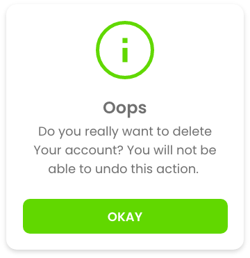
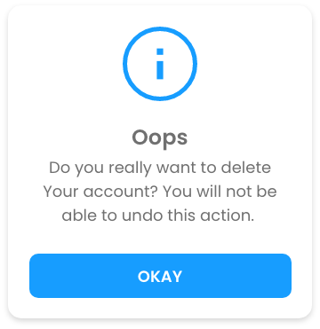
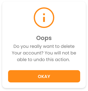
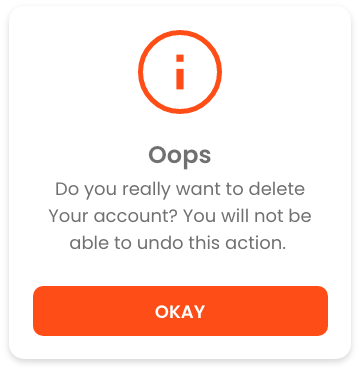
Panara Dialogs is a UI Kit for Dialog comes with 3 types of dialogs - Info Dialog, Confirmation Dialog both comes with 4 different variants as shown in below screenshots & Custom Dialog, with 7 different animations.

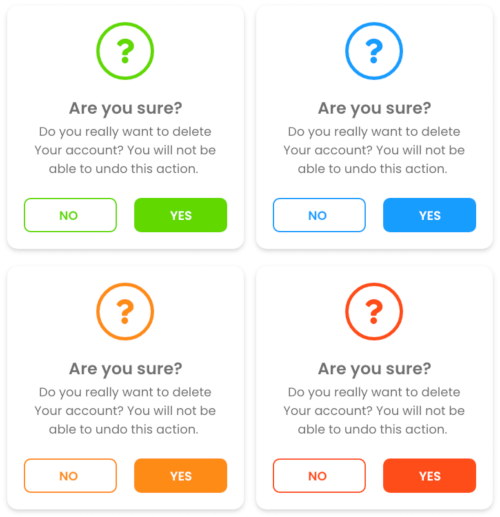
Preview

PanaraInfoDialog

successnormalwarningerror

PanaraConfirmDialog

successnormalwarningerror

Getting started

Add the dependency in pubspec.yaml:

dependencies:
  panara_dialogs: ^0.1.5

Usage

Then you just have to import the package with


import 'package:panara_dialogs/panara_dialogs.dart';

Here is how you can use PanaraInfoDialog in your flutter project.


PanaraInfoDialog.show(
    context,
    title: "Hello",
    message: "This is the PanaraInfoDialog",
    buttonText: "Okay",
    onTapDismiss: () {
        Navigator.pop(context);
    },
    panaraDialogType: PanaraDialogType.normal,
    barrierDismissible: false, // optional parameter (default is true)
);

Properties of PanaraInfoDialog
Property Type value
imagePath String path to your local assets image
title String any string value
message String any string value
buttonText String any string value
onTapDismiss void Function() function to decide what will happen onTap
panaraDialogType PanaraDialogType success, normal, warning, error, custom
color Color define your own color, by selecting panaraDialogType: PanaraDialogType.custom
textColor Color define your own text color
buttonTextColor Color define your own button text color
margin EdgeInsets define margin
padding EdgeInsets define padding
noImage bool If you don't want any image set it to true. it's false by default
barrierDismissible bool define if dialog is dismissible by tapping outside of dialog

And Here is how you can use PanaraConfirmDialog in your flutter project.


PanaraConfirmDialog.show(
    context,
    title: "Hello",
    message: "This is the PanaraConfirmDialog",
    confirmButtonText: "Confirm",
    cancelButtonText: "Cancel",
    onTapCancel: () {
        Navigator.pop(context);
    },
    onTapConfirm: () {
        Navigator.pop(context);
    },
    panaraDialogType: PanaraDialogType.normal,
    barrierDismissible: false, // optional parameter (default is true)
);

Properties of PanaraConfirmDialog
Property Type value
imagePath String path to your local assets image
title String any string value
message String any string value
confirmButtonText String any string value
cancelButtonText String any string value
onTapConfirm void Function() function to decide what will happen onTap confirm
onTapCancel void Function() function to decide what will happen onTap cancel
panaraDialogType PanaraDialogType success, normal, warning, error, custom
color Color define your own color, by selecting panaraDialogType: PanaraDialogType.custom
textColor Color define your own text color
buttonTextColor Color define your own button text color
margin EdgeInsets define margin
padding EdgeInsets define padding
noImage bool If you don't want any image set it to true. it's false by default
barrierDismissible bool define if dialog is dismissible by tapping outside of dialog

Here is how you can use PanaraCustomDialog in your flutter project.

PanaraCustomDialog.show(
    context,
    children: [
        Text(
            "Hello",
            style: TextStyle(
                fontSize: 20,
            ),
            textAlign: TextAlign.center,
        ),
        Text(
            "This is the PanaraCustomDialog",
            style: TextStyle(
                    fontSize: 16
                ),
            textAlign: TextAlign.center,
        ),
        // Add your own widgets here
    ],
    mainAxisAlignment: MainAxisAlignment.center,
    crossAxisAlignment: CrossAxisAlignment.center,
    backgroundColor: Colors.white,
    margin: EdgeInsets.all(20),
    padding: EdgeInsets.all(20),
    barrierDismissible: false, // optional parameter (default is true)
);
Properties of PanaraCustomDialog
Property Type value
children List<Widget> define your own widgets
mainAxisAlignment MainAxisAlignment start, center, end
crossAxisAlignment CrossAxisAlignment start, center, end
backgroundColor Color define background color
margin EdgeInsets define margin
padding EdgeInsets define padding
barrierDismissible bool define if dialog is dismissible by tapping outside of dialog
Animations for Both Dialogs

This are static methods for both Dialog Class.

method Animation
showAnimatedFromLeft() slide animation from left
showAnimatedFromRight() slide animation from right
showAnimatedFromTop() slide animation from top
showAnimatedFromBottom() slide animation from bottom
showAnimatedGrow() grow animation from center
showAnimatedShrink() shrink animation from center
showAnimatedFade() fade animation

Feedback

Please feel free to give me any feedback or file issue helping support this plugin !

Categories

Source repository

Projects using this package

No data available yet.