Search packages, repositories and app categories

pandabar cover
Package detailsv0.1.2

pandabar

A fancy bottom navigation bar for pandas. Pandabar designed for new neumorphic design trend.

AndroidiOSWebmacOSWindowsLinux
30-day downloads
64
Likes
66
Pub points
140

Install package

flutter pub add pandabar

Package Overview

Package selection guidance compiled from public package information, community data, and project usage.

Pandabar is a visually appealing bottom navigation bar for Flutter applications, inspired by the neumorphic design trend. It offers a modern, soft-edged aesthetic with subtle shadows and gradients, enhancing user interface appeal. Designed for developers seeking a fresh alternative to standard navigation bars, Pandabar supports multiple platforms including Android, iOS, Web, macOS, Windows, and Linux. Its customizable appearance allows integration into diverse app themes while maintaining smooth performance and intuitive interaction. The package is easy to implement using a simple pub add command.

Use cases

  • Modern app interfaces
  • Neumorphic-themed designs
  • Cross-platform mobile and desktop apps
  • Enhanced user navigation
  • Visual consistency across devices

Key features

  • Neumorphic design style
  • Customizable colors and shapes
  • Cross-platform compatibility
  • Smooth animations
  • Easy integration via pub
  • Responsive layout

Suitable for

  • Design-focused Flutter developers
  • Apps targeting modern aesthetics
  • Projects requiring unique navigation UI
  • Multi-platform deployment
  • Creative UI experimentation

Considerations

  • May require additional styling for dark mode
  • Performance impact on low-end devices
  • Limited customization beyond neumorphic theme
  • Not ideal for minimalistic or flat design approaches
  • Potential visual clutter in dense interfaces

Original README

Original README snapshot from the linked source repository. Visit the repository for the latest content.

Pub

PandaBar

A fancy bottom navigation bar for pandas. Pandabar designed for new neumorphic design trend.

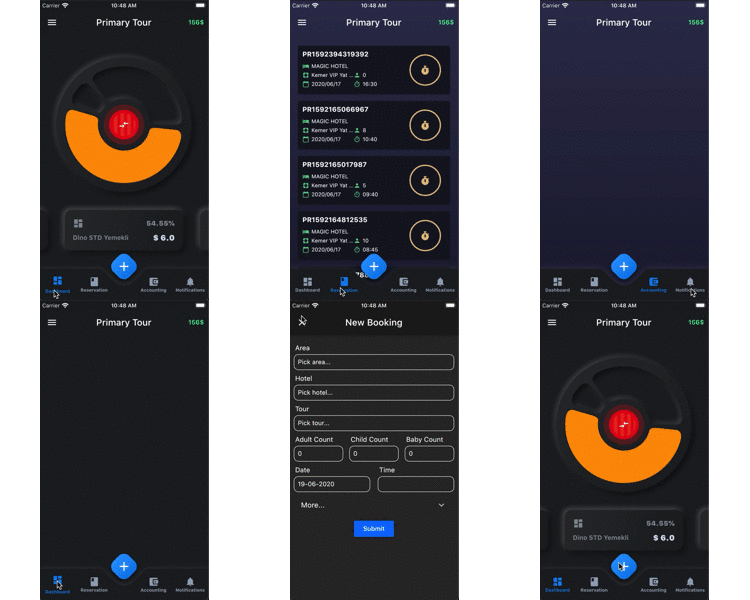
Preview PageView
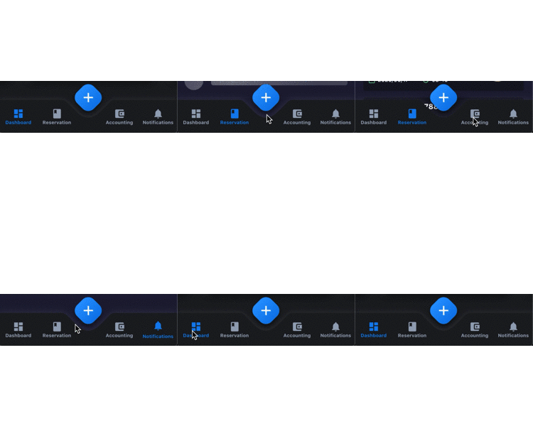
BottomNavBar Gif Fix Gif
PandaBar
  • buttonColor - to change button color
  • buttonSelectedColor - to change button selected color
  • backgroundColor - the navigation bar's background color
  • buttonData - navigation items, required more than one item and less than 5
  • fabIcon - the navigation bar's fab button icon
  • fabColors - the navigation bar's fab button gradient colors
  • onFabButtonPressed - required to listen fab button is pressed
  • onChange - required to listen when a item is pressed it provide the selected item's id
PandaBarButtonData
  • id - the id of this item
  • icon - the icon of this item
  • title - the title of this item

Getting Started

Add the dependency in pubspec.yaml:

dependencies:
  ...
  pandabar: ^0.1.1

Basic Usage

class HomePage extends StatefulWidget {
  @override
  _HomePageState createState() => _HomePageState();
}

class _HomePageState extends State<HomePage> {

  String page = 'Grey';

  @override
  Widget build(BuildContext context) {
    return Scaffold(
      extendBody: true,
      bottomNavigationBar: PandaBar(
        buttonData: [
          PandaBarButtonData(
            id: 'Grey',
            icon: Icons.dashboard,
            title: 'Grey'
          ),
          PandaBarButtonData(
            id: 'Blue',
            icon: Icons.book,
            title: 'Blue'
          ),
          PandaBarButtonData(
            id: 'Red',
            icon: Icons.account_balance_wallet,
            title: 'Red'
          ),
          PandaBarButtonData(
            id: 'Yellow',
            icon: Icons.notifications,
            title: 'Yellow'
          ),
        ],
        onChange: (id) {
          setState(() {
            page = id;
          });
        },
        onFabButtonPressed: () {

        },
      ),
      body: Builder(
        builder: (context) {

          switch (page) {
            case 'Grey':
              return Container(color: Colors.grey.shade900);
            case 'Blue':
              return Container(color: Colors.blue.shade900);
            case 'Red':
              return Container(color: Colors.red.shade900);
            case 'Yellow':
              return Container(color: Colors.yellow.shade700);
            default:
              return Container();
              
          }

        },
      ),
    );
  }
}

Categories

Source repository

Projects using this package

No data available yet.