Package selection guidance compiled from public package information, community data, and project usage.
Parent Child Checkbox is a Flutter package that enables hierarchical checkbox structures, allowing users to create nested checklists where parent checkboxes control the state of their child checkboxes. It supports intuitive selection and deselection across levels, making it ideal for forms, task lists, or settings with grouped options. The package is lightweight, easy to integrate, and works across all major platforms including Android, iOS, Web, macOS, Windows, and Linux.
Use cases
Task management systems
Form inputs with grouped options
Settings with nested categories
Hierarchical data selection
User preference configurations
Key features
Nested checkbox hierarchy
Automatic child state propagation
Cross-platform compatibility
Simple API integration
Supports partial selection states
Suitable for
Developers building complex forms
UI designers needing structured checklists
Apps requiring grouped selections
Projects targeting multiple platforms
Users seeking minimal setup for hierarchical checks
Considerations
May require custom styling for advanced UI needs
Limited built-in validation
Not suitable for non-hierarchical checkbox use cases
State management may need external handling in large trees
Documentation could be expanded for edge cases
Original README
Original README snapshot from the linked source repository. Visit the repository for the latest content.
parent_child_checkbox
Parent Child Checkbox is a type of checkbox where we can establish hierarchy in Checkboxes.
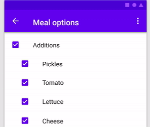
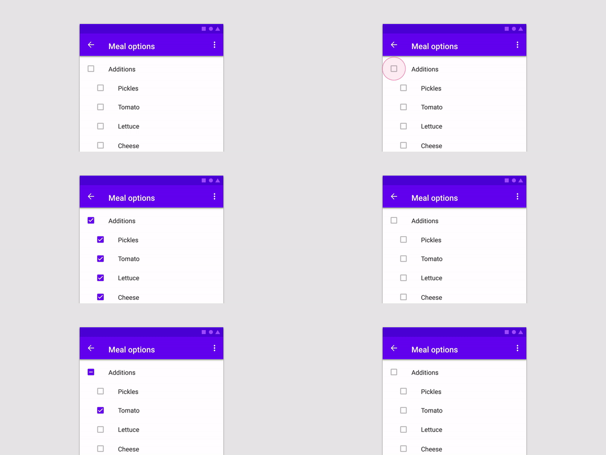
You can create a Parent Checkbox which has multiple checkboxes as their children! The value of parent checkbox depends on the value of children checkboxes and vice-versa.
If we clicked on Parent Checkbox, all children checkboxes will be selected too.
Properties available:
Parameter Name
Parameter Type
Description
parent
Text
Text Widget to specify the Parent checkbox
children
List<Text>
List<Text> Widgets to specify the Children checkboxes
parentCheckboxColor
Color
Color of Parent CheckBox Defaults to [ThemeData.toggleableActiveColor]
childrenCheckboxColor
Text Widget
Text Widget to specify the Parent checkbox
parentCheckboxScale
double
Scale of the Parent CheckBox. Defaults to [1.0]
childrenCheckboxScale
double
Scale of the Children CheckBox. Defaults to [1.0]
gap
double
Gap between the Parent and Children CheckBox. Defaults to [10.0]
onCheckedChild
void Function(int index)?
Function that will be executed if a child will be selected
onCheckedParent
void Function()?
Function that will be executed if the parent will be selected
isParentSelected
Getter
Getter to get whether particular parent is selected or not.
Example: {'Parent 1' : true, 'Parent 2' : false} where Parent 1 and Parent 2 will be 2 separate parents if you are using multiple ParentChildCheckbox in your code.
Default value will be false for all specified parents
selectedChildrens
Getter
Getter to get which childrens are selected for a particular parent.
Example: {'Parent 1' : ['Children 1.1','Children 1.2'], 'Parent 2' : []} where Parent 1 and Parent 2 will be 2 separate parents if you are using multiple ParentChildCheckbox in your code.
Default value is {'Parent 1' : [], 'Parent 2' : []}