Search packages, repositories and app categories

profile_photo cover
Package detailsv1.0.3

profile_photo

A simple Flutter package to display a profile photo with a badge

AndroidiOSWebmacOSWindowsLinux
30-day downloads
108
Likes
13
Pub points
160

Install package

flutter pub add profile_photo

Package Overview

Package selection guidance compiled from public package information, community data, and project usage.

A lightweight Flutter package designed to display profile photos with optional badges. It simplifies the integration of user avatars in apps, supporting various image sources and providing a clean, customizable interface. The badge feature is ideal for indicating status, notifications, or user roles. Compatible across all major platforms, it ensures consistent appearance on Android, iOS, Web, macOS, Windows, and Linux. Perfect for chat interfaces, user profiles, and social features.

Use cases

  • User profile displays
  • Chat interfaces
  • Social media apps
  • Notification indicators
  • Team member lists

Key features

  • Badge support
  • Cross-platform compatibility
  • Simple API
  • Customizable styling
  • Image source flexibility
  • Responsive design

Suitable for

  • Mobile app developers
  • Web application creators
  • Chat application builders
  • Social networking projects
  • UI component libraries

Considerations

  • Limited to basic avatar rendering
  • No built-in image caching
  • Requires manual handling of image loading errors
  • Not optimized for large-scale avatar grids
Original README

Original README snapshot from the linked source repository. Visit the repository for the latest content.

profile_photo

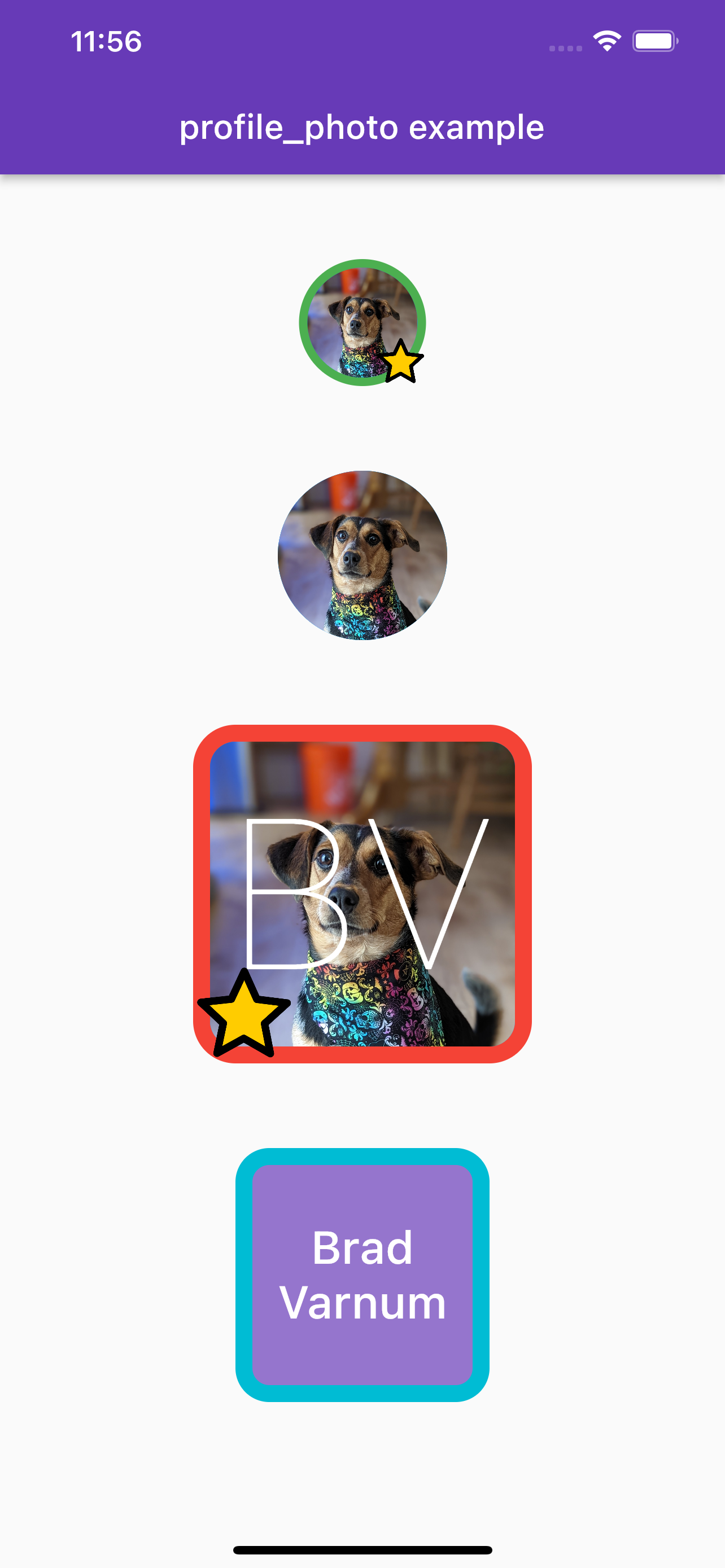
Creates a widget that was designed to be used to display a profile photo, but it could also be used in many other ways

Features

  • Ability to add a custom badge to the widget, could be used to display premium users for example
  • Will automatically figure out a users initals to display if no image is given, but a name is
  • ImageProvider as an image source to use either network or asset images
  • onTap and onLongPress call backs
  • Adjustable size
  • Adjustable corner radius
  • Adjustable outline width
  • Adjustable background and outline colors

Getting started

Add the dependency and add anywhere in widget tree

Usage

Minimum required code for a simple round photo (2nd example)

ProfilePhoto(
    totalWidth: 100,
    cornerRadius: 80,
    color: Colors.blue,
    image: const AssetImage('assets/test_profile_photo.jpg'),
),

More complicated example with initals shown, custom boarder and colors, and badge (3rd example)

ProfilePhoto(
    totalWidth: 200,
    cornerRadius: 25,
    color: Colors.blue,
    outlineColor: Colors.red,
    outlineWidth: 10,
    textPadding: 10,
    name: 'Brad Varnum',
    fontColor: Colors.white,
    nameDisplayOption: NameDisplayOptions.initials,
    fontWeight: FontWeight.w100,
    showName: true,
    image: const AssetImage('assets/test_profile_photo.jpg'),
    badgeAlignment: Alignment.bottomLeft,
    badgeSize: 60,
    badgeImage: const AssetImage('assets/star.png'),
    onTap: () {
        // open profile for example
    },
    onLongPress: () {
        // popup to message user for example
    },
),
example image

Additional information

  • Feel free to use as-is or fork and modify for what you need
  • If you find any issues, please create a issue in this repo
  • If you have any suggestions or feature requests, please create an issue
  • I made this mostly for fun, and explore the package creation process

Categories

Source repository

Projects using this package

No data available yet.