
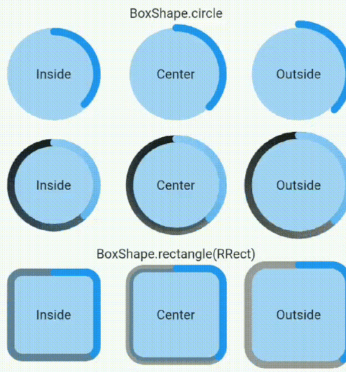
Overview
ProgressBorder is a Flutter package that extends BoxBorder to draw borders with customizable progress, supporting circular, rectangular, and square shapes. It enables visually dynamic borders that fill incrementally based on a progress value, ideal for loading indicators or progress visualization. The package integrates seamlessly into existing UIs and works across all major platforms including Android, iOS, Web, macOS, Windows, and Linux. It's lightweight and designed for developers seeking animated border effects without complex custom painting.
Use cases
- Loading indicators
- Progress visualization
- Animated UI elements
- Customizable border effects
- Interactive form validation
Key features
- Supports circular and rectangular borders
- Progress-driven border filling
- Cross-platform compatibility
- Easy integration with BoxBorder
- Customizable stroke width and color
Suitable for
- UI designers seeking visual feedback
- Developers building loading animations
- Apps requiring progress-based visuals
- Flutter beginners exploring custom painting
- Projects with interactive or animated interfaces
Considerations
- Requires manual progress updates
- Limited to border-only rendering
- Not suitable for complex animations
- May impact performance with many instances
- Depends on correct widget hierarchy for display