Search packages, repositories and app categories

progress_dialog_null_safe cover
Package detailsv3.1.0

progress_dialog_null_safe

A lightweight, null-safe Flutter package for showing customizable progress dialogs with support for dynamic content updates and various styling options.

AndroidiOSWebmacOSWindowsLinux
30-day downloads
3K
Likes
46
Pub points
140

Install package

flutter pub add progress_dialog_null_safe

Package Overview

Package selection guidance compiled from public package information, community data, and project usage.

A lightweight, null-safe Flutter package designed to display customizable progress dialogs. It supports dynamic content updates and offers various styling options for consistent UI across platforms. Ideal for showing loading states during asynchronous operations, it ensures type safety and smooth user experience on Android, iOS, Web, macOS, Windows, and Linux. The package is easy to integrate and maintain, making it suitable for apps requiring responsive feedback during data processing.

Use cases

  • Showing loading states during API calls
  • Updating dialog text dynamically
  • Displaying progress during file uploads
  • Providing feedback during background tasks
  • Customizing appearance for brand consistency

Key features

  • Null-safe design
  • Dynamic content updates
  • Multiple platform support
  • Customizable styling
  • Lightweight and fast
  • Easy integration with Flutter

Suitable for

  • Developers building cross-platform Flutter apps
  • Teams prioritizing type safety
  • Apps needing responsive loading indicators
  • Projects requiring minimal dependencies
  • UI-heavy applications with frequent async operations

Considerations

  • Requires Flutter 2.5 or higher
  • Limited to basic progress visualization
  • No built-in cancellation handling
  • Best suited for simple loading scenarios
  • May need additional logic for complex workflows

Original README

Original README snapshot from the linked source repository. Visit the repository for the latest content.

progress_dialog

A light weight package to show progress dialog. As it is a stateful widget, you can change the text shown on the dialog dynamically.

This is the original package and it's owner https://github.com/fayaz07/progress_dialog

It was discontinued by him, but i really liked the package so I am trynna revive it :D I added null safety and updated most of the stuff making it null safe and useable again :)

Demo

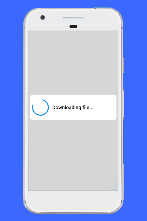
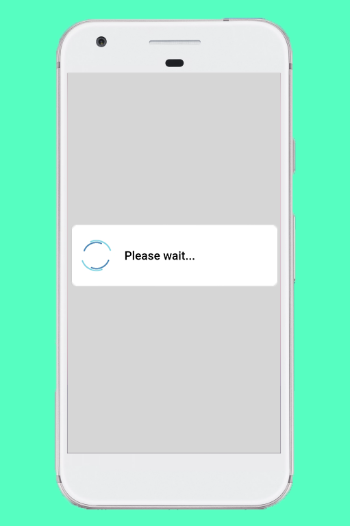
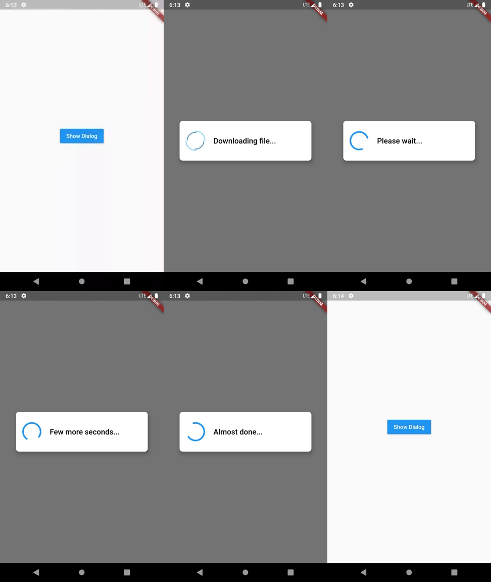
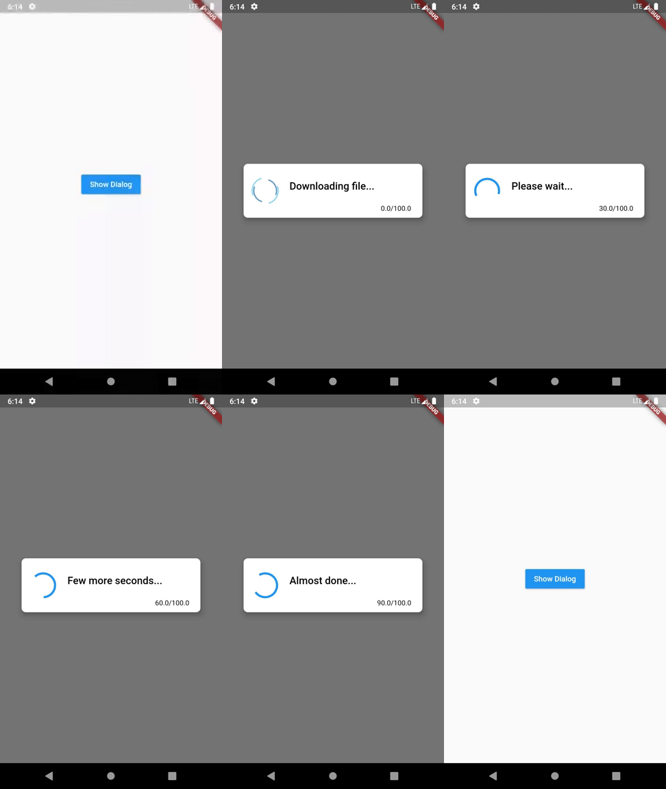
Normal dialog Demo Download dialog Demo

How to use

Import the package in your dart file

import 'package:progress_dialog/progress_dialog_null_safe.dart';

Create and initialise a ProgressDialog object inside the build() method passing context to it

  1. Initialize the ProgressDialog object
    final ProgressDialog pr = ProgressDialog(context);
    
  2. By default it is a normal dialog to show some message, if you would like to use it to show percentage of progress done, specify the optional type parameter and specify if you want your dialog to dismiss when back button is pressed isDismissible parameter (Optional)
    //For normal dialog
    pr = ProgressDialog(context,type: ProgressDialogType.Normal, isDismissible: true/false, showLogs: true/false);
        
    //For showing progress percentage
    pr =  ProgressDialog(context,type: ProgressDialogType.Download, isDismissible: true/false, showLogs: true/false);
    
  3. > Note: Please initialize the ```ProgressDialog```, where you have availability of the context
  4. Style the progress dialog (Optional)
    pr.style(
      message: 'Downloading file...',
      borderRadius: 10.0,
      backgroundColor: Colors.white,
      progressWidget: CircularProgressIndicator(),
      elevation: 10.0,
      insetAnimCurve: Curves.easeInOut,
      progress: 0.0,
      textDirection: TextDirection.rtl,
      maxProgress: 100.0,
      progressTextStyle: TextStyle(
         color: Colors.black, fontSize: 13.0, fontWeight: FontWeight.w400),
      messageTextStyle: TextStyle(
         color: Colors.black, fontSize: 19.0, fontWeight: FontWeight.w600)
      );
    
    Note: You don't need to use all parameters, all of them are optional
    
  5. Showing the progress dialog
    await pr.show();
    
  6. Dynamically update the content shown out there
    pr.update(
      progress: 50.0,
      message: "Please wait...",
      progressWidget: Container(
        padding: EdgeInsets.all(8.0), child: CircularProgressIndicator()),
      maxProgress: 100.0,
      progressTextStyle: TextStyle(
        color: Colors.black, fontSize: 13.0, fontWeight: FontWeight.w400),
      messageTextStyle: TextStyle(
        color: Colors.black, fontSize: 19.0, fontWeight: FontWeight.w600),
      );
    
    Note: You don't need to use all parameters, all of them are optional
    
  7. Dismissing the progress dialog
    pr.hide().then((isHidden) {
      print(isHidden);
    });
    
    // or
    await pr.hide();
    

Navigating to next screens must be done after the completion of Future - hide(). See here for example

Check if progress dialog is showing
bool isProgressDialogShowing = pr.isShowing();
print(isProgressDialogShowing);
Use custom body
    pr = ProgressDialog(
      context,
      type: ProgressDialogType.Normal,
      isDismissible: true,
      /// your body here
      customBody: LinearProgressIndicator(
        valueColor: AlwaysStoppedAnimation<Color>(Colors.blueAccent),
        backgroundColor: Colors.white,
      ),
    );

Demo

Normal dialog Demo Download dialog Demo

Default configuration/styles

If you don't like to configure/style the dialog and continue with the default style, it's okay but just have a look at our default configuration.

Attribute Value
Dismissible true
ProgressDialogType ProgressDialogType.Normal
BackgroundColor Colors.white
BorderRadius RoundedRectangularBorder(radius: 8.0)
AnimationCurve Curves.easeInOut
Elevation 8.0
ProgressWidget Double_rings_loding_indicator
MessageTextStyle color: Colors.black, fontSize: 19.0, fontWeight: FontWeight.w600
ProgressTextStyle color: Colors.black, fontSize: 13.0, fontWeight: FontWeight.w400
showLogs false
Well let's discuss limits for configuring it
Attribute Can be updated during instantiating Can be updated during styling Can be updated during dialog is shown
Dismissible Yes No No
ProgressDialogType Yes No No
BackgroundColor No Yes No
BorderRadius No Yes No
AnimationCurve No Yes No
Elevation No Yes No
ProgressWidget No Yes Yes
MessageTextStyle No Yes Yes
ProgressTextStyle No Yes Yes
ShowLogs Yes No No

Loading indicator -> https://loading.io/

Categories

Source repository

Projects using this package

No data available yet.