
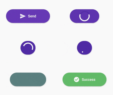
Overview
A customizable progress button widget for Flutter that supports Android, iOS, Web, macOS, Windows, and Linux. It allows developers to create buttons with dynamic states such as loading, success, error, and idle, enhancing user feedback during actions like form submissions or API calls. The widget is highly configurable, enabling customization of colors, labels, icons, and animations. It integrates seamlessly into existing Flutter apps and provides a consistent experience across platforms.
Use cases
- Form submission with loading state
- Authentication flow progress
- File upload indicators
- Payment processing UI
- Onboarding wizard steps
Key features
- Multiple state support (idle, loading, success, error)
- Customizable appearance and behavior
- Cross-platform compatibility
- Animated transitions between states
- Configurable labels and icons
- Easy integration with existing widgets
Suitable for
- Developers building interactive forms
- Teams prioritizing UX consistency
- Apps requiring real-time feedback
- Cross-platform mobile and web applications
- Projects with complex user workflows
Considerations
- Requires understanding of Flutter state management
- May need additional styling for complex designs
- Limited to button-specific use cases
- Not suitable for non-interactive elements
- Depends on platform-specific rendering behaviors