
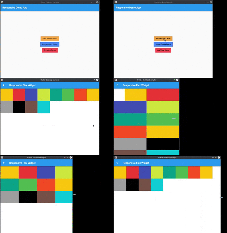
Overview
The responsive package simplifies creating adaptive user interfaces in Flutter applications across mobile, desktop, and web platforms. It enables developers to define different widget sizes and layouts based on screen size and device orientation, ensuring consistent and optimal UI experiences. With intuitive APIs, it streamlines responsive design without requiring complex conditional logic or manual media query handling. The package is particularly useful for apps targeting multiple form factors with varying screen dimensions.
Use cases
- Cross-platform app development
- Adaptive layouts for mobile and desktop
- Dynamic UI sizing based on screen orientation
- Building scalable web interfaces
- Responsive design for tablets and large screens
Key features
- Automatic screen size detection
- Orientation-aware widget sizing
- Simple API for responsive widgets
- Support for all major Flutter platforms
- Built-in breakpoints for common devices
Suitable for
- Developers building multi-platform Flutter apps
- Teams prioritizing UI consistency across devices
- Projects requiring dynamic layout adjustments
Considerations
- May require testing on multiple device types
- Performance impact with excessive nested responsive widgets
- Limited customization beyond predefined breakpoints