
Overview
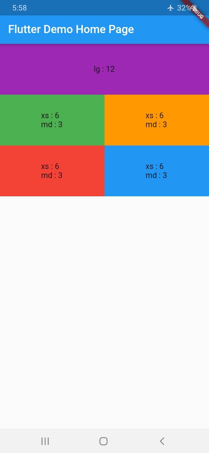
A Flutter package that enables responsive grid layouts and lists across multiple platforms. It automatically adjusts column counts and spacing based on screen size, ensuring optimal UI presentation on Android, iOS, Web, macOS, Windows, and Linux. The package simplifies creating adaptive interfaces without writing complex media query logic. Ideal for dashboards, product catalogs, and content grids that need to scale gracefully.
Use cases
- Building responsive dashboards
- Creating adaptive product grids
- Designing cross-platform layouts
- Displaying dynamic content in rows
- Implementing fluid list structures
Key features
- Auto-adjusts columns by screen size
- Supports all major Flutter platforms
- Simple API with minimal setup
- Customizable spacing and alignment
- Built-in responsive breakpoints
Suitable for
- Developers building multi-platform apps
- UI designers needing flexible layouts
- Projects requiring adaptive content grids
- Teams prioritizing responsive design
- Apps targeting diverse device sizes
Considerations
- May require tuning for complex nested layouts
- Performance impact on very large datasets
- Limited customization beyond basic grid settings
- Not ideal for highly dynamic or animated grids
- Depends on correct use of constraints in parent widgets