
Overview
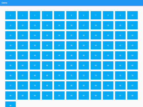
A Flutter package that enables the creation of responsive grid lists using ListView.builder() or SliverList with a SliverChildBuilderDelegate. It automatically adjusts the number of columns based on screen size, ensuring optimal layout across devices. Ideal for displaying collections of items like images, cards, or products in a fluid, adaptive manner. The package supports all major platforms including Android, iOS, Web, macOS, Windows, and Linux.
Use cases
- Displaying image galleries
- Building product catalogs
- Creating adaptive card layouts
- Implementing responsive dashboards
- Rendering dynamic content grids
Key features
- Auto-adjusts columns by screen size
- Supports ListView.builder and SliverList
- Cross-platform compatibility
- Simple integration with existing widgets
- Flexible item sizing
Suitable for
- Developers building responsive UIs
- Apps targeting multiple device sizes
- Content-heavy applications
- Design systems requiring grid consistency
Considerations
- Requires careful handling of item aspect ratios
- May need custom spacing adjustments
- Not ideal for highly complex grid patterns
- Performance depends on item complexity
- Limited to basic grid behaviors without advanced customization