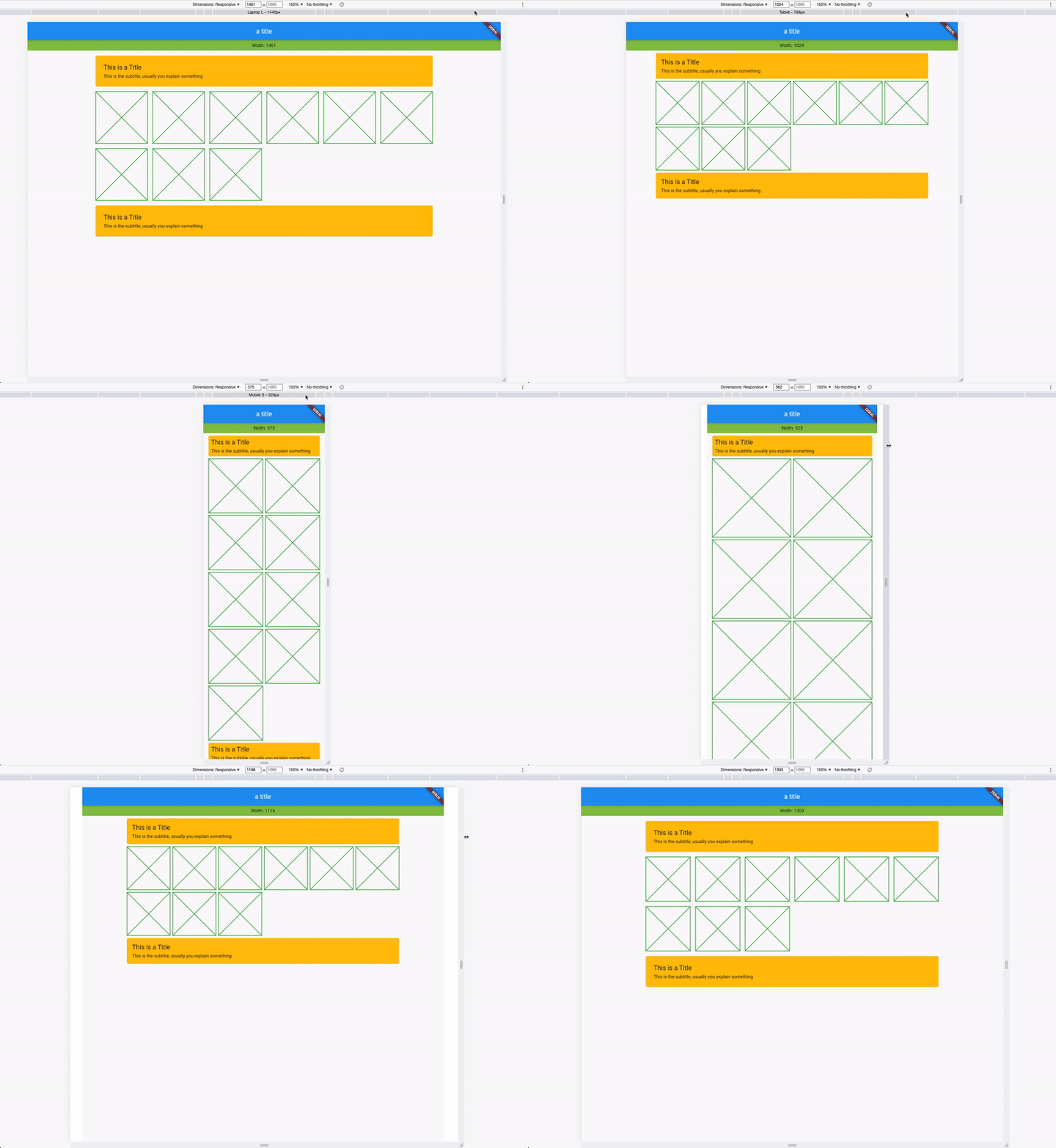
Package selection guidance compiled from public package information, community data, and project usage.
ResponsiveSpacing is a Flutter/Dart package that enables developers to create adaptive and responsive user interfaces by dynamically adjusting spacing, margins, paddings, gutters, body size, and column layouts based on screen size. It simplifies responsive design across multiple platforms including Android, iOS, Web, macOS, Windows, and Linux. By using built-in responsive units and breakpoints, it ensures consistent UI appearance regardless of device dimensions. Ideal for apps requiring flexible layouts without writing repetitive media query logic.
Use cases
Building cross-platform responsive layouts
Adapting UI for different screen sizes
Creating fluid grid systems
Automating padding and margin adjustments
Designing scalable mobile and web interfaces
Key features
Dynamic spacing based on screen size
Built-in responsive breakpoints
Support for margins, paddings, and gutters
Cross-platform compatibility
Easy integration with existing Flutter widgets
Flexible column and body size controls
Suitable for
Developers building responsive Flutter apps
Teams targeting multiple platforms
UI designers focusing on adaptability
Projects requiring scalable layout systems
Apps with complex responsive requirements
Considerations
May require initial learning curve for new users
Performance impact in very large widget trees
Depends on accurate screen size detection
Best used with consistent design system
Limited customization beyond provided responsive units
Original README
Original README snapshot from the linked source repository. Visit the repository for the latest content.
This plugin helps to design and develop beautiful responsive and adaptive flutter apps.
Lightweight, Responsive Spacing
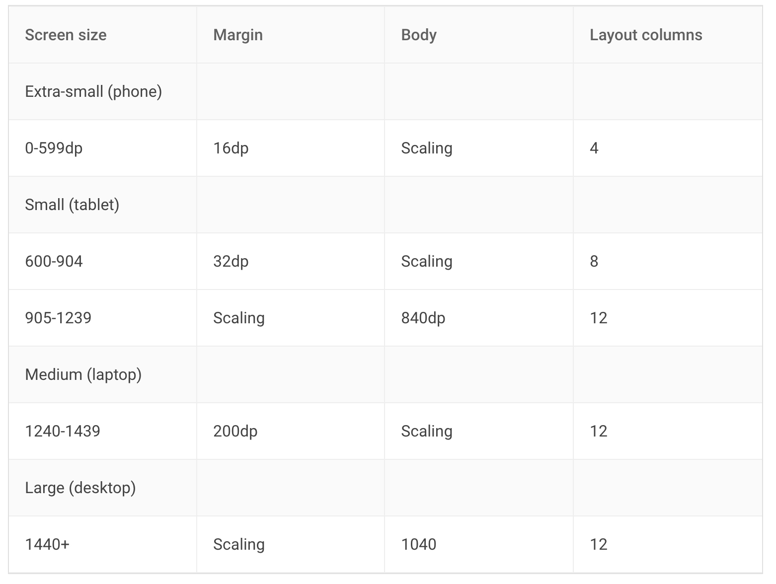
All design principles have roughly the same elements. For example, Material Design works with margin, gutter, body and has a responsive 12 column system.
Our default values are set by the Material Design Guidelines, but you can also easily set your own breakpoints, margins, and spacing.
You can find spacings everywhere in your Project, don't use Magic Numbers, use the context-oriented spacing class instead.
We have developed this plugin so that you can easily make your app adaptive and responsive.
Simple Spacing
Access your own Spacing-System:
// Example values for a Pixel 7 Pro
context.spacing.xs; // default 2
context.spacing.s; // default 8
context.spacing.m; // default 12
context.spacing.l; // default 16
context.spacing.xl; // default 32
context.spacing.xxl; // default 56// Example:// Instead of SizedBox(height: 8);
// useSizedBox(height: context.spacing.s); // Wow!
And whenever your design guru wants to modify the values, you only have to modify it in a single file.
Giga Spacing for all design chads that need more power
Design Gurus are around the world and you will maybe find one in your own company. If you have such a mysterious creature, use the Giga Spacing class for even more fine tuning.
In the previous Example, we used the any override, this will ignore the layout width. If you want to make the spacings responsive, override the values for xl, lg, md, sm2, sm1 & xs
And in your Widget, access the Spacing class with Spacing.of(context) or context.spacingConfig which returns an object of ResponsiveData. The object has all necessary spacings.
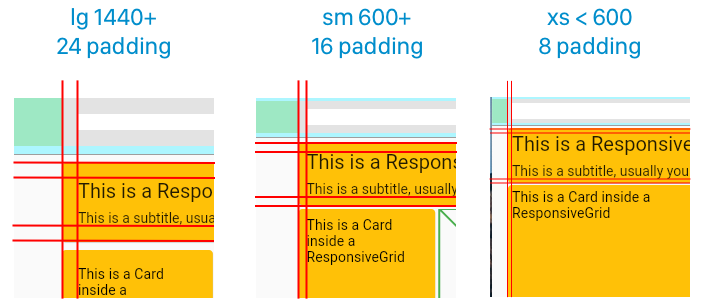
context.spacingConfig.margin;
context.spacingConfig.padding;
context.spacingConfig.gutter;
context.spacingConfig.body;
context.spacingConfig.layoutColumns;

// You are now good to use these properties in your layout.
For example with a Card:
Card(
  // use margin
  margin: context.spacingConfig.margin.horizontalEdgeInsets,

  child: Padding(

    // use padding
    padding: context.spacingConfig.padding.allEdgeInsets,

    child: Column(
      children: [
        Text("This is a Title"),
        Text("This is the subtitle, usually you explain something")
      ],
    ),
  ),
)
Columns, Gutters & Margins
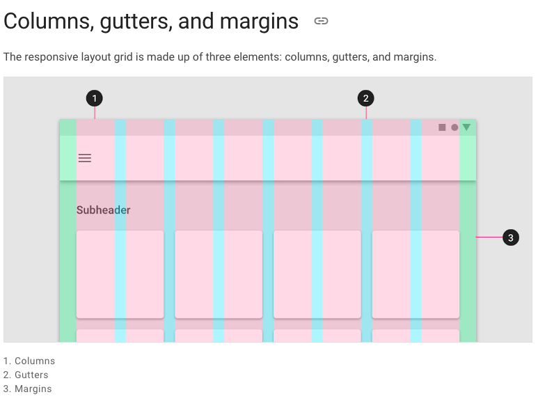
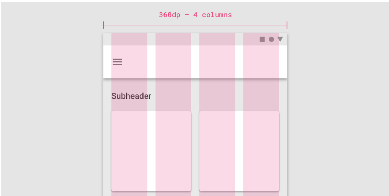
The responsive layout grid is made up of three elements: columns, gutters, and margins. Read everything about Columns, Gutters & Margins on the material guidelines responsive layout page.
Example: Access global padding setting in your widget:
Spacing.of(context).padding

// or

context.spacingConfig.padding
Just like the custom breakpoints, you can also set your own spacing, spaces, and margins. Create your own gutter class by extending ResponsiveCollection:
There are two types of widgets, the data widgets that create the spacing context and widgets that use the spacing context.
Data Widgets
Data widgets create the spacing context and provide responsive values to all widgets created in the tree below. if there are multiple data widgets in the tree, the closest one is taken.