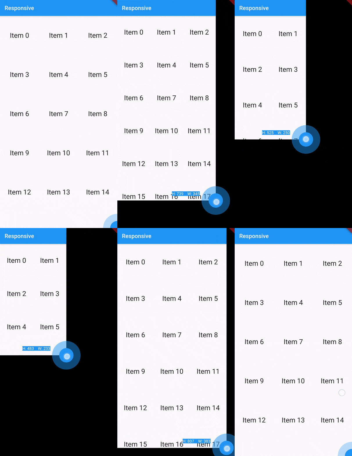
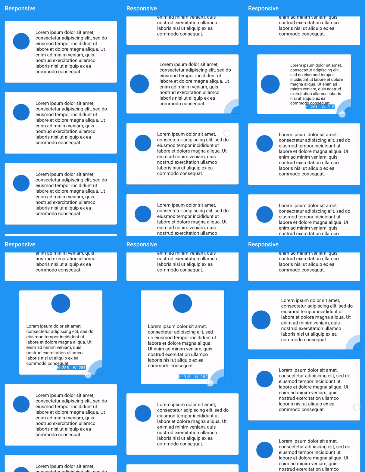
Responsive_Util is a Flutter package that provides a draggable widget for testing responsive design by allowing users to resize its child's bounds interactively. It helps developers visualize how layouts adapt across different screen sizes during development. The widget supports all major platforms, including mobile, web, and desktop, making it ideal for cross-platform UI testing. By enabling real-time adjustments, it streamlines the process of fine-tuning responsive layouts without needing multiple device emulators.
Use cases
- Testing responsive layouts in development
- Adjusting UI behavior across screen sizes
- Visual debugging of layout constraints
- Cross-platform UI validation
- Rapid prototyping of responsive designs
- Iterative design refinement
Key features
- Draggable bounds resizing
- Real-time layout preview
- Cross-platform support
- Simple integration with existing widgets
- No runtime performance overhead
- Built-in developer-friendly interface
Suitable for
- Flutter developers focused on responsive UI
- Teams testing multi-device compatibility
- Designers collaborating with developers
- Projects requiring frequent layout adjustments
- Developers using hot reload for rapid iteration
Considerations
- Not intended for production use
- Requires manual activation during development
- May interfere with gesture handling if nested improperly
- Limited to visual testing, not automated responsiveness
- Best used in debug mode only