Search packages, repositories and app categories

rolling_bottom_bar cover
Package detailsv0.2.2

rolling_bottom_bar

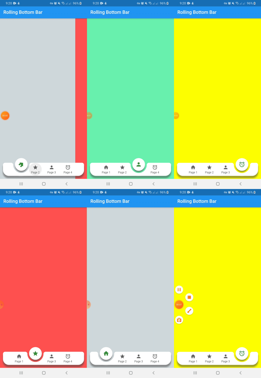
Package to show a dynamic bottom bar with a ball as indicator.

AndroidiOSWebmacOSWindowsLinux
30-day downloads
162
Likes
38
Pub points
140

Install package

flutter pub add rolling_bottom_bar

Package Overview

Package selection guidance compiled from public package information, community data, and project usage.

A Flutter package that implements a dynamic bottom navigation bar featuring a rolling ball indicator. The ball smoothly animates across the bar to indicate the current selected tab, offering a modern and interactive user experience. It supports multiple platforms including Android, iOS, Web, macOS, Windows, and Linux. The package is lightweight and customizable, allowing developers to adjust colors, sizes, and animation speed. Ideal for apps seeking a visually engaging navigation interface with fluid transitions.

Use cases

  • Mobile app navigation
  • Web application interfaces
  • Cross-platform UI design
  • Interactive tab switching
  • Modern app aesthetics

Key features

  • Rolling ball indicator
  • Smooth animations
  • Cross-platform support
  • Customizable appearance
  • Lightweight implementation

Suitable for

  • Developers seeking modern navigation
  • Apps with multiple tabs
  • Design-focused Flutter projects
  • Interactive UI components
  • Multi-platform applications

Considerations

  • May require performance tuning on low-end devices
  • Limited customization for complex animations
  • Not ideal for simple static navigation
  • Requires understanding of Flutter animation principles
  • Best suited for apps with 3-5 tabs

Original README

Original README snapshot from the linked source repository. Visit the repository for the latest content.

Rolling Bottom Bar

This packages, based on this demo by Kabo showing a bottom bar with a dynamic ball indicator.

New Features 💥
  • Capability to avoid the bottom bar shadow by flat property on false
  • Setting active color by each item define on color property of RollingBottomBarItem widget

Demo

Instalation

Include rolling_bottom_bar in your pubspec.yaml file:

dependencies:
  flutter:
    sdk: flutter
  rolling_bottom_bar: version

Usage

To use this package, just import it into your file, build your bottom bar together with a PageView and enjoy it.

import 'package:rolling_bottom_bar/rolling_bottom_bar.dart';
import 'package:rolling_bottom_bar/rolling_bottom_bar_item.dart';

...

@override
  Widget build(BuildContext context) {
    return Scaffold(
      appBar: AppBar(
        title: Text('Rolling Bottom Bar'),
      ),
      body: PageView(
        controller: _controller,
        children: <Widget>[
          ColoredBox(color: Colors.blueGrey.shade100),
          ColoredBox(color: Colors.redAccent),
          ColoredBox(color: Colors.greenAccent),
          ColoredBox(color: Colors.yellowAccent),
        ],
      ),
      extendBody: true,
      bottomNavigationBar: RollingBottomBar(
        controller: _controller,
        items: [
          RollingBottomBarItem(Icons.home, label: 'Page 1'),
          RollingBottomBarItem(Icons.star, label: 'Page 2'),
          RollingBottomBarItem(Icons.person, label: 'Page 3'),
          RollingBottomBarItem(Icons.access_alarm, label: 'Page 4'),
        ],
        activeItemColor: Colors.green.shade700,
        enableIconRotation: true,
        onTap: (index) {
          _controller.animateToPage(
            index,
            duration: const Duration(milliseconds: 400),
            curve: Curves.easeOut,
          );
        },
      ),
    );
  }
}

...

Options for Rolling Bottom Bar Item use

Name Description Required Default
iconData IconData to use as item icon True
label String to use as label item False
activeColor Color to use when icon is active. Only works with useActiveColorByDefault property of RollingBottomBarItem set on true False Colors.green

Options for Rolling Bottom Bar use

Name Description Required Default
controller PageView controller to use to move between pages True
items List of RollingBottomBarItem to render into bottom bar True
onTap Function triggered when an item is tapped True
color Color value to use as background False Colors.white
itemColor Color value to use with inactive items False Colors.grey[700]
activeItemColor Color value to use with active items False Colors.green
enableIconRotation Boolean value to indicate when rotation effect is triggered False false
flat Boolean value to indicate if the bottom bar has shadow or not False false
useActiveColorByDefault Boolean value to indicate when to use individual active color for each child False true

Categories

Source repository

Projects using this package

No data available yet.