Package selection guidance compiled from public package information, community data, and project usage.
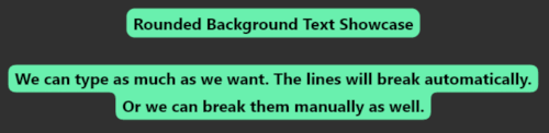
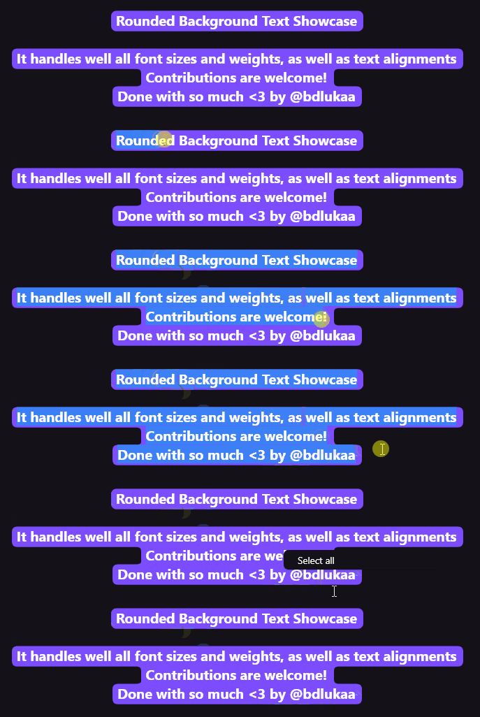
A Flutter package that adds rounded corner backgrounds to text elements, including Text, TextField, and TextSpan. It enables visually appealing text highlighting with customizable colors, border radii, and padding. Ideal for creating modern UIs with emphasis on text readability and design flair. The package supports all major platforms—Android, iOS, Web, macOS, Windows, and Linux—ensuring consistent styling across devices. Simple integration via a single pub add command makes it accessible for developers seeking elegant text effects without complex custom painting.
Use cases
Highlighting key text in apps
Creating styled input fields
Adding visual emphasis to labels
Designing modern UI components
Enhancing accessibility through contrast
Building interactive text elements
Key features
Rounded corner background for Text
Support for TextField with rounded background
Customizable border radius and padding
Compatible with TextSpan
Cross-platform support
Easy integration via pub.dev
Suitable for
UI designers seeking visual polish
Developers building modern Flutter apps
Apps requiring highlighted text elements
Projects focused on accessibility and readability
Teams wanting quick effect implementation
Considerations
May impact performance with many instances
Requires careful color contrast for accessibility
Limited to text decoration use cases
Not suitable for complex layouts
Depends on platform rendering consistency
Best used sparingly to avoid visual clutter
Original README
Original README snapshot from the linked source repository. Visit the repository for the latest content.
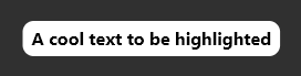
RoundedBackgroundText(
'A cool text to be highlighted',
style: constTextStyle(fontWeight: FontWeight.bold),
backgroundColor: Colors.white,
),
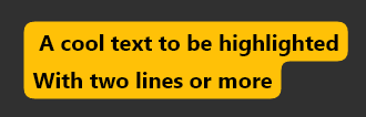
Multiline text is also supported
RoundedBackgroundText(
'A cool text to be highlighted\nWith two lines or more',
style: constTextStyle(fontWeight: FontWeight.bold),
backgroundColor: Colors.amber,
),
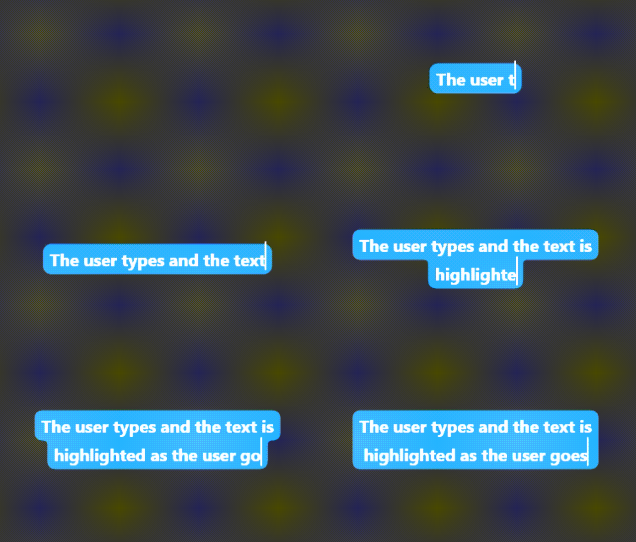
The text highlight will follow the text field scroll position.
Highlight a text span:
Highlight a small part of a text
RichText(
text: TextSpan(
text: 'Start your text and ',
children: [
RoundedBackgroundTextSpan(
text: 'highlight something',
backgroundColor: Colors.blue,
),
constTextSpan(text: ' when necessary'),
],
),
),
Select a highlighted text:
Use RoundedBackgroundText.selectable to make the text selectable:
RoundedBackgroundText.selectable(
'A cool highlighted text to be selected',
style: constTextStyle(fontWeight: FontWeight.bold),
backgroundColor: Colors.white,
),
You may like to know:
Change the corner radius
You can change the radius of the corners by setting innerRadius and outerRadius:
RoundedBackgroundText(
'A cool text to be highlighted',
style: constTextStyle(fontWeight: FontWeight.bold),
backgroundColor: Colors.white,
innerRadius: 15.0,
outerRadius: 10.0,
),
The max allowed value is 20.0. The min is 0.0
Deep dive
This section explains, with details, how the background painting works.
RoundedBackgroundText doesn't use a Text widget under the hood. Instead, it uses a custom text painter to paint the text above the background. As soon as the RoundedBackgroundText widget is initialized, the line metrics for the text is calculated (See computeLineMetrics), and is recalculated when the text changes or when the parent width changes. This is done at built time, resulting in a smooth experience for the user.
To paint the background, the line metrics generated before is used. Each line has 4 properties:
x - where the line starts horizontally within the size
y - where the line starts vertically within the size
width - the horizontal size of the line
height - the vertical size of the line
With these values, we can generate the background for each line. The background is generated around the whole text: from top-left to bottom-left to bottom-right to top-right to top-left. This makes it easy to calculate when there is a corner, either outer or inner.
The inner and outer radius are dynamically calculated based on the line height, provided by the line metrics, and the given innerRadius and outerRadius, respectively. By default, innerRadius is 10.0 and outerRadius is 10.0. For safety, in order to keep the roundnesses correct, these values must be in the bounds of 0.0 (min) and 20.0 max, otherwise the painting would be out the line.