Search packages, repositories and app categories

rounded_expansion_tile cover
Package detailsv0.0.13

rounded_expansion_tile

A simple Expansiontile for Flutter applications with borderradius.

AndroidiOSWebmacOSWindowsLinux
30-day downloads
705
Likes
28
Pub points
135

Install package

flutter pub add rounded_expansion_tile

Package Overview

Package selection guidance compiled from public package information, community data, and project usage.

A Flutter package that provides an enhanced ExpansionTile with customizable border radius, offering a modern and visually appealing design for collapsible content sections. Built for simplicity and integration, it extends the standard ExpansionTile with rounded corners across all platforms. Ideal for creating clean, user-friendly interfaces in mobile and web applications. The package is lightweight and maintains compatibility with Flutter's core widgets.

Use cases

  • Creating styled collapsible sections in forms
  • Designing responsive accordions in dashboards
  • Enhancing UI consistency with rounded interactive elements
  • Building accessible navigation panels
  • Implementing expandable product details in e-commerce apps

Key features

  • Customizable border radius
  • Cross-platform support (Android, iOS, Web, macOS, Windows, Linux)
  • Simple integration with existing Flutter projects
  • Extends standard ExpansionTile
  • Lightweight and minimal dependencies

Suitable for

  • Developers seeking polished UI components
  • UI designers focusing on visual cohesion
  • Projects requiring consistent rounded card-like expansions
  • Apps targeting multiple platforms
  • Flutter beginners exploring widget customization

Considerations

  • Limited to border radius styling only
  • Does not include additional animations beyond standard ExpansionTile
  • Requires manual handling of content padding if needed
  • No built-in icon or title customization beyond default
  • Best suited for simple expansion use cases without complex layouts
Original README

Original README snapshot from the linked source repository. Visit the repository for the latest content.

Rounded Expansiontile

A simple combination of widgets to provide an Expansiontile with rounded corners. This widget uses default Flutter widgets only and is available for each platform.

Getting Started

This Widget returns a column with a ListTile and a ListView. It has all properties of the ListTile width a few custom inputfield. Simply load the widget in your pubspec yaml and start using it.

Inputfields

Default ListTile and ExpansionTile inputfields
  • autofocus

  • contentPadding

  • dense

  • enabled

  • enableFeedback

  • focusColor

  • focusNode

  • horizontalTitleGap

  • hoverColor

  • isThreeLine

  • key

  • leading

  • minLeadingWidth

  • minVerticalPadding

  • mouseCursor

  • onLongPress

  • selected

  • selectedTileColor

  • shape

  • subtitle

  • title

  • tileColor

  • trailing

  • visualDensity

  • onTap

  • initiallyExpanded

Extra inputfields and tips
  • shape Shape()

    The shape will be used for the shape of the ListTile, not for the children. This is visible when pressed and will be shown in the ink splash.

    Use the RoundedExpansionTile in a Card-widget with the same shape for the best result.

    Card(
        shape: RoundedRectangleBorder(borderRadius: BorderRadius.circular(16)),
        child: RoundedExpansionTile(
            shape: RoundedRectangleBorder(borderRadius: BorderRadius.circular(16)),
            title: Text('Some title'),
            children: [
                child1,
                child2,
                child3,
                ...
            ],
        ),
    ),
    
  • duration Duration()

    This will be used to show the expansion animation. It is used for the Expansion it self and the rotation / animation of the Icon. By default the duration is 500 milliseconds.

  • children List<Widget>[]

    The children that will be displayd when the ListTile is expanded.

  • childrenPadding EdgeInsets()

    The padding around the children. This is not the same as the contentpadding.

  • curve Curve()

    The curve used for the children animation. By default it uses Curves.fastLinearToSlowEaseIn

  • trailing Widget()

    When provided this will override the default hamburger menu icon (AnimatedIcon). This icon will rotate by default but can be set to false see rotateTrailing.

  • rotateTrailing bool

    Rotate the custom trailing icon when provided. By default this is true. When set to false the icon stays the same. Provide the trailing with an arrow down to make the widget look like the default ExpansionTile.

  • noTrailing bool

    When set to true there will be no trailing at all. Even when provided custom trailing this bool will prevent it from being shown.

Example

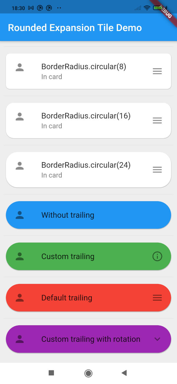
Screenshot of example app

Categories

Source repository

Projects using this package

No data available yet.