Search packages, repositories and app categories

scaled_app cover
Package detailsv2.3.2

scaled_app

Scale the entire UI design proportionally, useful when your UI design is fixed-width.

AndroidiOSWebmacOSWindowsLinux
30-day downloads
54.8K
Likes
96
Pub points
160

Install package

flutter pub add scaled_app

Package Overview

Package selection guidance compiled from public package information, community data, and project usage.

Scaled_App is a Flutter package that enables proportional scaling of the entire UI based on a reference design width. It ensures consistent layout and typography across different screen sizes by scaling widgets dynamically. Ideal for designs with a fixed-width foundation, it maintains visual fidelity without manual adjustments. The package supports all major platforms, including mobile, web, and desktop, making it suitable for cross-platform applications requiring precise UI control.

Use cases

  • Fixed-width design adaptation
  • Cross-platform UI consistency
  • Responsive layout scaling
  • Design system implementation
  • UI precision across devices

Key features

  • Proportional UI scaling
  • Reference design width support
  • Cross-platform compatibility
  • Automatic widget resizing
  • Minimal configuration required

Suitable for

  • Developers with fixed-width design specs
  • Teams using design systems
  • Apps targeting multiple screen sizes
  • Projects requiring pixel-perfect UI replication
  • Flutter apps with strict design constraints

Considerations

  • Best suited for fixed-width design workflows
  • May require initial setup for reference width
  • Not ideal for fluid or dynamic layouts
  • Performance impact negligible but depends on complexity
  • Requires careful testing on target devices
Original README

Original README snapshot from the linked source repository. Visit the repository for the latest content.

Scale the entire UI design proportionally.

Button, image, font, every widget is scaled simultaneously.

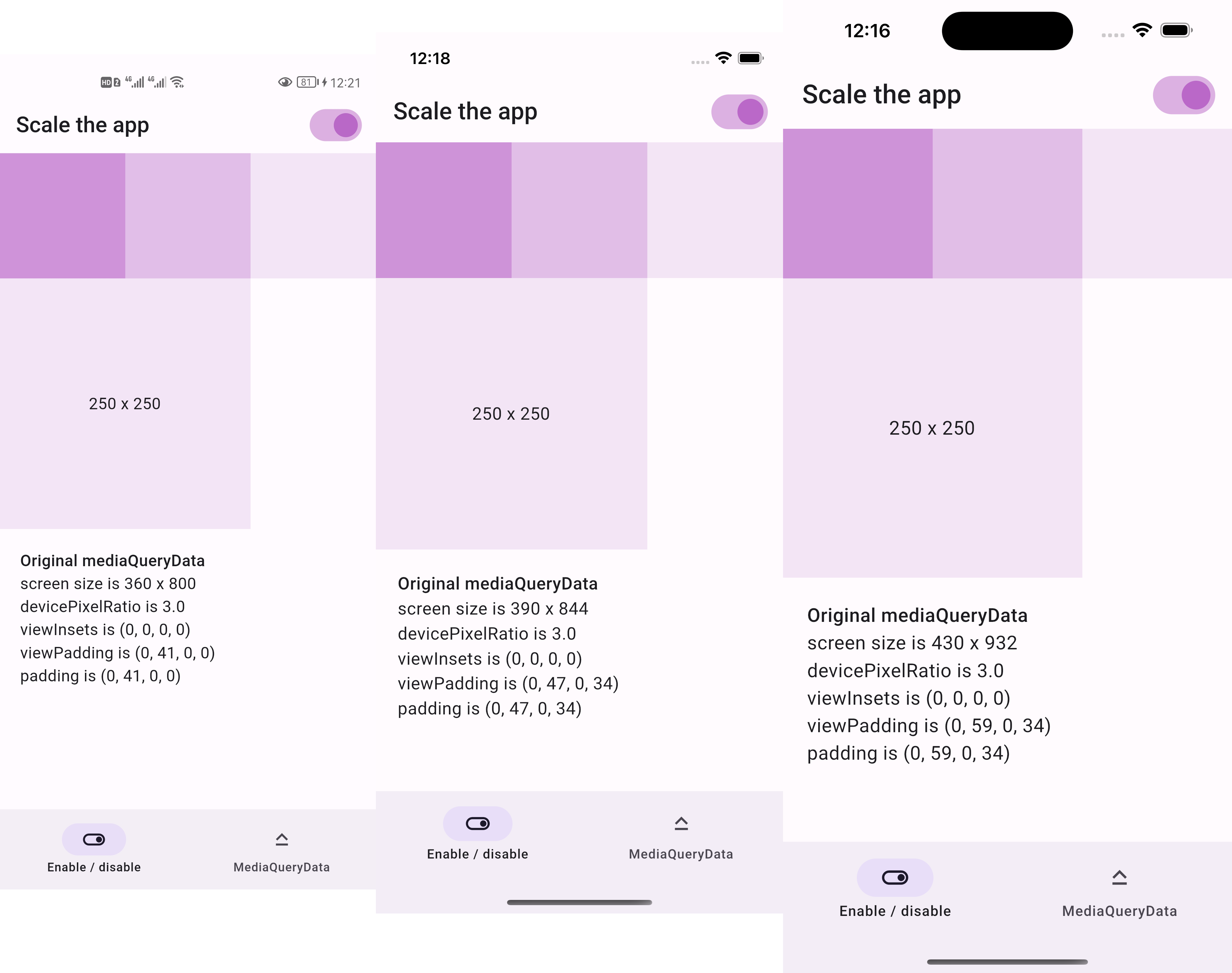
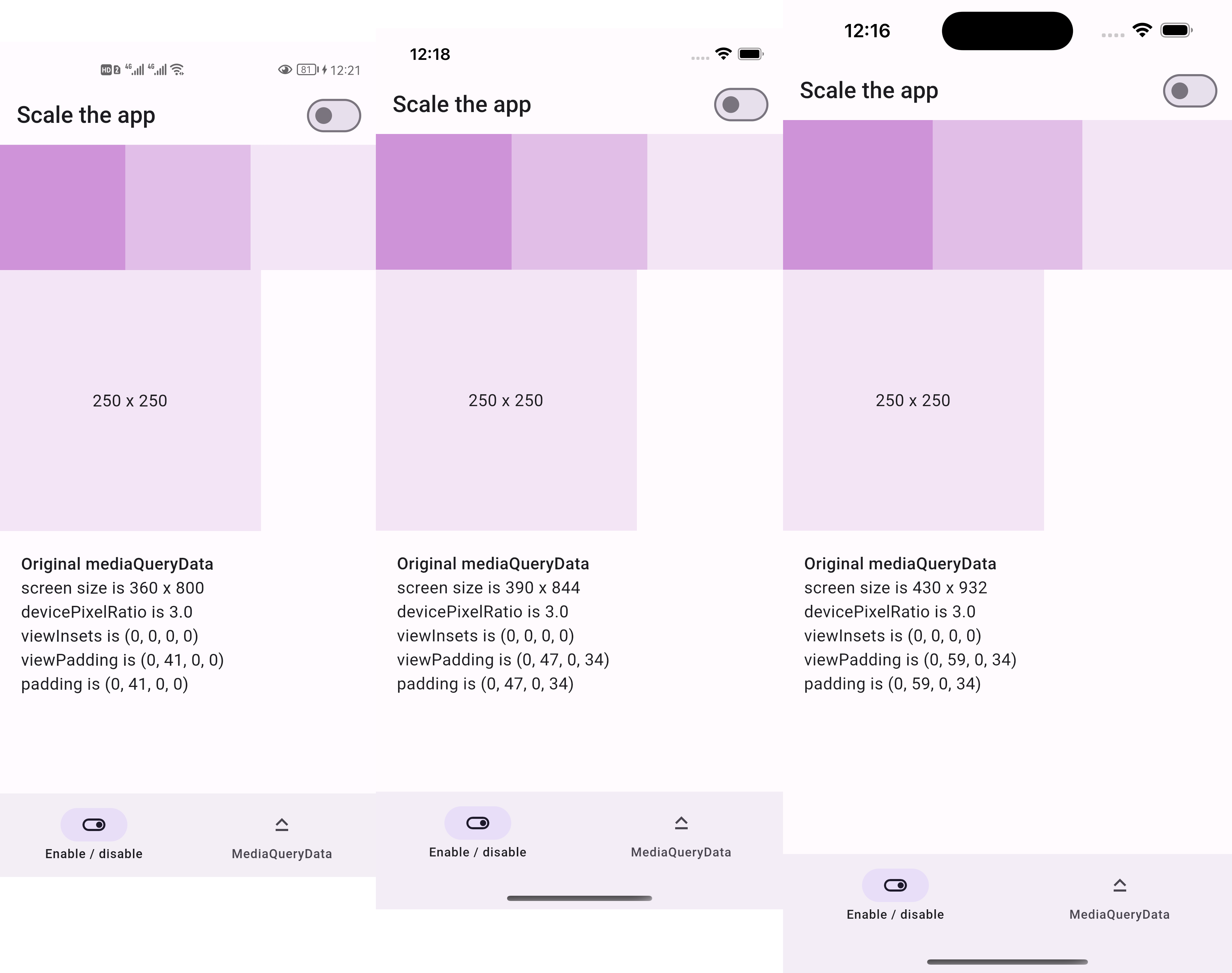
Before:

  • 250x250 square is the same size across devices

Screenshots of the same design before scaling

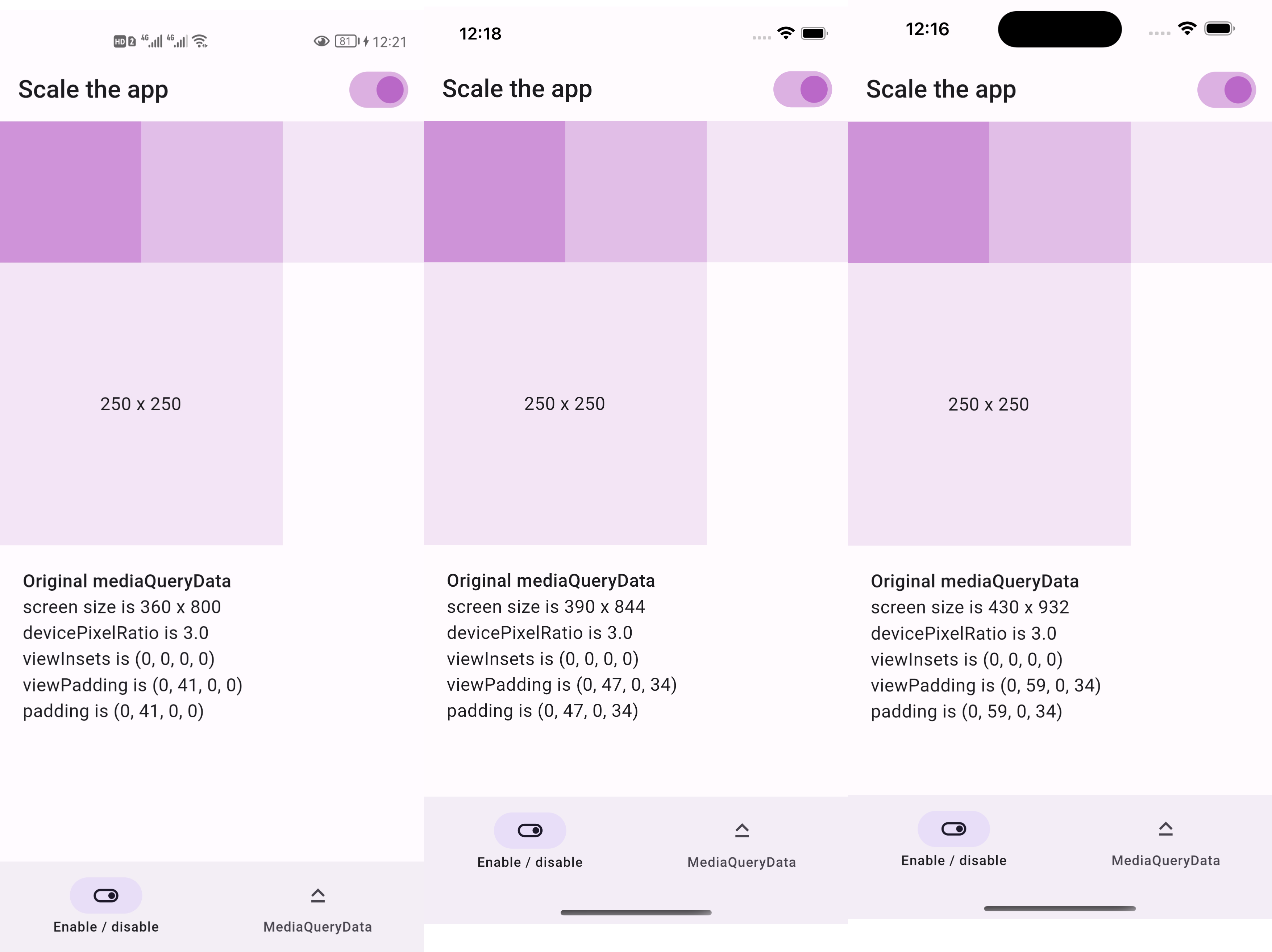
After:

  • 250x250 square is two thirds the screen width across devices

Screenshots of the same design after scaling

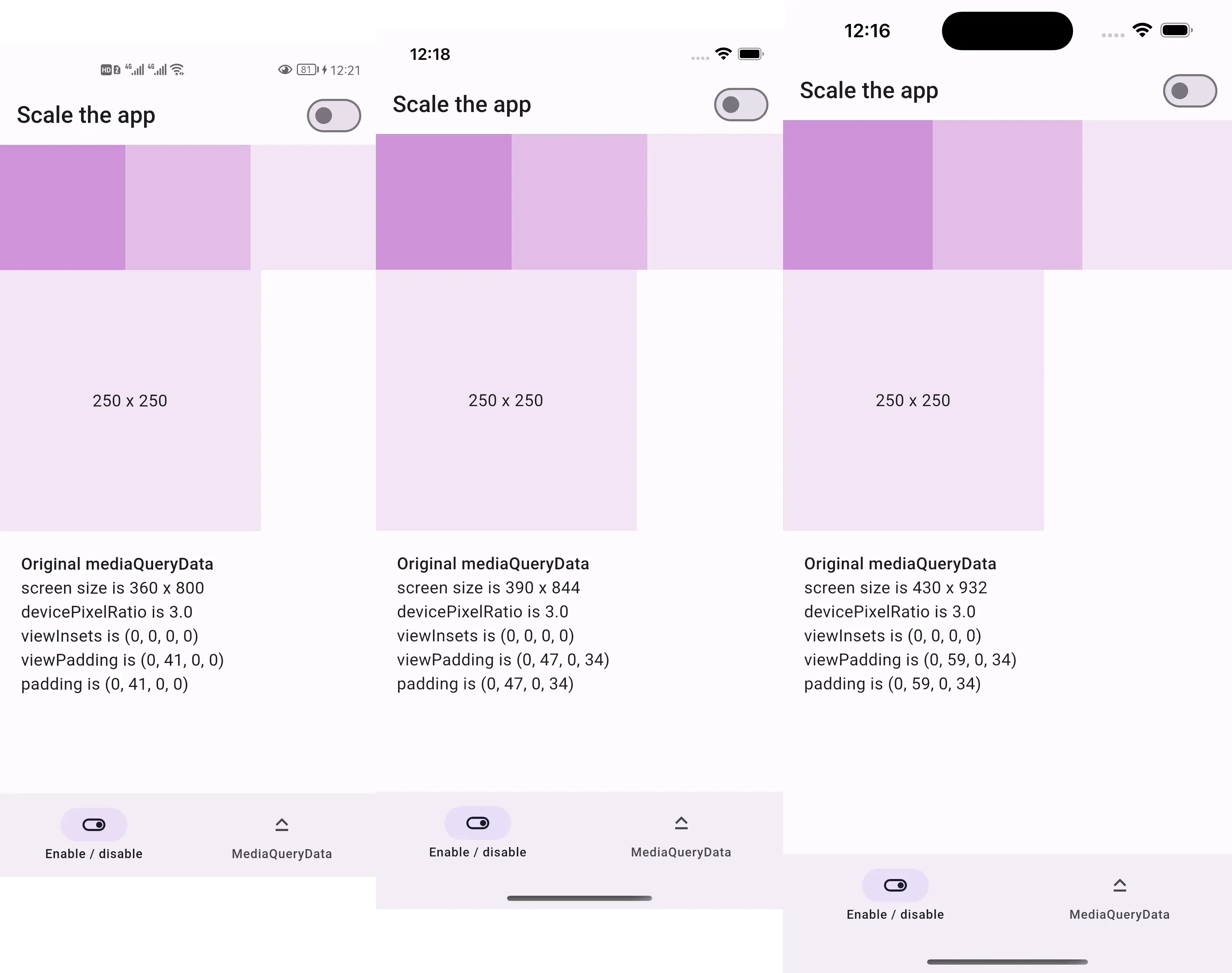
  • if we resize the screenshots above to be the same width
  • then everything appears the same size as below

Resized screenshots of the same design after scaling

Sponsor

庞征博引 — 想学的,慢慢都会

This package is sponsored by 庞征博引, which breaks complex subjects into 5–10 minute reads you work through, and ask questions about, at your own pace.

Live demo

https://lastmonopoly.github.io/flutter_web_app/scaled_app_demo/

Features

Use this package in your Flutter app when:

  • your UI design is fixed-width
  • you want to scale the entire UI, not just part of it

Usage

Firstly, replace runApp with runAppScaled

void main() {
  // 1st way to use this package
  runAppScaled(const MyApp(), scaleFactor: (deviceSize) {
    // screen width used in your UI design
    const double widthOfDesign = 375;
    return deviceSize.width / widthOfDesign;
  });
}

Or, replace WidgetsFlutterBinding with ScaledWidgetsFlutterBinding

void main() {
  // 2nd way to use this package
  // Scaling will be applied based on [scaleFactor] callback.
  ScaledWidgetsFlutterBinding.ensureInitialized(
    scaleFactor: (deviceSize) {
      // screen width used in your UI design
      const double widthOfDesign = 375;
      return deviceSize.width / widthOfDesign;
    },
  );
  runApp(const MyApp());
}

Then, use MediaQueryData.scale to scale size, viewInsets, viewPadding, etc.

class PageRoute extends StatelessWidget {
  const PageRoute({Key? key}) : super(key: key);

  @override
  Widget build(BuildContext context) {
    return MediaQuery(
      data: MediaQuery.of(context).scale(),
      child: const Scaffold(...),
    );
  }
}

Optionally, update ScaledWidgetsFlutterBinding.instance.scaleFactor to enable / disable scaling on demand.

Reference

https://juejin.cn/post/7078816723666731021

Categories

Source repository

Projects using this package

Rankings