Package selection guidance compiled from public package information, community data, and project usage.
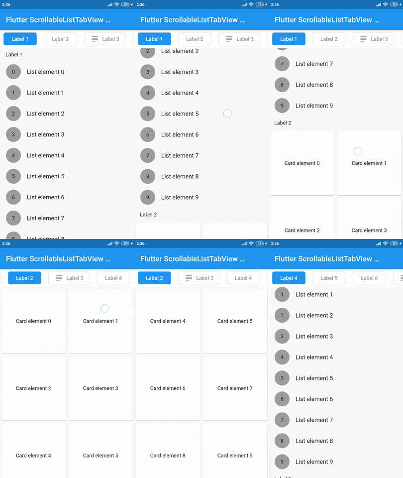
A Flutter widget that synchronizes a scrollable list with a custom tab view, ensuring smooth alignment between the two components. It enables users to navigate through content via scrolling while simultaneously updating the selected tab, and vice versa. Ideal for creating cohesive, interactive interfaces where list items and tabs are closely related. The package is lightweight and designed for seamless integration into existing Flutter projects.
Use cases
Synchronized list and tab navigation
Creating content-heavy dashboards
Building guided onboarding flows
Implementing scrollable tabbed interfaces
Key features
Real-time sync between scroll and tabs
Customizable tab styling
Supports dynamic content
Simple integration with existing widgets
Responsive behavior across devices
Suitable for
Developers building tabbed content layouts
Apps requiring synchronized scrolling and tab selection
Not suitable for highly complex nested navigations
Original README
Original README snapshot from the linked source repository. Visit the repository for the latest content.
scrollable_list_tabview
A Flutter widget which synchronize a ScrollView and a custom tab view.
The main idea is to create a custom tab view synchronizing with inner ScrollView. The scroll activity will trigger custom tab view at the top to follow the index of the inner scroll view widget.
Installation
Add dependency for package on your pubspec.yaml:
dependencies:
    scrollable_list_tabview: <latest>
Usage
To use this widget we must first define how our tabs will look like.
ListTab
Parameter
Definition
Widget icon
Trailing widget for a tab, typically an Icon.
Widget label
Label to be shown in the tab, must be non-null.
BorderRadiusGeometry borderRadius
BorderRadius value for a single tab.
Color activeBackgroundColor
Color to be used when the tab is selected.
Color inactiveBackgroundColor
Color to be used when the tab isn't selected.
bool showIconInList
Decide whether show icon widget in the scrollable view.
Color borderColor
Color of the border of tab when its not selected
Then we can use LisTab in ScrollableListTab.
ScrollableListTab
Parameter
Definition
ListTab tab
Data model used for rendering tab widgets.
ScrollView body
An individual inner scrollable widget.
Then ScrollableListTabView will take a list of ScrollableListTab as an argument.
ScrollableListTabView
Parameter
Definition
List<ScrollableListTab> tabs
List of tabs to be built.
double height
Height of the tab at the top of the view.
Duration tabAnimationDuration
Duration of tab change animation.
Duration bodyAnimationDuration
Duration of inner scroll view animation.
Curve tabAnimationCurve
Animation curve used when animating tab change.
Curve bodyAnimationCurve
Animation curve used when changing index of inner ScrollView(s).
There are some limitations on this package. For example we only support ScrollView to be the body. Also, we could have used builder pattern to build the widgets.
I would like to thank Google developers for creating awesome package called ScrollablePositionedList.
Contribution
Contributions are accepted via pull requests. For more information about how to contribute to this package, please check the contribution guide.
License
This project is licensed under the MIT license, additional knowledge about the license can be found here.