Package selection guidance compiled from public package information, community data, and project usage.
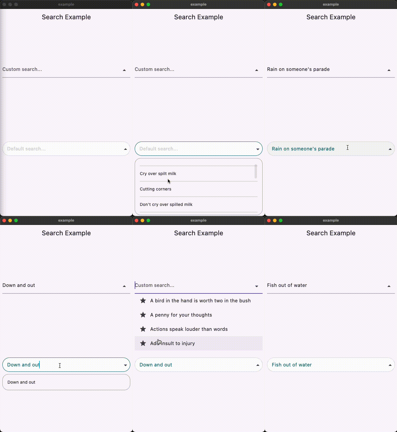
A Flutter widget for implementing autocomplete search functionality with customizable dropdowns and seamless integration with Cubit or BLoC state management. It enables users to input text and receive real-time suggestions, enhancing user experience in search-heavy applications. The package supports multiple platforms including Android, iOS, Web, macOS, Windows, and Linux, making it versatile for cross-platform development. With clean, modular design, it simplifies the creation of responsive and interactive search interfaces.
Use cases
Real-time search in apps
Filtering large datasets
Enhancing user input experience
Customizable suggestion dropdowns
Cross-platform search UI
Key features
Customizable dropdown UI
Cubit/BLoC integration
Real-time filtering
Multi-platform support
Simple API for quick setup
Suitable for
Search features in e-commerce apps
Data filtering in dashboards
User-friendly input fields
Developers using BLoC/Cubit
Cross-platform Flutter projects
Considerations
Requires state management knowledge
May need styling customization
Performance depends on data size
Limited built-in themes
Best suited for moderate-sized datasets
Original README
Original README snapshot from the linked source repository. Visit the repository for the latest content.
Search Autocomplete Flutter Package
Overview
This Flutter package provides a SearchAutocomplete widget for implementing autocomplete functionality with a dropdown menu. The package offers extensive customization options for the search field, dropdown items, and includes hooks for search logic.
Installation
To use this package, add search_autocomplete as a dependency in your pubspec.yaml file:
dependencies:
  search_autocomplete: ^1.0.3
Features
Customizable search field
Customizable dropdown items
Hooks for search logic
Initial value support
Placeholder text support
Widget to display when the dropdown is empty
State Management Compatibility
Designed to work seamlessly with Cubit/Bloc and other orthodox state managers. Since the list updating logic resides higher up in the widget tree, it allows for a clean separation between UI and logic.
Usage
Here's a simple example demonstrating how to use the SearchAutocomplete widget:
Basic example:
SearchAutocomplete<String>(
  options: state.filteredItems, // Like: ['Apple', 'Banana', 'Orange'],
  initValue: state.currentItem, // Like: 'Apple',
  getString: (item) => item,
  onSearch: (query) {
    // Call your Bloc/Cubit/Provider method to filter options based on the query
    context.read<SearchCubit>().search(query);
  },
  onSelected: (item) {
    // Update your Bloc/Cubit/Provider state when an item is selected
    context.read<SearchCubit>().select(item);
  },
  hintText: 'Search fruits...',
)
Customization example:
You can customize both the search field and dropdown items appearance using provided builders: