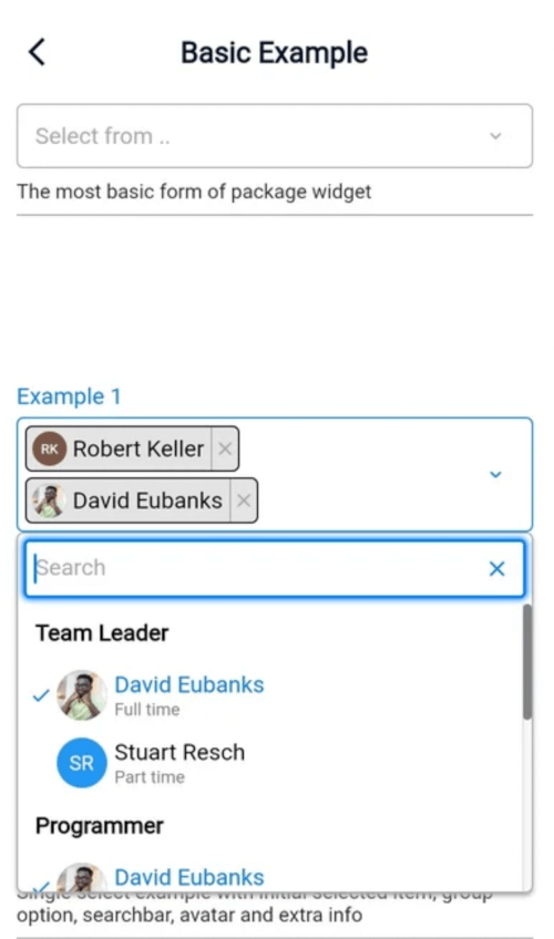
Select2dot1 give you a fully customizable single/multiple select box with support for searching, group option, extra info and avatar. Works using overlay and modal.
Package selection guidance compiled from public package information, community data, and project usage.
Select2dot1 is a highly customizable Flutter package for creating single or multiple select dropdowns with advanced features like search functionality, grouped options, custom option details, and avatar support. Built using overlays and modals, it provides a seamless user experience across platforms. The package is ideal for forms and data selection interfaces requiring rich interaction and visual customization. It supports all major platforms including Android, iOS, Web, macOS, Windows, and Linux.
Use cases
Form inputs with searchable options
Multi-select dropdowns in dashboards
Grouped category selection
User profile selection with avatars
Dynamic filtering of large datasets
Key features
Searchable dropdowns
Support for grouped options
Customizable option widgets
Avatar and extra info display
Overlay-based modal implementation
Suitable for
Developers needing rich select components
Apps with complex data selection needs
Cross-platform applications
UI-heavy forms and admin panels
Considerations
Requires careful styling for optimal UX
May need performance tuning with very large datasets
Overlay behavior may require platform-specific adjustments
Original README
Original README snapshot from the linked source repository. Visit the repository for the latest content.
Select2dot1
Introduction
Select2dot1 gives you a customizable single/multiple select box with support for searching, group option, extra info and avatar. Select2dot1 utilizes overlays on (web, desktop) and modal for mobile. Its entirely customizable through settings and builder.
ScrollController is used to control anchor position of dropdown menu. You can pass your own ScrollController to Select2dot1 widget.
Fully Customizable
If you want to change something that is not available in settings, you will have to make your own component through using the builder option.
Check the customization section for more information.
Components and Settings
Components View
In this section you can see how the components of Select2dot1 widget look like as well as their hierarchy. You can also see how to customize them by settings and builder. For more details hierarchy of components , go to Tree View Components with Settings section.
If you want to see treeview components with all settings you can access here.
Miro is an absolutely wonderful app that im familiar with, i would highly recommend you checking it outTree View was created by . If you want to customize any of the components of Select2dot1 widget, you can use Tree View to see all the components and settings.
Customization
If you want to customize Select2dot1 widget you can do it through utilizing the settings and builder.
The first option you can try to use is to use settings to customize, if you have a hard time with that you can use builder.
By Settings
Use global settings to customize all components of Select2dot1 widget
You can pass global settings to Select2dot1 widget. Global settings will be used by the components of Select2dot1 widget.
In the following example you will be shown how to customize mainColor and fontFamily for all the components of Select2dot1 widget.
Use single component settings to customize only one component of Select2dot1 widget
You can pass the single component settings to Select2dot1 widget. Single component settings will be used only by one component of Select2dot1 widget.
In the following example you will be shown how to customize the CategoryNameOverlay component and CategoryItemOverlay component in Dropdown (modification of the design only be done through desktop overlay).
Using builder you can customize all components of Select2dot1 widget. You can use your own components or you can use the default components that are available in Select2dot1 widget.
Create your own component completely
You can create your own component by using Select2dot1Builder class. You have to pass your own component to Select2dot1Builder class and then pass this class to Select2dot1 widget. When you are using builder you have access to all data that you need to create your own component.
If you want to change the layout of your component you can utilize other component templates, so you can use the default components that are available.
Remember that when using this builder, you must make sure that the code thats written is correct before you do anything else.
ATTENTION: For better performance create SelectDataController as field in class not in build
class_BasicExample1StateextendsState<BasicExample1> {
finalSelectDataController selectDataController = SelectDataController(
data: ExampleData.exampleData1,
);
@overrideWidgetbuild(BuildContext context) {
// Do not create SelectDataController in build method!// return Select2dot1(selectDataController: SelectDataController(data: ExampleData.exampleData1))returnSelect2dot1(selectDataController: selectDataController);
}
}
SelectDataController is a controller that is used to manage the data in Select2dot1 widget. You can use it to add, remove, select and deselect data. All the data that you want to display in Select2dot1 widget must be added to SelectDataController
Remember that when isMultiple is false, you can add only one position to initialSelectedData.
In SelectDataController you can also set:
inital selected data
multiple select or single select
Select2dot1(
selectDataController:
SelectDataController(
data: exampleData,
isMultiple: false,
initialSelectedData: [ // Remember that when isMultiple is false, you can add only one position to initialSelectedData.SingleItemCategoryModel(
nameSingleItem: 'Stuart Resch',
value: 'Stuart Resch 1',
),
],
),
);
Contributing
Pull requests (the pull request template is available for use) are welcome. For major changes, please open an issue first to discuss what you would like to change. More information about contributing you can find here. Remember to follow the code of conduct.
Issues
If you find any issues (bug, feature, performance or other), please report them here.
Please do not ask questions in the issue tracker. Use Q&A section instead.
Please do not report security vulnerabilities on the public issue tracker. The SECURITY page details the procedure for disclosing security issues.
Security
If you discover any security related issues, please go to SECURITY page.
Contributors
Roman Dykyj (@romanjrdykyj)
QA
If you have any questions, feel free to ask them here.
FAQ
How to get selected item?
Use 'onChanged' Callback Function
You can pass callback function to Select2dot1 widget. This function will be called every time when user select an item.
Select2dot1(
    selectDataController: SelectDataController(data: exampleData),
    onChanged: (value) {
        print(value); // value is a list of selected items
    },
),
How to used only overlay or modal mode on all platforms?
It is not possible to use only overlay or modal mode on all platforms. It is automatically set by the package. Overlay mode is used on desktop and modal mode is used on mobile.
How to set NO group select?
If you dont want to group select, you dont need to use name parameter in SingleCategoryModel.
staticconstList<SingleCategoryModel> exampleData3 = [
SingleCategoryModel(
nameCategory: null, // If you dont want to group select, you dont need to use name parameter in SingleCategoryModel or set it to null.
singleItemCategoryList: [
SingleItemCategoryModel(nameSingleItem: 'Alabama',),
SingleItemCategoryModel(nameSingleItem: 'Arkansas'),
SingleItemCategoryModel(nameSingleItem: 'Illonois'),
],
),
];
License
This package is licensed under the MIT license. To see the full license text, see the LICENSE file.