Package selection guidance compiled from public package information, community data, and project usage.
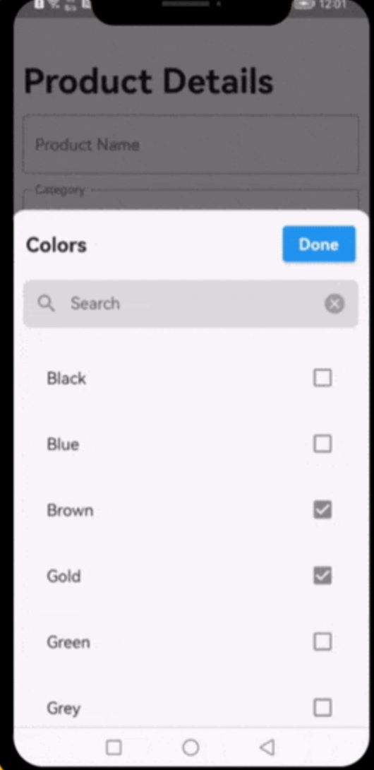
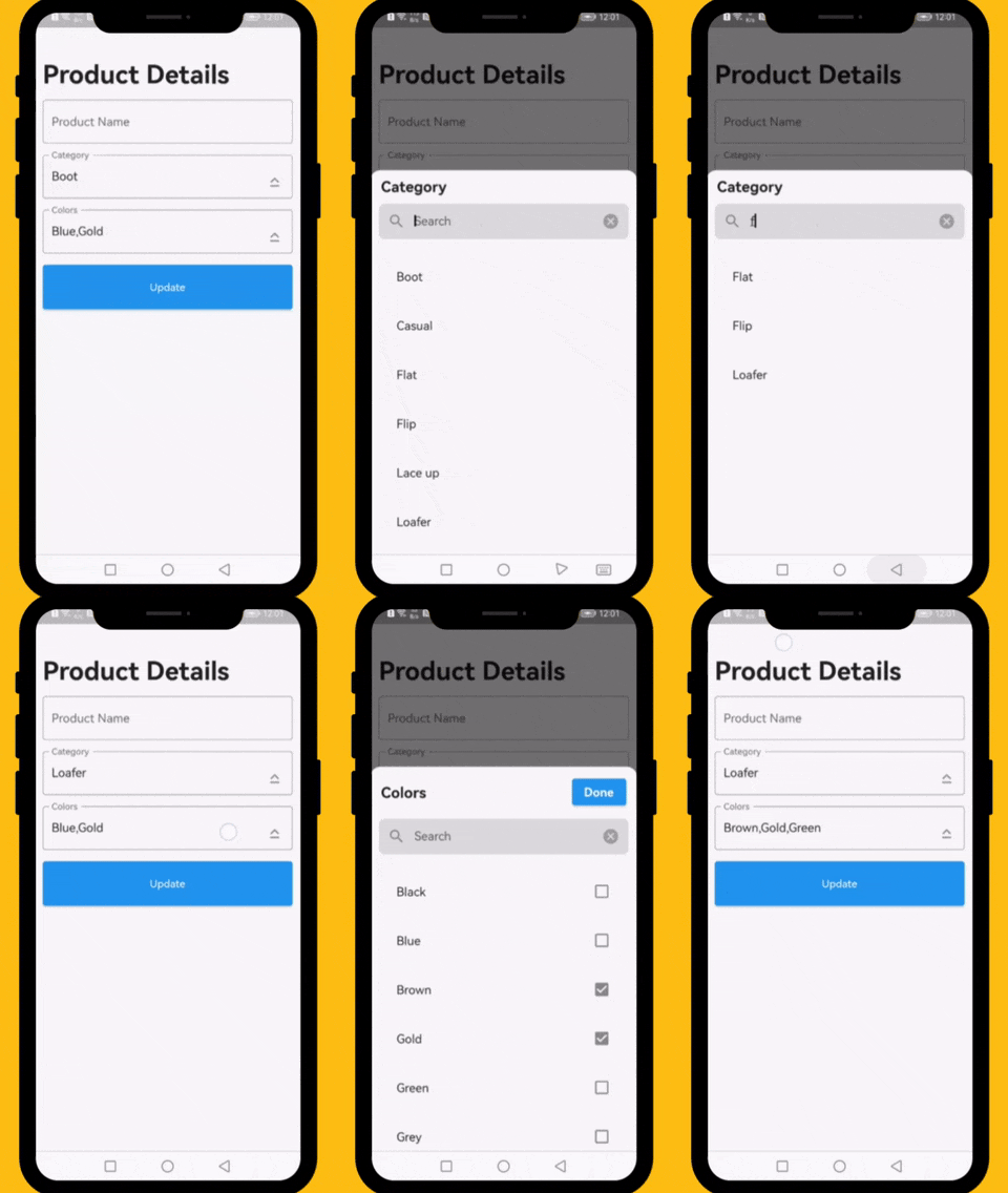
A Flutter widget designed to simplify the process of searching through single or multiple options in a dropdown list. It provides an intuitive, searchable interface that enhances user experience when selecting from large datasets. The widget is highly customizable and supports various platforms including Android, iOS, Web, macOS, Windows, and Linux. Ideal for forms and data entry interfaces requiring efficient filtering and selection.
Use cases
Form inputs with large option lists
Dynamic filtering in admin dashboards
User profile setup with category selection
Searchable multi-select dropdowns
Data entry applications with extensive choices
Key features
Real-time search filtering
Support for single and multiple selections
Cross-platform compatibility
Customizable UI and styling
Easy integration with existing forms
Lightweight and performant
Suitable for
Developers building data-heavy apps
Teams needing responsive search interfaces
Projects requiring multi-select dropdowns
UI/UX focused Flutter applications
Applications targeting multiple operating systems
Considerations
May require additional styling for complex themes
Limited built-in validation features
Performance depends on dataset size
Not optimized for extremely large datasets without pagination
Requires manual handling of selection callbacks
Original README
Original README snapshot from the linked source repository. Visit the repository for the latest content.
Dropdown Searchable List Choices
A very useful widget for searching through single or multiple options from a drop-down list.
Platforms
This plugin has been successfully tested on iOS, Android & web.
Examples
The following examples are extracted from the example project available in the repository. More examples are available in this project.
This property takes List as a parameter and it is useful to display items in drop down list.
Optional parameters
listBuilder:
This property takes int value as a parameter. This is use to set the initial segment from [segmentNames].
enableMultipleSelection:
This property takes Color value as a parameter. You can change the background color of animated segment.
bottomSheetTitle:
This gives the bottom sheet title.
submitButtonChild:
You can set your custom submit button when the multiple selection is enabled.
selectedItems:
This will give the call back to the selected items from list.
dropDownBackgroundColor:
This will set the background color to the Dropdown Searchable.
searchWidget:
This property takes TextFormField value as a parameter. [searchWidget] is use to show the text box for the searching. If you are passing your own widget then you must have to add [TextEditingController] for the [TextFormField].
isSearchVisible:
This property takes bool value as a parameter. [isSearchVisible] is use to manage the search widget visibility. by default it is [True] so widget will be visible.
I would be happy if you send us feedback on your projects where you use our component. Just email amir.email@gmail.com and let me know if you have any questions or suggestions about my work.