
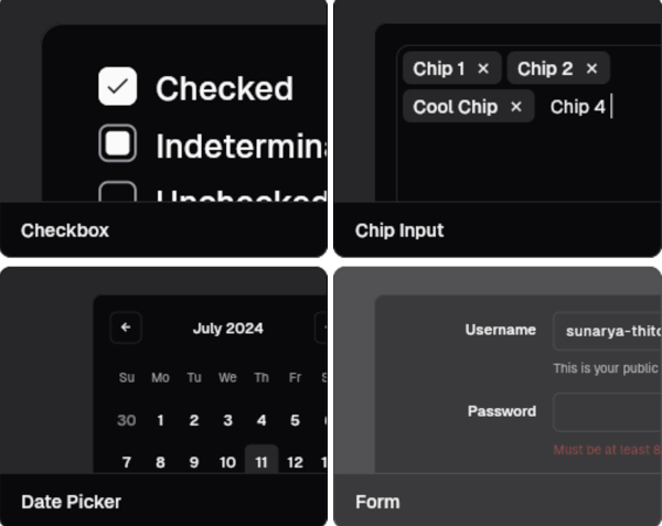
Overview
shadcn_flutter brings the elegant, customizable components from Shadcn/UI to Flutter, offering a modern, accessible, and production-ready set of UI elements. Built with simplicity and design consistency in mind, it provides developers with beautifully crafted widgets that follow best practices in usability and aesthetics. The package integrates seamlessly into Flutter projects and supports multiple platforms, enabling consistent cross-platform experiences. It emphasizes composability and theme flexibility, making it ideal for apps that prioritize visual quality and developer experience.
Use cases
- Building modern, visually appealing Flutter apps
- Creating consistent UI across Android, iOS, and desktop
- Rapid prototyping with production-ready components
- Designing accessible and responsive interfaces
- Customizing UI without writing boilerplate code
Key features
- Pre-designed, accessible components
- Cross-platform compatibility
- Highly customizable themes
- Composable widget architecture
- Built-in dark mode support
- Lightweight and modular structure
Suitable for
- UI designers working with Flutter
- Developers seeking polished, ready-to-use components
- Teams prioritizing design consistency
- Projects requiring fast UI development
- Apps targeting multiple platforms
Considerations
- Requires understanding of Flutter's widget system
- May need additional styling for unique brand requirements
- Depends on community maintenance and updates
- Not a full framework—complements existing Flutter workflows