Search packages, repositories and app categories

Package detailsv0.0.2

side_sheet_material3

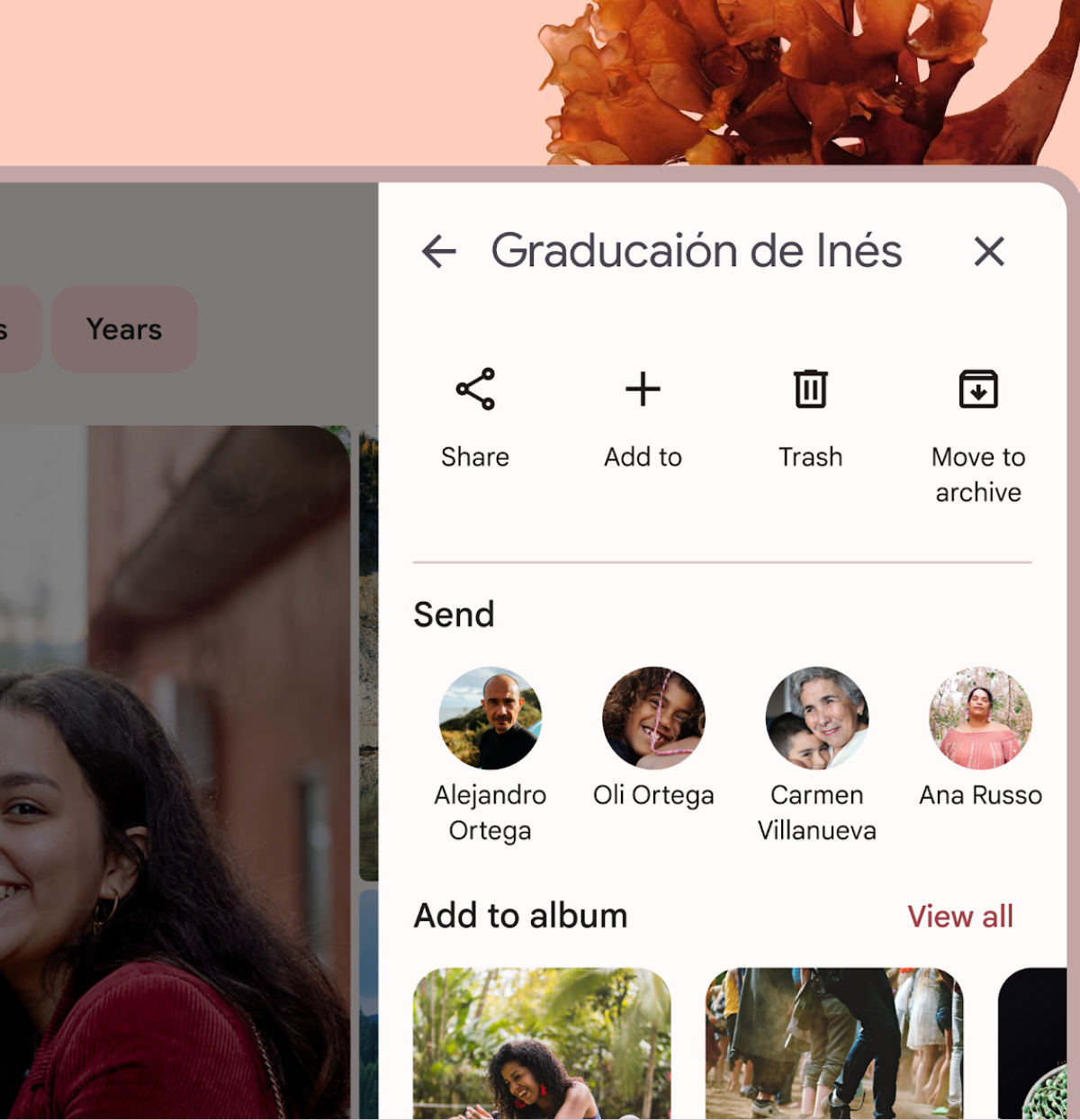
This Flutter package provides a Material Design 3 modal side sheet widget.

AndroidiOSWebmacOSWindowsLinux
30-day downloads
167
Likes
32
Pub points
140

Install package

flutter pub add side_sheet_material3

Package Overview

Package selection guidance compiled from public package information, community data, and project usage.

A Flutter package that implements a Material Design 3-compliant modal side sheet widget, offering a modern, responsive sliding panel for additional content or actions. Designed to align with Material Design 3 guidelines, it supports various platforms including Android, iOS, Web, macOS, Windows, and Linux. The side sheet can be used for navigation, settings, or detailed information display, providing a consistent user experience across devices. It integrates seamlessly with existing Flutter apps and follows current design principles for accessibility and usability.

Use cases

  • Displaying supplementary content
  • Implementing mobile navigation
  • Showing settings panels
  • Presenting detailed information
  • Enhancing form workflows

Key features

  • Material Design 3 compliance
  • Cross-platform support
  • Modal sliding behavior
  • Customizable appearance
  • Responsive layout handling

Suitable for

  • Apps using Material Design 3
  • Developers seeking modern bottom sheets
  • Projects requiring platform-agnostic UI components
  • Mobile-first applications
  • UI-heavy dashboards

Considerations

  • Requires Flutter SDK 3.0+
  • Limited customization beyond Material 3 specs
  • May need additional styling for non-standard use cases
  • Depends on material3 package
  • Best suited for single-pane layouts

Original README

Original README snapshot from the linked source repository. Visit the repository for the latest content.

Material Design 3 modal side sheet

A Flutter package that provides a Material Design 3 side sheet as a general dialog.

Please check out the official documentation for more information on Material Design side sheet

Features

  • Custom header and body widgets.
  • Option to add a back button and close button.
  • Option to add confirm and cancel action buttons.
  • Option to show/hide a divider between the body and action buttons.
  • Customizable button text and tooltips.
  • Option to dismiss the dialog by tapping outside of it.

Usage

To use this package, add side_sheet_material3 as a dependency in your pubspec.yaml file.

dependencies:
  side_sheet_material3: ^0.0.1

Example

await showModalSideSheet(
  context: context,
  header: 'Edit Profile',
  body: ProfileEditForm(), // Put your content widget here
  addBackIconButton: true,
  addActions: true,
  addDivider: true,
  confirmActionTitle: 'Save',
  cancelActionTitle: 'Cancel',
  confirmActionOnPressed: () {
    // Do something
  },

  // If null, Navigator.pop(context) will used
  cancelActionOnPressed: () {
    // Do something
  },
);

Please check out the full example for more information on how to use this package.

Buy me a coffe

Categories

Source repository

Projects using this package

No data available yet.