Search packages, repositories and app categories

simple_progress_indicators cover
Package detailsv0.2.0

simple_progress_indicators

Simple progress indicators package with solid colors and gradients. Can be used to show progress or for simple animation.

AndroidiOSWebmacOSWindowsLinux
30-day downloads
7K
Likes
40
Pub points
140

Install package

flutter pub add simple_progress_indicators

Package Overview

Package selection guidance compiled from public package information, community data, and project usage.

A lightweight Flutter package offering simple progress indicators with solid colors and gradient support. Ideal for displaying loading states or creating subtle animations in apps. The package is easy to integrate and provides clean, customizable visual feedback across multiple platforms. It supports Android, iOS, Web, macOS, Windows, and Linux, making it versatile for cross-platform development. Designed for developers seeking minimalistic yet effective progress visualization without complex configurations.

Use cases

  • Loading state indicators
  • Animated progress displays
  • Simple UI feedback
  • Cross-platform progress bars
  • Customizable loading animations
  • App splash screens

Key features

  • Solid color progress bars
  • Gradient support
  • Minimal configuration
  • Cross-platform compatibility
  • Easy integration
  • Lightweight size

Suitable for

  • Beginner Flutter developers
  • Simple app interfaces
  • Loading UX enhancements
  • Fast prototyping
  • Apps needing lightweight indicators
  • Visual feedback in forms or downloads

Considerations

  • Limited customization options
  • No advanced styling features
  • Not suitable for complex animations
  • Best for basic progress needs
  • No built-in pause/resume controls
  • Depends on external dependency management

Original README

Original README snapshot from the linked source repository. Visit the repository for the latest content.

Simple progress indicators package with solid colors and gradients. Can be used to show progress or for simple progress bar animation.

How it looks

Table of contents

Usage

Linear Progress indicator

ProgressBar

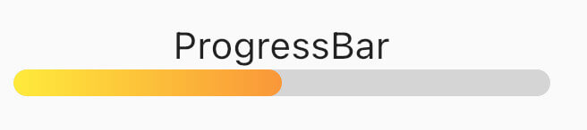
ProgressBar is a basic linear indicator widget. It's a Stateless Widget that produces basic horizontal rounded rectangle with optional background rounded rectangle underneath. Include it in your build method like:

  @override
  Widget build(BuildContext context) {
    return const MaterialApp(
      home: Scaffold(
        body: Center(
          child: ProgressBar(
            value: 0.5,
            //specify only one: color or gradient
            //color:Colors.red,
            gradient: LinearGradient(
              begin: Alignment.topLeft,
              end: Alignment.bottomRight,
              colors: [Colors.yellowAccent, Colors.deepOrange],
            ),
          ),
        ),
      ),
    );
  }

It has several configurable parameters:

  • value - current indicator value, where 0.0 is 0% progress, 1.0 is 100% progress
  • width - indicator width, defaults to 200.0
  • height - indicator height, defaults to 10.0
  • color - solid indicator fill color
  • gradient - gradient fill, accepts Gradient class
  • backgroundColor - solid indicator background color, defaults to transparent

Minimum working widget requires only a value and color OR gradient property. NOTE: Specifying both properties is not accepted.

ProgressBarAnimation

ProgressBarAnimation is a simple animating progress bar widget. It animates ProgressBar widget for a given duration. Animation starts at the time the widget is built.

It has several configurable parameters:

  • duration - 0% to 100% animation duration
  • width - indicator width, defaults to 200.0
  • height - indicator height, defaults to 10.0
  • color - solid indicator fill color
  • gradient - gradient fill, accepts Gradient class
  • backgroundColor - solid indicator background color, defaults to transparent
  • curve - animation curve, defaults to linear. For other curves check Curves
ProgressBarAnimation(  
  duration: const Duration(seconds: 2),  
  gradient: const LinearGradient(  
    colors: [  
      Colors.blue,  
      Colors.purple,  
    ],  
  ),  
  backgroundColor: Colors.grey.withOpacity(0.4),  
),
AnimatedProgressBar

AnimatedProgressBar is a ImplicitlyAnimatedWidget. It behaves like other flutter AnimatedFoo widgets. This animates value parameter changes for a given duration. Animation starts only when one (initial) value changes to other (final) value. See the example below.

It has several configurable parameters:

  • value - value widget animates to, need to be changed
  • duration - initial value to final value animation duration
  • width - indicator width, defaults to 200.0
  • height - indicator height, defaults to 10.0
  • color - solid indicator fill color
  • gradient - gradient fill, accepts Gradient class
  • backgroundColor - solid indicator background color, defaults to transparent
  • curve - animation curve, defaults to linear. For other curves check Curves
  • onEnd - callback to trigger additional actions (e.g. another animation) at the end of the current animation
AnimatedProgressBar(  
  value: full ? 1.0 : 0.0,  
  duration: const Duration(seconds: 3),  
  gradient: const LinearGradient(  
    colors: [  
      Colors.amber,  
      Colors.red,  
    ],  
  ),  
  backgroundColor: Colors.grey.withOpacity(0.4),  
),

For full demo check examples folder.

Animation demo

Additional information

For issues and animation ideas visit issues section on github homepage.

Categories

Source repository

Projects using this package