Search packages, repositories and app categories

simple_tooltip cover
Package detailsv1.2.0

simple_tooltip

A simple library for creating tooltips

AndroidiOSWebmacOSWindowsLinux
30-day downloads
5.6K
Likes
78
Pub points
130

Install package

flutter pub add simple_tooltip

Package Overview

Package selection guidance compiled from public package information, community data, and project usage.

A lightweight Flutter package for easily adding tooltips to UI elements. It provides a simple API to display informative pop-up text when users hover over or tap specific widgets, enhancing user experience with minimal setup. Ideal for apps needing contextual guidance without complex animations or styling. Supports all major platforms including mobile, web, and desktop.

Use cases

  • Adding context help to form fields
  • Guiding users through app features
  • Improving accessibility with descriptive hints
  • Enhancing dashboard tooltips
  • Displaying quick info on icons
  • Providing feedback on interactive elements

Key features

  • Minimal configuration
  • Cross-platform support
  • Customizable tooltip appearance
  • Supports tap and hover interactions
  • Lightweight and fast
  • Easy integration with existing widgets

Suitable for

  • Beginner Flutter developers
  • Apps requiring simple tooltips
  • Accessibility-focused designs
  • Prototypes and rapid development
  • UIs with dense information layouts

Considerations

  • Limited advanced animation options
  • Tooltip positioning may need manual adjustment in complex layouts
  • No built-in support for keyboard navigation
  • Best suited for basic use cases
  • May require additional styling for consistency with design system

Original README

Original README snapshot from the linked source repository. Visit the repository for the latest content.

simple_tooltip

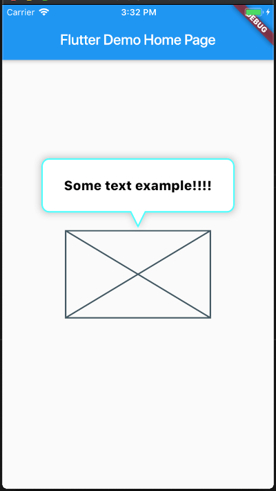
A plugin for creating tooltips with shape of a balloon

You can customize multiple elements

💻 Installation

In the dependencies: section of your pubspec.yaml, add the following line:

dependencies:
  simple_tooltip: <latest version>

Usage

Basic

You can get started really simple, just add

Basic

SimpleTooltip(
        tooltipTap: () {
        print("Tooltip tap");
        },
        animationDuration: Duration(seconds: 3),
        show: true,
        tooltipDirection: TooltipDirection.up,
        child: Container(
        width: 200,
        height: 120,
        child: Placeholder(),
        ),
        content: Text(
        "Some text example!!!!",
        style: TextStyle(
            color: Colors.black,
            fontSize: 18,
            decoration: TextDecoration.none,
        ),
        ),
    ),

Full Api

/// The [child] which the tooltip will target to
  final Widget child;

  /// Sets the tooltip direction
  /// defaults to [TooltipDirection.up]
  final TooltipDirection tooltipDirection;

  /// Defines the content that its placed inside the tooltip ballon
  final Widget content;

  /// If true, it will display the tool , if false it will hide it
  final bool show;

  /// Sets the content padding
  /// defautls to: `const EdgeInsets.symmetric(horizontal: 20, vertical: 16),`
  final EdgeInsets ballonPadding;

  /// sets the duration of the tooltip entrance animation
  /// defaults to [460] milliseconds
  final Duration animationDuration;

  /// [top], [right], [bottom], [left] position the Tooltip absolute relative to the whole screen
  double top, right, bottom, left;

  /// [minWidth], [minHeight], [maxWidth], [maxHeight] optional size constraints.
  /// If a constraint is not set the size will ajust to the content
  double minWidth, minHeight, maxWidth, maxHeight;

  ///
  /// The distance of the tip of the arrow's tip to the center of the target
  final double arrowTipDistance;

  ///
  /// The length of the Arrow
  final double arrowLength;

  ///
  /// the stroke width of the border
  final double borderWidth;

  ///
  /// The minium padding from the Tooltip to the screen limits
  final double minimumOutSidePadding;

  ///
  /// The corder radii of the border
  final double borderRadius;

  ///
  /// The width of the arrow at its base
  final double arrowBaseWidth;

  ///
  /// The color of the border
  final Color borderColor;

  ///
  /// The color of the border
  final Color backgroundColor;

  ///
  /// Set a custom list of [BoxShadow]
  /// defaults to `const BoxShadow(color: const Color(0x45222222), blurRadius: 8, spreadRadius: 2),`
  final List<BoxShadow> customShadows;

  ///
  /// Set a handler for listening to a `tap` event on the tooltip (This is the recommended way to put your logic for dismissing the tooltip)
  final Function() tooltipTap;

  ///
  /// If you want to automatically dismiss the tooltip whenever a user taps on it, set this flag to [true]
  /// For more control on when to dismiss the tooltip please rely on the [show] property and [tooltipTap] handler
  /// defaults to [false]
  final bool hideOnTooltipTap;

  ///
  /// Pass a `RouteObserver` so that the widget will listen for route transition and will hide tooltip when
  /// the widget's route is not active
  final RouteObserver<PageRoute> routeObserver;

Screenshots

Animated
This plugin was inspired by super_tooltip

Getting Started

This project is a starting point for a Dart package, a library module containing code that can be shared easily across multiple Flutter or Dart projects.

For help getting started with Flutter, view our online documentation, which offers tutorials, samples, guidance on mobile development, and a full API reference.

Categories

Source repository

Projects using this package

No data available yet.