Search packages, repositories and app categories

Package detailsv1.0.0

sk_alert_dialog

A highly customizable, powerful and easy-to-use alert dialog for Flutter.

30-day downloads
14
Likes
23
Pub points
40

Install package

flutter pub add sk_alert_dialog

Package Overview

Package selection guidance compiled from public package information, community data, and project usage.

sk_alert_dialog is a highly customizable and easy-to-use alert dialog widget for Flutter, designed to enhance user interaction with flexible styling and intuitive configuration. It offers a powerful API for creating responsive, visually appealing dialogs with minimal setup. Ideal for displaying notifications, confirmations, or prompts, it supports custom content, buttons, and animations. The package is lightweight and integrates seamlessly into existing Flutter projects. Its open-source nature encourages community contributions and transparency.

Use cases

  • Displaying confirmation dialogs
  • Showing user notifications
  • Collecting user input via forms
  • Handling app-level alerts
  • Customizing dialog appearance
  • Implementing onboarding messages

Key features

  • Highly customizable design
  • Easy integration with Flutter
  • Supports custom content and buttons
  • Lightweight and performant
  • Open-source with active development
  • Responsive layout support

Suitable for

  • Developers seeking reusable dialog components
  • Projects requiring consistent UI across platforms
  • Apps needing branded alert experiences
  • Teams prioritizing developer productivity
  • Frontend-focused Flutter applications
  • Prototyping rapid UI interactions

Considerations

  • Limited platform-specific behavior customization
  • No built-in localization support
  • Requires manual handling of accessibility features
  • May need additional styling for complex layouts
  • Not optimized for very large dialog content
  • Depends on external dependencies for advanced features

Original README

Original README snapshot from the linked source repository. Visit the repository for the latest content.

SKAlertDialog

  A highly customizable, powerful and easy-to-use alert dialog for Flutter.   Flutter pub package

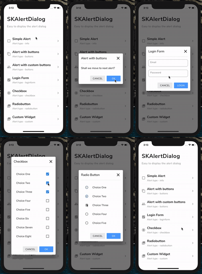
GIF

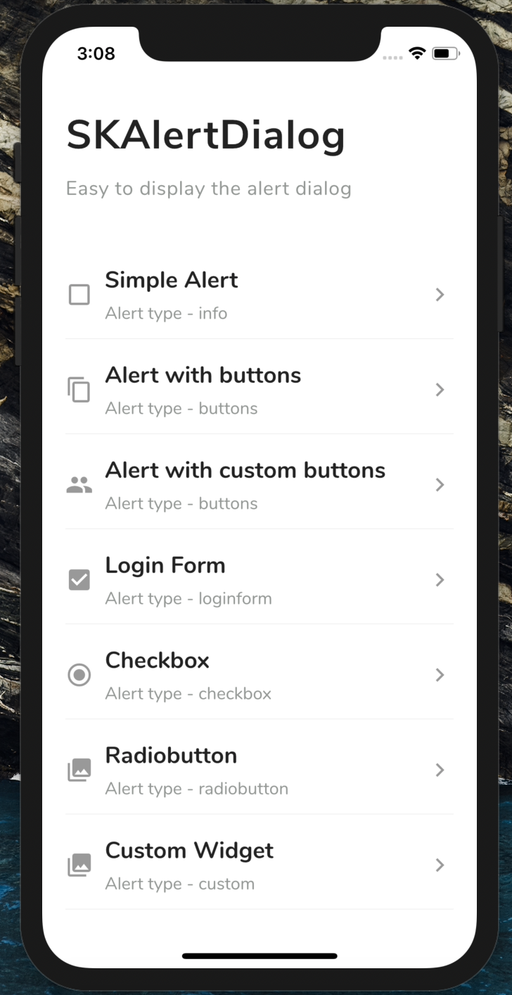
Screenshots

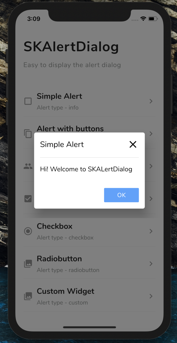
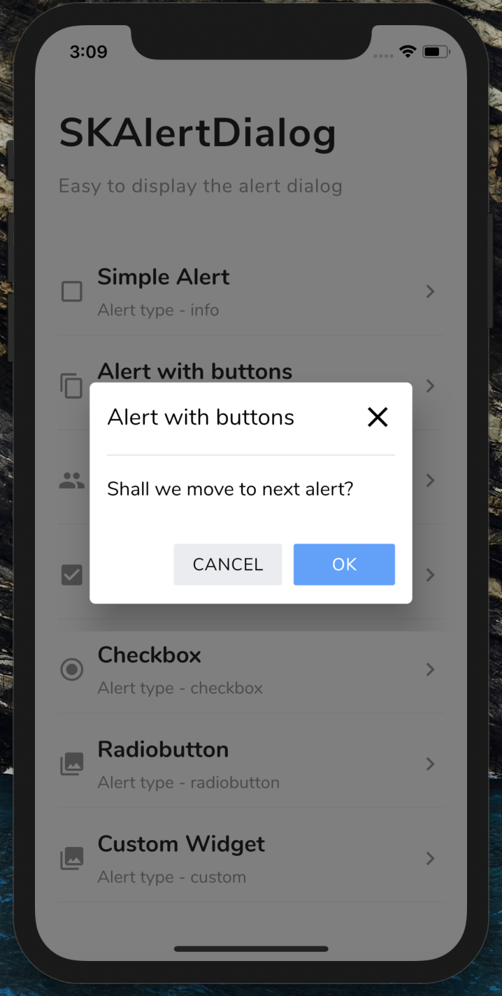
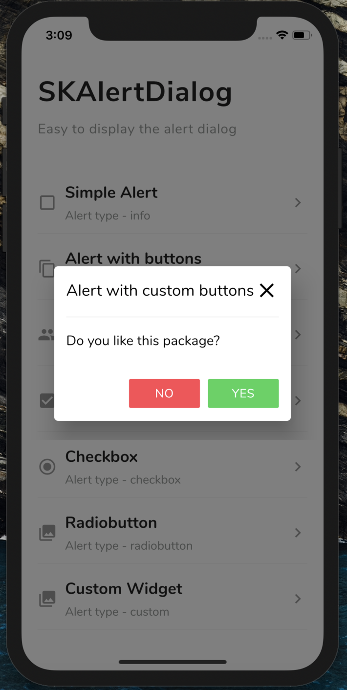
SKAlertDialog Basic Alert Alert with buttons Alert with custom buttons
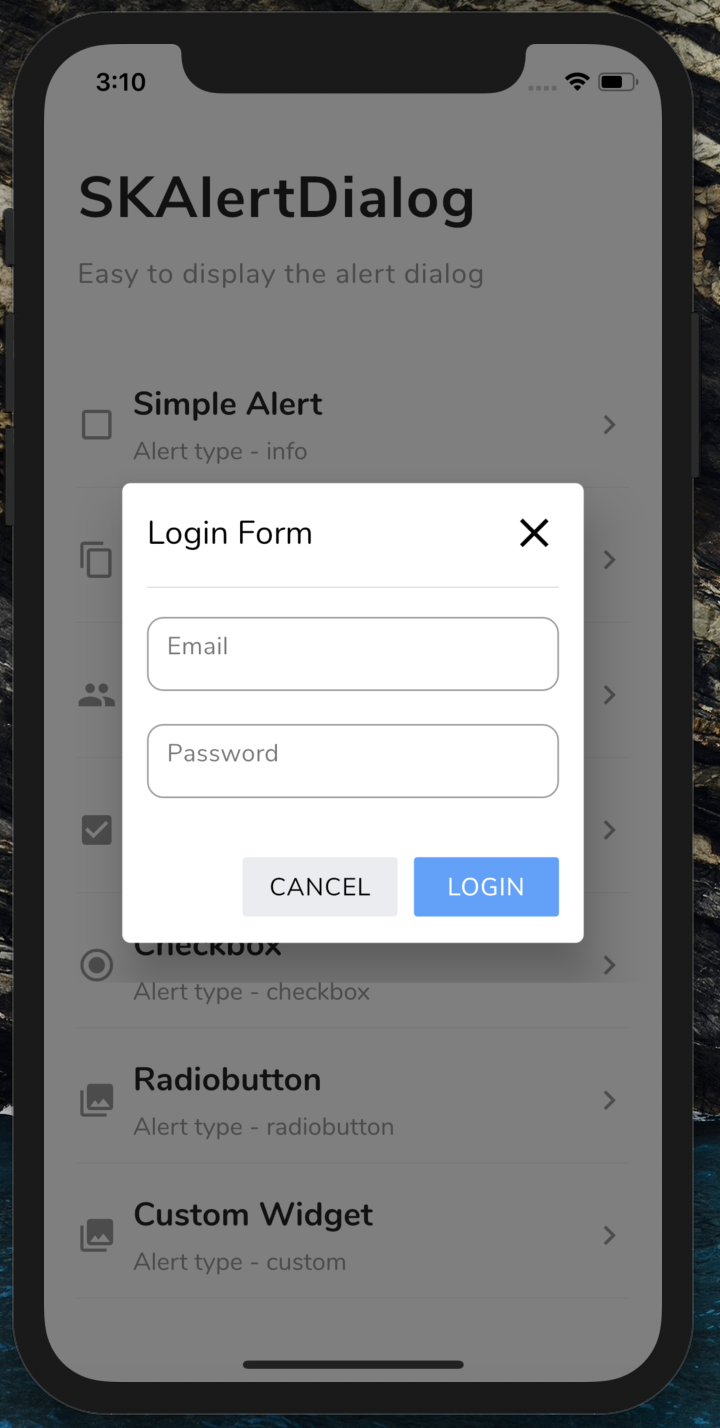
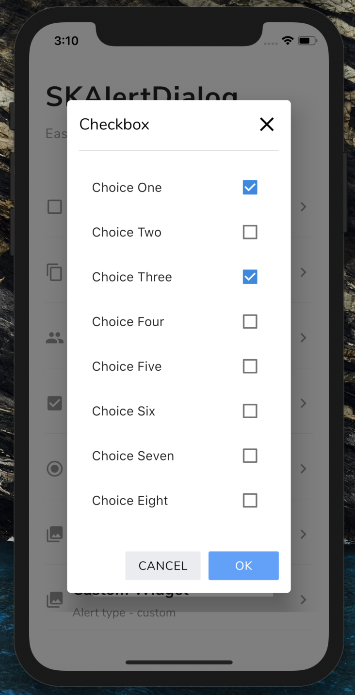
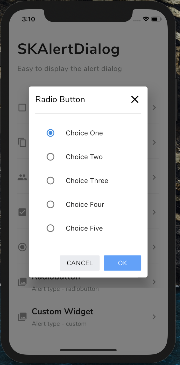
Login Form Checkbox Radio button Custom Dialog

💻 Installation

You just need to add sk_alert_dialog as a dependency in your pubspec.yaml file.

dependencies:
sk_alert_dialog: ^1.0.0

Usage

Import this class
import 'package:sk_alert_dialog/sk_alert_dialog.dart';

Simple Alert

     SKAlertDialog.show(
        context: context,
        type: SKAlertType.info,
        title: 'Simple Alert',
        message: 'Hi! Welcome to SKALertDialog',
        onOkBtnTap: (value) {
          print('Okay Button Tapped');
        },
      );

Alert with buttons

    SKAlertDialog.show(
        context: context,
        type: SKAlertType.buttons,
        title: 'Alert with buttons',
        message: 'Shall we move to next alert?',
        onOkBtnTap: (value) {
          print('Okay Button Tapped');
        },
        onCancelBtnTap: (value) {
          print('Cancel Button Tapped');
        },
      );

Alert with custom buttons

   SKAlertDialog.show(
        context: context,
        type: SKAlertType.buttons,
        title: 'Alert with custom buttons',
        message: 'Do you like this package?',
        okBtnText: 'YES',
        okBtnTxtColor: Colors.white,
        okBtnColor: const Color(0xFF3BD459),
        cancelBtnText: 'NO',
        cancelBtnTxtColor: Colors.white,
        cancelBtnColor: const Color(0xFFFF4954),
        onOkBtnTap: (value) {
          print('Okay Button Tapped');
        },
        onCancelBtnTap: (value) {
          print('Cancel Button Tapped');
        },
      );

Login Form

  SKAlertDialog.show(
        context: context,
        type: SKAlertType.loginform,
        title: 'Login Form',
        okBtnText: 'LOGIN',
        onOkBtnTap: (value) {
          print('Okay Button Tapped');
        },
        onCancelBtnTap: (value) {
          print('Cancel Button Tapped');
        },
        onEmailTextFieldChanged: (value) {
          print('On Email Text Changed $value');
        },
        onPasswordTextFieldChanged: (value) {
          print('On Password Text Changed $value');
        },
      );

Checkbox

    SKAlertDialog.show(
        context: context,
        type: SKAlertType.checkbox,
        checkBoxAry: {'Choice One': true, 'Choice Two': false, 'Choice Three': true, 'Choice Four': false, 'Choice Five': false},
        title: 'Checkbox',
        onCancelBtnTap: (value) {
          print('Cancel Button Tapped');
        },
        onCheckBoxSelection: (value) {
          print('onCheckBoxSelection $value');
        },
      );

Radio button

    SKAlertDialog.show(
        context: context,
        type: SKAlertType.radiobutton,
        radioButtonAry: {'Choice One': 1, 'Choice Two': 2, 'Choice Three': 3, 'Choice Four': 4, 'Choice Five': 5},
        title: UtilsImporter().stringUtils.radio_button_alert_title,
        onCancelBtnTap: (value) {
          print('Cancel Button Tapped');
        },
        onRadioButtonSelection: (value) {
          print('onRadioButtonSelection $value');
        },
      );

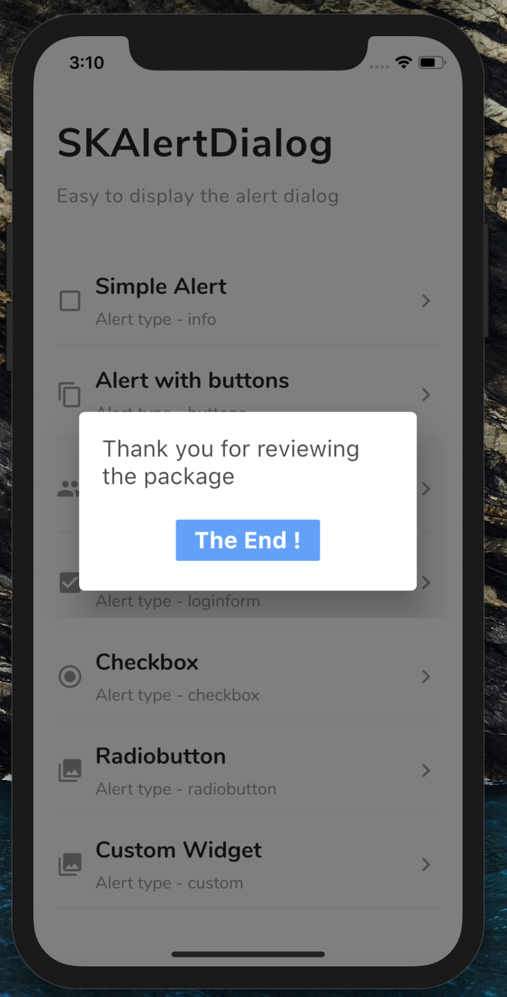
Custom Dialog

    SKAlertDialog.show(
        context: context,
        type: SKAlertType.custom,
        customWidget: customWidget(),
      );
Create the custom widget
  Widget customWidget() { 
     return new Padding(
        padding: EdgeInsets.only(left: 20, right: 20, top: 20, bottom: 20),
        child: Column(
          crossAxisAlignment: CrossAxisAlignment.start,
          children: <Widget>[
            Text(
              'Thank you for reviewing the package',
              style: TextStyle(
                  fontWeight: FontWeight.w400,
                  color: Theme.of(context).primaryColorDark.withOpacity(0.7),
                  fontSize: 20),
            ),
            SizedBox(height: 20),
            Row(
              mainAxisAlignment: MainAxisAlignment.center,
              children: <Widget>[
                FlatButton(
                  color: const Color(0xFF50A1FF),
                  onPressed: () {
                    Navigator.of(context).pop();
                  },
                  child: Text(
                    'The End !',
                    style: TextStyle(
                        fontWeight: FontWeight.w700,
                        color: Colors.white,
                        fontSize: 20),
                  ),
                )
              ],
            ),
          ],
        ));
  }

Categories

Dependencies

Dependency list 1 items

Source repository

Projects using this package

No data available yet.