Search packages, repositories and app categories

slidable_bar cover
Package detailsv1.1.1

slidable_bar

A Flutter package to show SideBar and hide it and custimaze your clicker.

AndroidiOSWebmacOSWindowsLinux
30-day downloads
61
Likes
48
Pub points
150

Install package

flutter pub add slidable_bar

Package Overview

Package selection guidance compiled from public package information, community data, and project usage.

SlidableBar is a Flutter package that enables developers to implement a customizable sliding sidebar navigation component across multiple platforms. It allows users to reveal or hide the sidebar with smooth animations, offering flexibility in design and interaction. The package supports various customization options for the sidebar's appearance and behavior, making it ideal for apps requiring intuitive navigation. It integrates seamlessly into Flutter projects and works on Android, iOS, Web, macOS, Windows, and Linux.

Use cases

  • Implementing collapsible navigation menus
  • Creating responsive layouts for mobile and web
  • Adding swipe gestures for sidebar control
  • Designing custom drawer interfaces
  • Building dashboard-style applications
  • Enhancing user experience with animated transitions

Key features

  • Smooth sliding animation
  • Customizable sidebar appearance
  • Support for swipe gestures
  • Cross-platform compatibility
  • Easy integration with existing Flutter apps
  • Configurable open/close behavior

Suitable for

  • Developers building navigation-heavy apps
  • Designers seeking interactive UI components
  • Projects targeting multiple platforms
  • Apps requiring lightweight navigation solutions
  • Teams using Flutter for full-stack development
  • Prototyping dynamic UI layouts

Considerations

  • May require additional styling for complex designs
  • Performance impact with heavy widgets inside sidebar
  • Limited built-in themes compared to other packages
  • Requires careful handling of gesture conflicts
  • Not optimized for very large navigation items
  • Best suited for moderate-sized navigation structures

Original README

Original README snapshot from the linked source repository. Visit the repository for the latest content.

slidable_bar

A Flutter side bar slider can be with any widget you want

review

Features

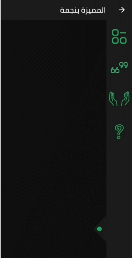
  • The SlidableBar can have four positions: top, bottom, right and left.
  • Customizable clicker, you can change the clicker widget with what you want.
  • Just like Flutter's Drawer, but with new way.

Things to note

  • The SlidableBar should have specific width and height, it works fine with scaffold's body.
  • The SlidableBar doesn't create it's own context, so it will appear under floating action button if you add one.

Usage

    final SlidableBarController controller = SlidableBarController(initialStatus: true);
    
    SlidableBar(
        size: 50, // this will be bar's height in case Side is bottom or top and width in case Side is left or right 
        children: <Widget>[], // here is the widgets inside the bar
        child: Container(), // here is your widget that will be under the bar 
        // optional
        frontColor: Colors.green, // the color of the cycle inside the default clicker
        slidableController: controller, // the contoller to change and listen to the bar status
        barRadius: const BorderRadius.circular(10.0), // the contoller to change and listen to the bar status
        side: Side.bottom, // Side.right is the default
        clickerPosition: 1.0, // the position of the clicker, 0.0 is the default
        clickerSize: 60, // the sizer of the default clicker, 55 is the default
        onChange: (int index){
            print(index); // this will print the index of the widget you clicked inside the bar
        },
        duration: Duration(milliseconds: 500), // the duration of the animation, (300 mil) is the default
        isOpenFirst: true, // the initial state of the bar, false is default
        backgroundColor: Colors.black, // primary color is default
        curve: Curves.ease, // the animation curve, linear is defualt
        clicker: Icon(Icons.arrow_forward_ios), // this will build instead of the default clicker
      )

Getting started

In the pubspec.yaml of your flutter project, add the following dependency:

dependencies:
  slidable_bar: "^1.1.0"

Then run $ flutter pub get. In your library, add the following import:

import 'package:slidable_bar/slidable_bar.dart';

Preview Images (The positions)

right left

top bottom

Custom Clicker

custom-clicker

Author

Mahmoud Haj Ali - GitHub

Categories

Source repository

Projects using this package

No data available yet.