Package selection guidance compiled from public package information, community data, and project usage.
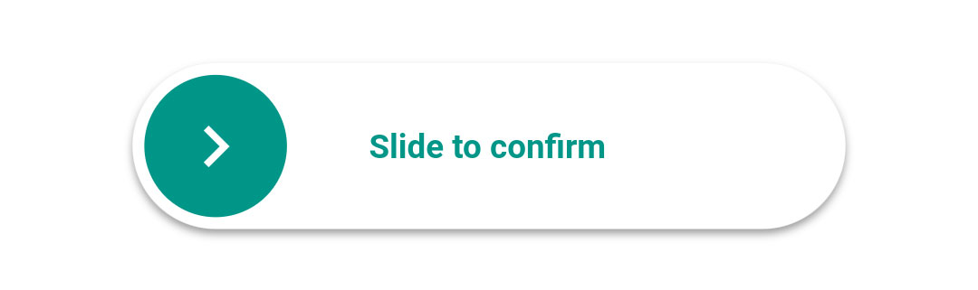
A Flutter package that provides a customizable slider widget designed to trigger a callback once the user slides it fully to 100%. It enhances user interaction by requiring a deliberate gesture, commonly used for confirming actions like deleting items or submitting forms. The slider supports smooth animations and can be styled with custom colors, sizes, and labels. It works across all major platforms including Android, iOS, Web, macOS, Windows, and Linux.
Use cases
Confirming destructive actions
User verification before submission
Enhancing form interactions
Preventing accidental taps
Adding interactive feedback
Custom confirmation gestures
Key features
Full 100% slide activation
Configurable colors and size
Callback on completion
Smooth animation
Cross-platform support
Customizable label text
Suitable for
Form confirmations
Delete action prompts
Interactive UI elements
User engagement features
Accessibility-enhanced controls
Simple yet effective gesture inputs
Considerations
Requires user attention to complete
May need accessibility adjustments
Limited to single-direction sliding
Not suitable for rapid input
Visual feedback should be clear
Performance impact on complex layouts
Original README
Original README snapshot from the linked source repository. Visit the repository for the latest content.
slide_to_confirm
A customizable slider that will activate a callback when the user slides it to 100%.
Installation
In the dependencies: section of your pubspec.yaml, add the following line:
heightdouble: Height of the slider. Defaults to 70.
widthdouble: Width of the slider. Defaults to 300.
backgroundColorColor: The color of the background of the slider. Defaults to Colors.white.
backgroundColorEndColor: The color of the background of the slider when it has been slide to the end. By giving a value here, the background color will gradually change from backgroundColor to backgroundColorEnd when the user slides. Is not used by default.
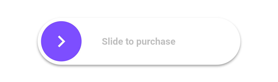
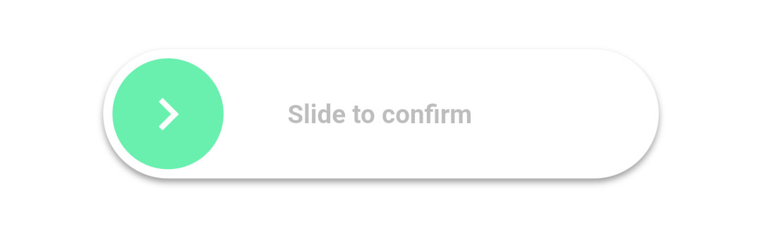
foregroundColorColor: The color of the moving element of the slider. Defaults to Colors.blueAccent.
iconColorColor: The color of the icon on the moving element if icon is IconData. Defaults to Colors.white.
sliderButtonContentWidget or : The icon widget used on the moving element of the slider. Defaults to Icon(Icons.chevron_right).
shadowBoxShadow: The shadow below the slider. Defaults to BoxShadow(color: Colors.black38, offset: Offset(0, 2),blurRadius: 2,spreadRadius: 0,).
textString: The text showed below the foreground. Used to specify the functionality to the user. Defaults to "Slide to confirm".
textStyleTextStyle: The style of the text. Defaults to TextStyle(color: Colors.black26, fontWeight: FontWeight.bold,).
onConfirmationVoidCallback: The callback when slider is completed. This is the only required field.
onTapDownVoidCallback: The callback when slider is pressed.
onTapUpVoidCallback: The callback when slider is release.
foregroundShapeBorderRadius: The shape of the foreground (the moving element of the slider). Defaults to a circular border radius.
backgroundShapeBorderRadius: The shape of the background of the slider. Defaults to a circular border radius.
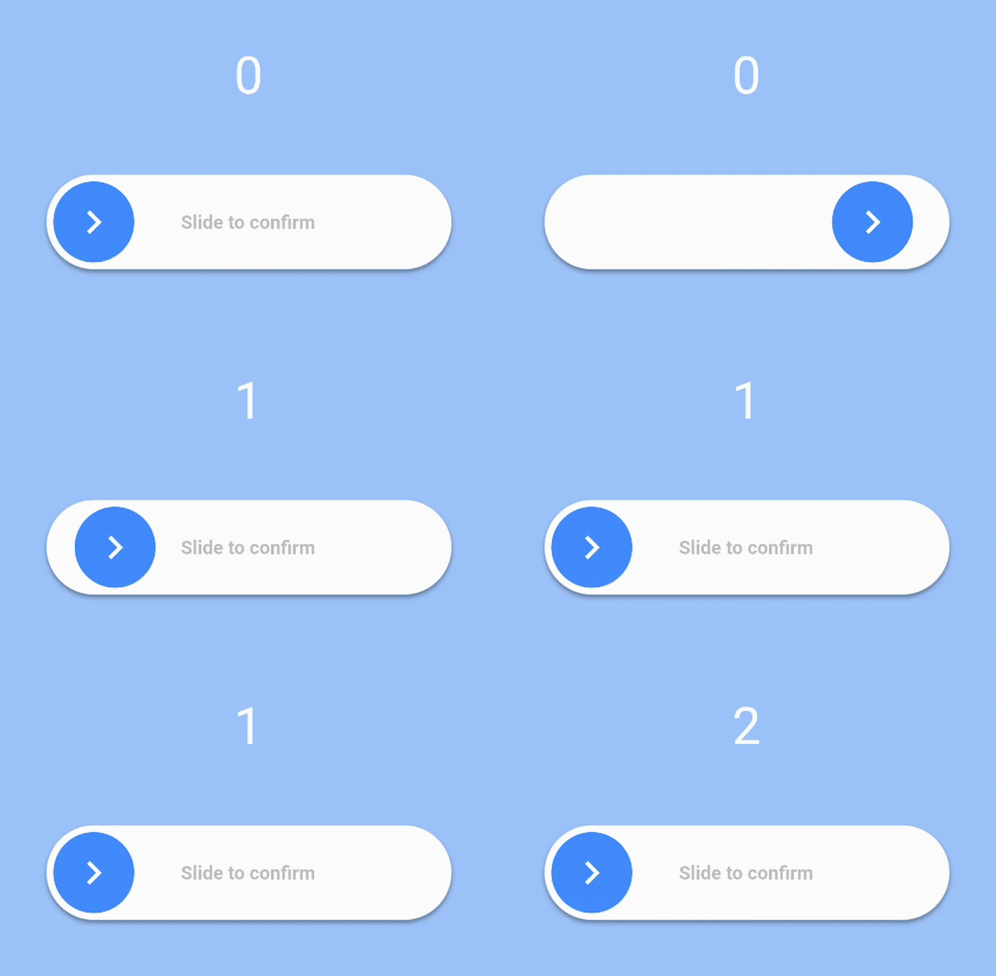
stickToEndbool: Bool that indicates if stick or not the cursor at end of slide
Example
View the Flutter app in the example directory to see a working example of how to use and implement the slider.