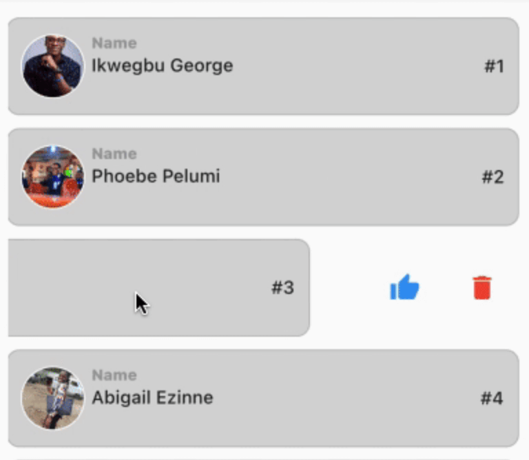
Flexible and customizable slideable list item for Flutter apps. Add multiple action buttons, control animations, and automatically close open items with ease.
Package selection guidance compiled from public package information, community data, and project usage.
Slideable is a flexible and customizable Flutter package that enables swipeable list items with multiple action buttons. It allows developers to define custom actions, control animation behavior, and automatically close open items when new ones are activated. Ideal for creating interactive lists with contextual actions, such as delete, archive, or edit options. The package supports all major platforms including Android, iOS, Web, macOS, Windows, and Linux, ensuring consistent behavior across devices.
Use cases
Interactive to-do list items
Swipe-to-delete messages
Customizable action panels
List item management
Contextual editing interfaces
Key features
Multiple action buttons per item
Customizable animations
Automatic closing of open items
Cross-platform support
Easy integration with ListView
Configurable slide thresholds
Suitable for
Developers building interactive lists
Apps requiring swipe gestures
UI-heavy applications
Mobile and web apps with dynamic lists
Teams prioritizing consistent UX
Considerations
May require performance tuning for large lists
Animation customization needs careful handling
Limited documentation beyond basic usage
Potential conflicts with other gesture detectors
Not optimized for extremely complex layouts
Original README
Original README snapshot from the linked source repository. Visit the repository for the latest content.
Slideable
This is a flexible slideable implementation that will allow you to pass simple widgets(icons or anything at all) as action items, and also control various backgrounds for the action item, and closes an already slide item in your list.
This is a side project that I have reused severally on lots of my project and decided to turn it into a package for anyone that wants more flexibility than the usual flutter_slidable package.
Features
Control flexibility on the type of widget to use as your action item.
A predefined callback function that automatically closes an already slid item in your list.
Can contain a maximum of 6 action items.
You can control the animation curver and animation speed.
Getting started
In the pubspec.yaml of you flutter project, add the following dependency:
dependencies:
 slideable: <latest_version>
In your screen or page, add the below import, to expose the package:
import'package:slideable/Slideable.dart';
Basic Usage
ActionItems, controls the actions widget you would want to have in the display. This is a List<ActionItems>, where, each actionItem consists of the requiredicon widget, which can be any accepted Flutter Widget, a requiredonPress function, that executes what you want that ActionItem to do, a defaulted backgroundColor of transparent, which is totally flexible to change and a radius, just incase you want to add a tweak to your design to match the Slidable child's borderRadius.
Slideable, requires the ActionItems item widget list and the child, which will be the initial point of contact in our case.
The other values includes the backgroundColor, which by default is set to transparent' but can be changed to suit your design. resetSlide, which is a boolean value used to notifiy the Slideable to close all the slid item, unless set to false by an external false. A duration, which is used to control the the slide time and the curve, which is used to control the speed or motion of the slide animation.