Package selection guidance compiled from public package information, community data, and project usage.
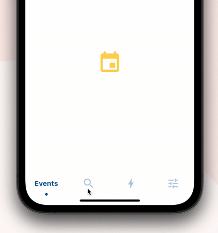
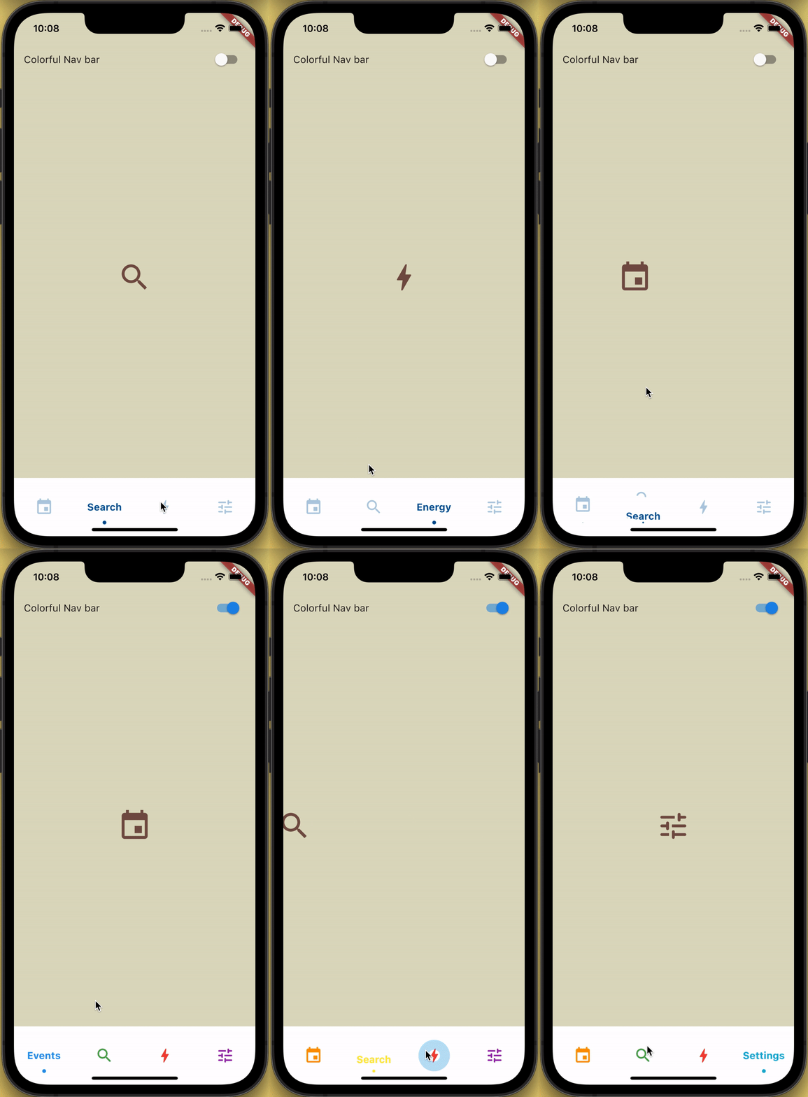
A customizable bottom navigation bar featuring a sliding animation for icons and labels, enhanced with a clipping effect and ripple feedback on tap. Designed for modern, interactive UIs, it supports multiple platforms including Android, iOS, Web, macOS, Windows, and Linux. The package offers smooth transitions and visual polish, ideal for apps requiring intuitive navigation with dynamic feedback. It integrates seamlessly into Flutter projects via pub.dev.
Use cases
Mobile app navigation
Web application interfaces
Cross-platform UI design
Interactive bottom bars
Modern app aesthetics
Key features
Sliding icon and text animation
Clipping effect for visual depth
Ripple effect on tap
Cross-platform compatibility
Customizable appearance
Smooth transition animations
Suitable for
Flutter developers seeking animated bottom navs
Design-focused applications
Apps with high user interaction
Developers targeting multiple platforms
UI/UX enhancement projects
Considerations
May require performance tuning on older devices
Limited customization beyond core features
Potential layout conflicts in complex widgets
Not optimized for very large navigation sets
Depends on Flutter's rendering pipeline
Original README
Original README snapshot from the linked source repository. Visit the repository for the latest content.
How to use?
Add sliding_clipped_nav_bar: to your pubspec.yaml dependencies then run flutter pub get
Add SlidingClippedNavBar() to bottomNavigationBar property of Scaffold() and add PageView() to body with NeverScrollableScrollPhysics() don't try to upate the seleted index from onPageChanged or will see some weird behaviour. You can use Stack() or AnimatedSwitcher() for custom page transition animation.
API reference
barItems → List<BarItem>
List of bar items that shows horizontally, Minimum 2 and maximum 4 items. required
selectedIndex → int
Selected index of the bar items. required
iconSize → double
Size of all icons (inactive items), don't make it too big or will be clipped. optional [30]
fontSize → double
FontSize of the text. optional [16]
fontWeight → FontWeight
FontWeight of the text. optional [FontWeight.bold]
fontStyle → FontStyle
FontStyle of the text. optional [null]
activeColor → Color
Color of the selected item which indicate selected. required
inactiveColor → Color?
Inactive color of item, which actually color icons. nullable
onButtonPressed → OnButtonPressCallback
Callback when item is pressed. required
backgroundColor → Color
background color of the bar. optional [Colors.white]
The height must be constant because the animation is in vertical direction. According to me 60 is perfect. But if you think needs to be reduced then please create an issue with a screenshot. I will see if I can do something.
How do I add drop shadow?
Wrap SlidingClippedNavBar with DecoratedBox or Container and pass BoxDecoration to decoration property. BoxDecoration takes list of boxShadow there you can pass your drop shadow.