Package selection guidance compiled from public package information, community data, and project usage.
sliver_catalog is a Flutter package offering a curated collection of experimental and creative slivers designed to enhance scrollable interfaces. Built for developers seeking unique, visually engaging scrolling experiences, it extends Flutter's built-in sliver components with innovative layouts and behaviors. Ideal for prototyping or adding flair to apps with complex scroll interactions, the package supports all major platforms including mobile, web, and desktop. Its modular design allows easy integration into existing scroll views.
Use cases
Creating dynamic scrollable UIs
Prototyping advanced scroll effects
Enhancing app visual appeal
Building custom scroll layouts
Adding experimental sliver behaviors
Key features
Experimental sliver widgets
Creative scroll designs
Cross-platform support
Modular and extensible
Easy integration with ScrollView
Suitable for
Flutter developers exploring scroll effects
Designers wanting unique UI components
App builders seeking visual innovation
Prototypers testing new scroll patterns
Teams building immersive scroll-based experiences
Considerations
Best suited for experimental projects
May require additional styling
Not recommended for production stability
Limited documentation
Potential performance impact with complex layouts
Original README
Original README snapshot from the linked source repository. Visit the repository for the latest content.
What this library is
A collection of experimental and creative slivers for Flutter. Extend your scrolling experience beyond the basics.
Gallery
Demo
Overview
Sliver Catalog provides a set of advanced and experimental slivers for Flutter, enabling developers to create unique, visually engaging scroll effects. The package includes basic slivers as a platform for creating effects and specific implementations that provide ready-to-use effects.
Basics
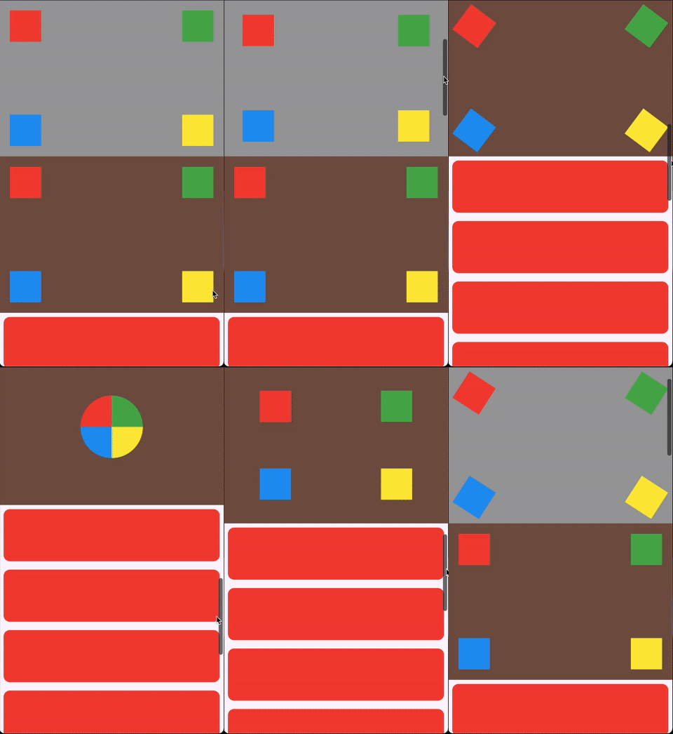
ScrollHijackSliver: A sliver that consumes a specified amount of scrollable space before allowing its child to start scrolling.
LeavingViewportShaderSliver: Applies a shader on top of the child while it leaves the viewport.
LeavingViewportTransformedRenderSliver: A render object that applies a transformation to the child while it leaves the viewport.
Ready-to-use effects
SpinnerSliver: Rotates its child as it leaves the viewport, with configurable anchor and angle.
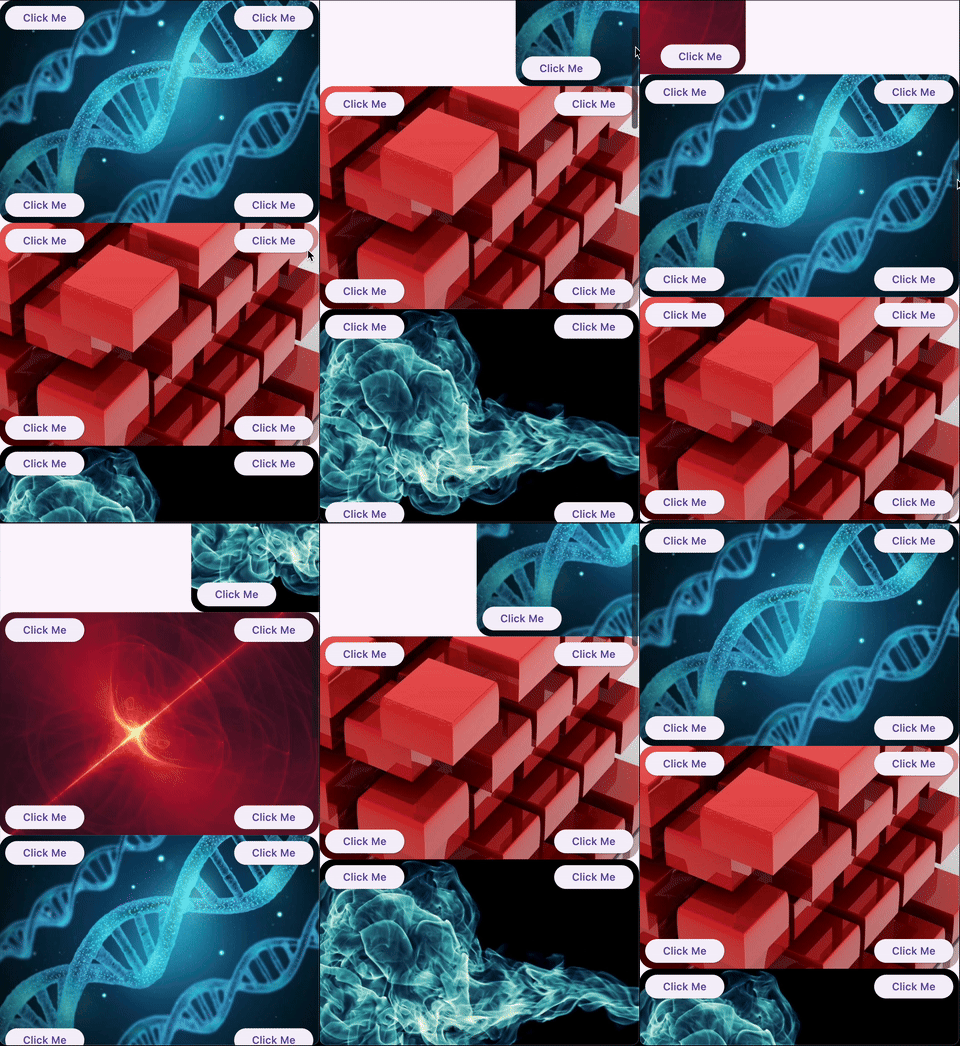
GliderSliver: Smoothly shifts the child in and out of the viewport.
FreezeSliver: Applies a freezing effect to the child while it leaves the viewport.
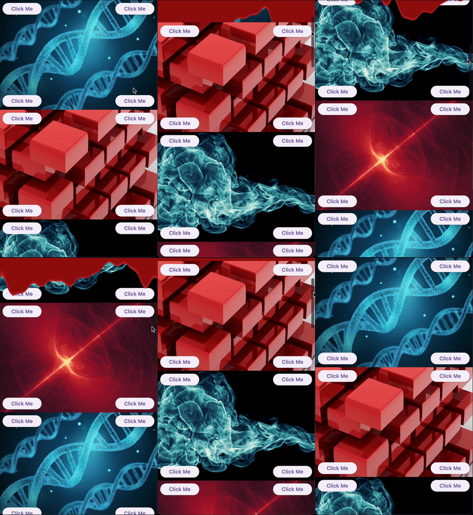
BloodSliver: Applies a blood covering effect to the child while it leaves the viewport.
Explore the library
ScrollHijackSliver
A sliver that consumes a specified amount of scrollable space before allowing its child to start scrolling. This is useful for creating custom scroll-driven animations and effects.
Key features:
Exposes a ValueListenable<double> progress (0.0–1.0) to the builder, so you can animate your child based on the progress.
Supports different progress calculation behaviors via ScrollHijackProgressBehavior.
A sliver that applies a fragment shader effect to its child as it leaves the viewport. This enables advanced visual effects as the user scrolls.
Key features:
Can operate with a raw FragmentShader that uses a specific order of arguments (size, offset, progress), or with a custom shader wrapper for any uniform order via the LeavingViewportShader interface.
The shader receives the child's size, paint offset, and a progress value (0.0–1.0) indicating how much the child has left the viewport.
Example:
CustomScrollView(
slivers: [
// Using a raw FragmentShader (default uniform order)LeavingViewportShaderSliver.fromFragmentShader(
shader: myFragmentShader,
child: Image.network('https://...'),
),
// Using a custom wrapper for arbitrary uniform orderLeavingViewportShaderSliver(
shader: MyCustomLeavingViewportShader(),
child: Image.network('https://...'),
),
// ... other slivers ...
],
)
There are also two built-in inheritances of LeavingViewportShaderSliver:
FreezeSliver
A sliver that applies a "freezing" shader effect to its child as it leaves the viewport. This effect is built-in and requires no manual shader setup.
Key features:
Uses a predefined freezing shader bundled with the package.
No shader code required—just wrap a content with the sliver.
A sliver that applies a "blood covering" shader effect to its child as it leaves the viewport. This effect is built-in and requires no manual shader setup.
Key features:
Uses a predefined blood shader bundled with the package.
No shader code required—just wrap a content with the sliver.
A base render sliver for creating scroll-driven 3D or 2D transformations as a child leaves the viewport. This class is intended for advanced use, enabling you to define custom transformation effects (such as rotation, scaling, skewing, etc.) based on scroll progress.
Key features:
Exposes a performTransform method to define any transformation matrix based on child size and leaving progress.
Handles all the layout, painting, and hit testing logic for you.
Allows to define a custom hit testing logic if it is necessary.
Usage:
To create a custom effect, extend LeavingViewportTransformedRenderSliver and implement performTransform.
We appreciate any form of support, whether it's a financial donation, a public sharing, or a star on GitHub and a like on Pub. If you want to provide financial support, there are several ways you can do it: