Search categories, packages and repositories

Package detailsv0.2.1

smart_grid_view

A responsive grid view that changes it's cross axis child count based on the available horizontal size.

30-day downloads
15
Likes
16
Pub points
30

Install package

flutter pub add smart_grid_view

Package Overview

Package selection guidance compiled from public package information, community data, and project usage.

SmartGridView is a responsive grid layout widget for Flutter that automatically adjusts the number of children in the cross axis based on the available horizontal space. It ensures optimal use of screen width by dynamically changing the column count, making it ideal for adaptive UIs across different device sizes. The package simplifies responsive design without requiring complex media queries or custom logic. It integrates seamlessly with existing Flutter projects and supports smooth rendering of grid items.

Use cases

  • Responsive layouts on multiple screen sizes
  • Adaptive grid designs for mobile and tablet
  • Dynamic content grids with variable item widths
  • Building flexible product or image galleries
  • Creating scalable dashboard interfaces

Key features

  • Automatic cross-axis child count adjustment
  • Responsive behavior based on available width
  • Simple integration with Flutter's GridView
  • Supports custom spacing and alignment
  • Optimized performance for large datasets

Suitable for

  • Developers building responsive apps
  • Designers needing adaptive grid layouts
  • Projects targeting multiple device form factors
  • Apps with dynamic or variable content

Considerations

  • Limited to cross-axis responsiveness (not row-based)
  • May require tuning for complex item dimensions
  • Best suited for uniform or predictable item sizes
  • Not ideal for highly customized grid patterns
  • Performance depends on item complexity and count
Original README

Original README snapshot from the linked source repository. Visit the repository for the latest content.

smart_grid_view

A responsive grid view that changes it's cross axis child count based on the available horizontal size.

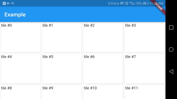
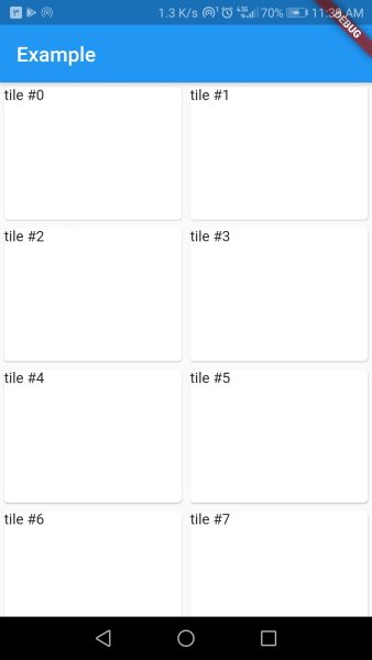
This widget is great for creating responsive designs as the sized of tiles stays about the same across different screen sizes.

How does it work

Using the width of tiles, SmartGridview will calculate the crossAxisCount for the underlying GridView with maxWidth ~/ tileWidth.

The tileHeight is used with tileWidth to calculate gridChildRatio.

Example

class MyApp extends StatelessWidget {

  @override
  Widget build(BuildContext context) {
    return MaterialApp(
      home: Scaffold(
        appBar: AppBar(title: Text('Example')),
        body: SmartGridView(
          tileWidth: 128,
          tileHeight: 168,
          children: List.generate(80, (index) => Card(
            child: GridTile(
              child: Text('tile #$index'),
            ),
          )),
        ),
      ),
    );
  }
}
Result

Categories

Source repository

Projects using this package

No data available yet.